Oh it feels so good to have completed projects and photo shoots again! This Before and After is an especially warm and uplifting one as we head into these shorter, darker days and colder temps.
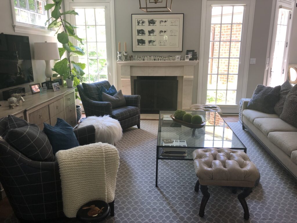
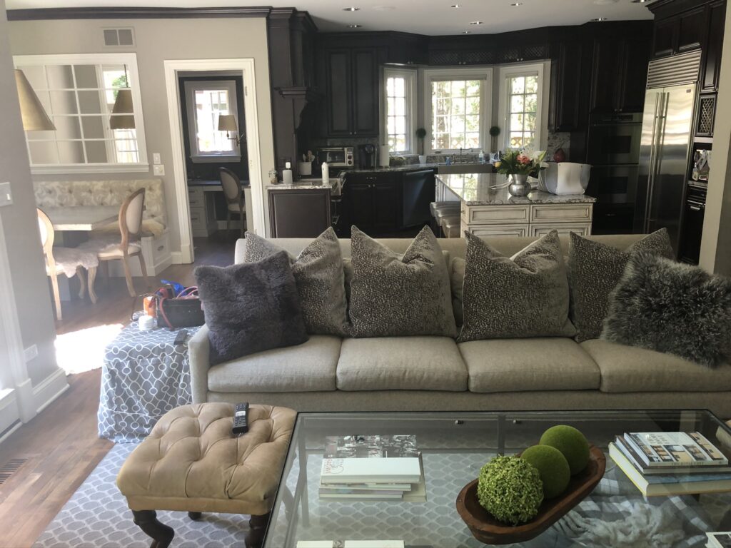
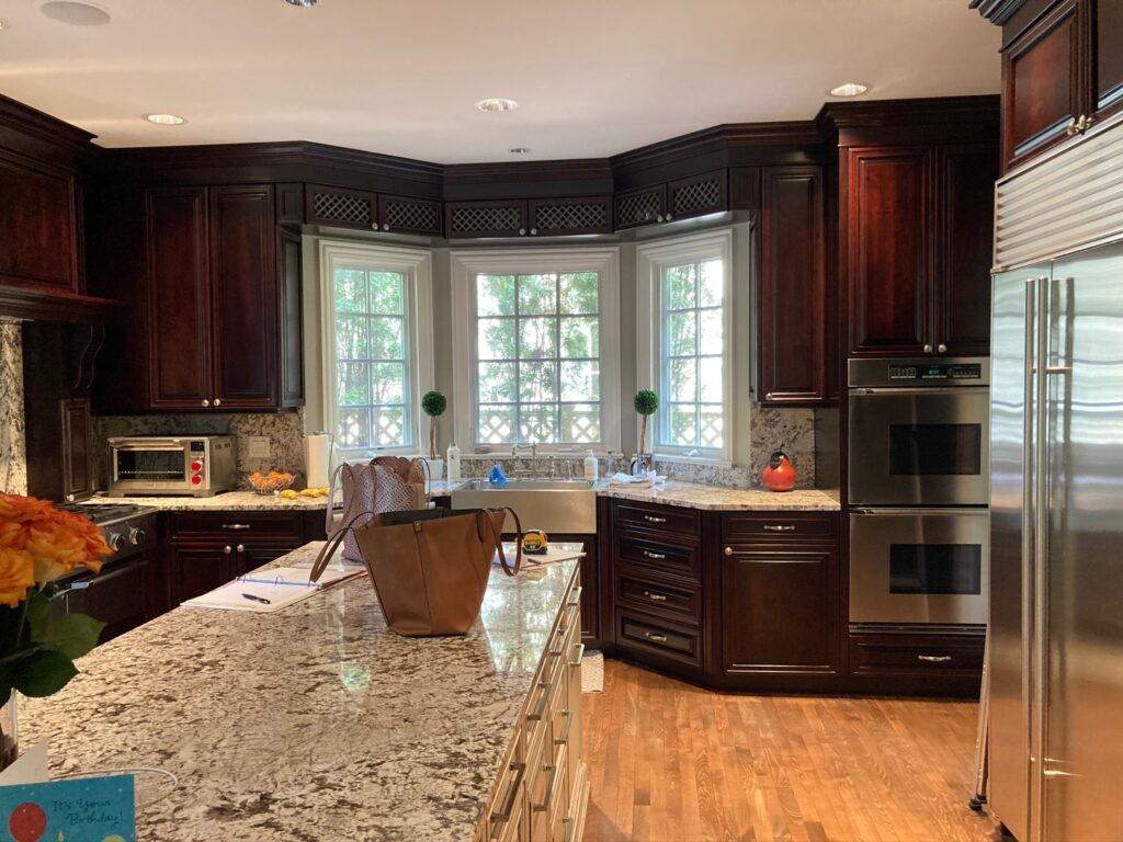
I’ll admit, when I first walked into this client’s house my initial thought was, I wonder what she needs me for! Ha! They had a very sophisticated space with lots of unique details, lighting, art and furniture. She admitted to me that she had done the whole “neutral” thing … lots of gray, white, ivory, beige … but she was over it! She wanted to bring in some bright and fun colors. The neutral palate had actually made the space feel darker. And the kitchen, with it’s dark brown cabinets and granite countertops wasn’t helping the situation since it was an open layout with the family room.
Teaming up with Stephanie Frees of Plain & Posh Distinctive Cabinetry Design again for her amazing kitchen designs, we set out to transform the space with color and brightness.
Before:
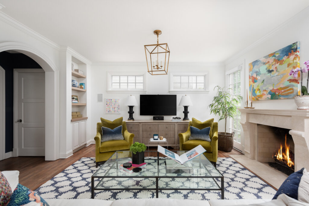
After:

Looking towards the kitchen before …
And now …
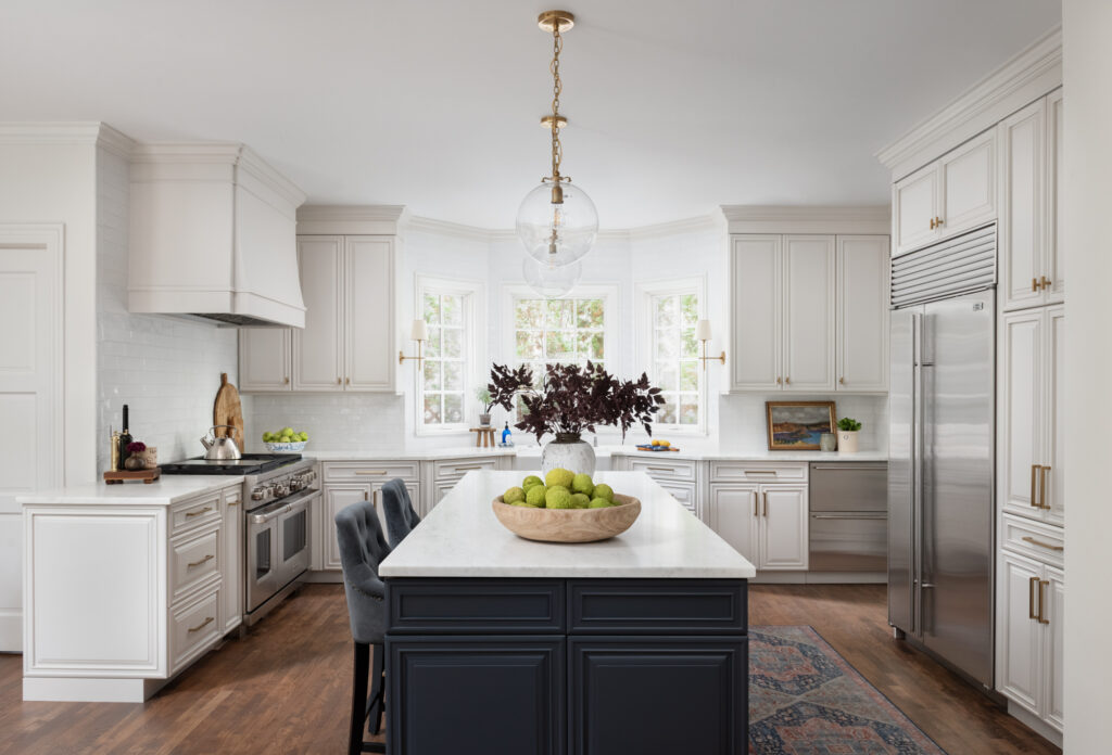
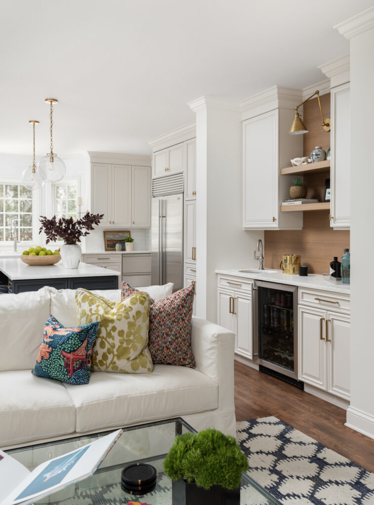
Bright and cheery is now the best way to describe this space. Can you believe the transformation?
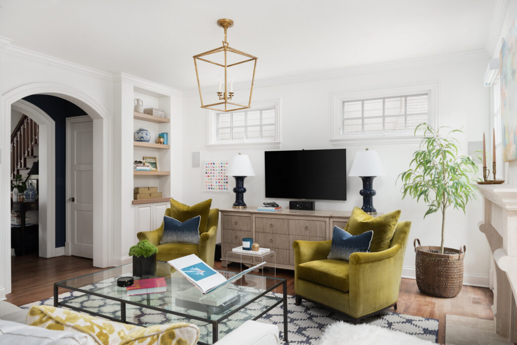
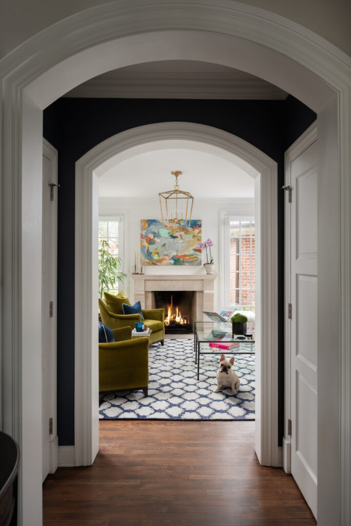
First, I’ll delve into what we did in the family room. My client loves navy (me too!) … but what brighter colors could we add to the space? After selecting this fun rug from Serena & Lily …
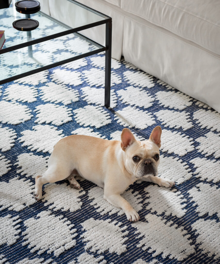
… and a new crisp white slipcovered sofa from Crate & Barrel for a comfy casual feel, my client said she’d love to bring in bright chartreuse and pops of pink.
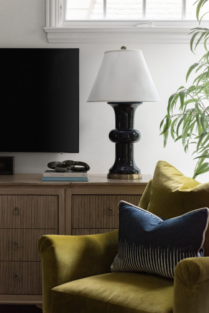
We decided her existing chairs with their great shape were the perfect opportunity to go bold with a luxurious chartreuse Velvet. Karen Flanagan of Sew Special handled the reupholstering and made our custom pillows.
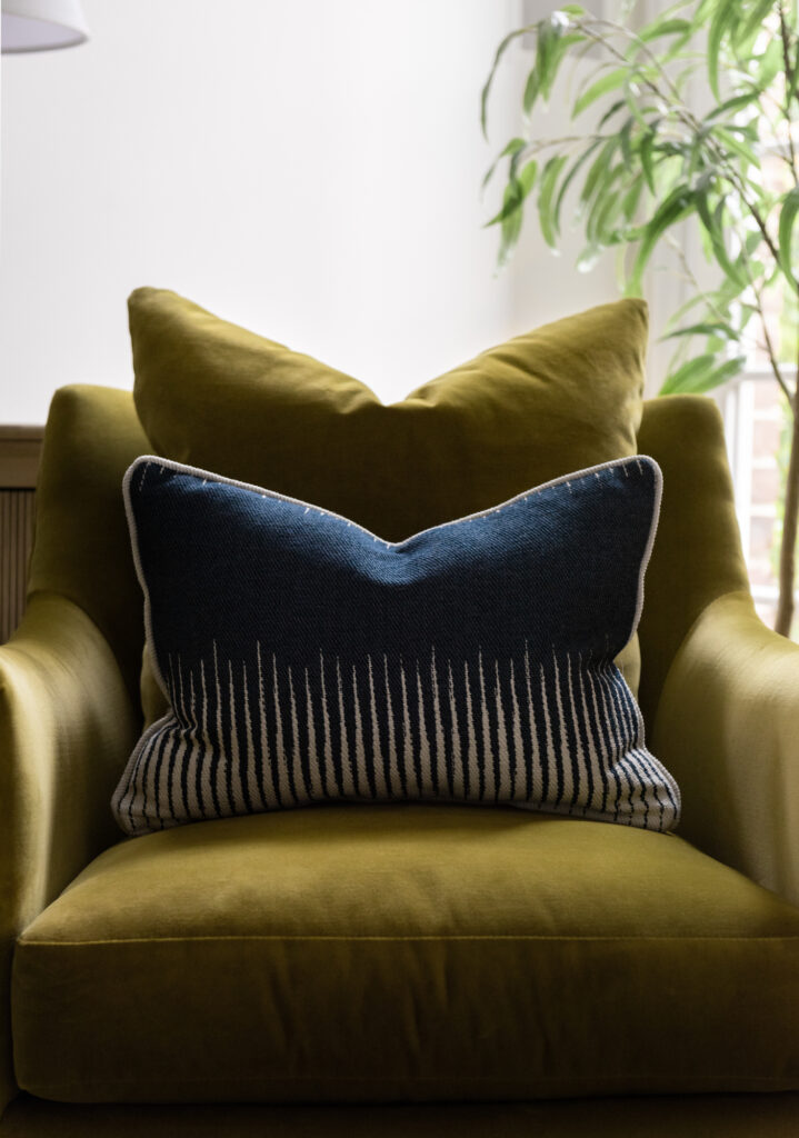
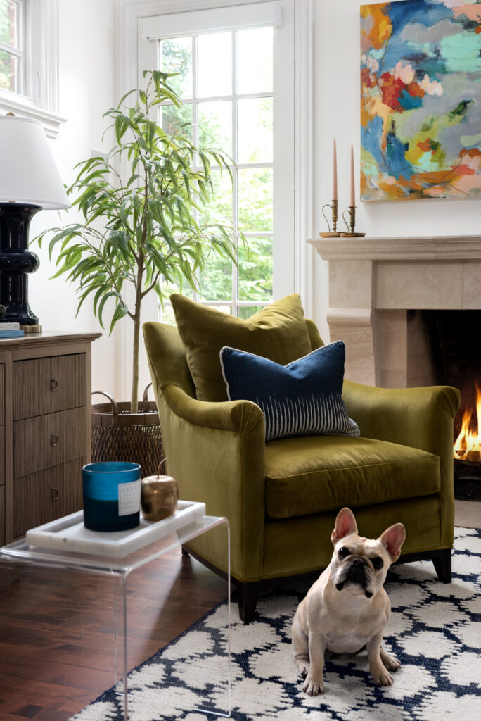
Next – can we talk about his amazing art by Heidi Becker?
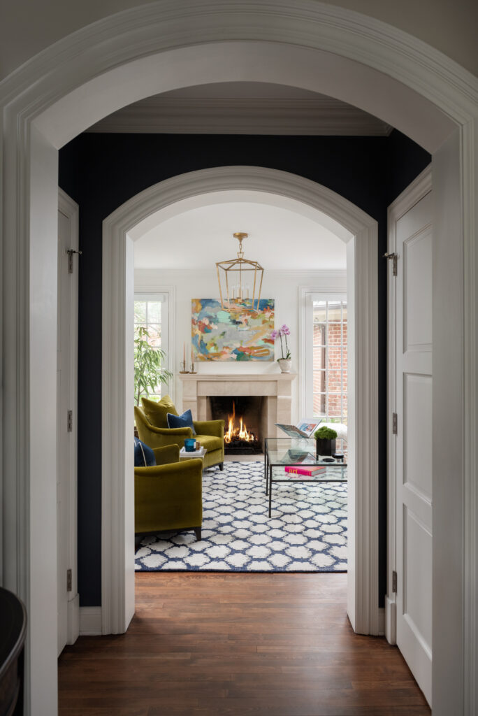
The bright happy colors draw you into the room from the front door and tie all of our selections together.
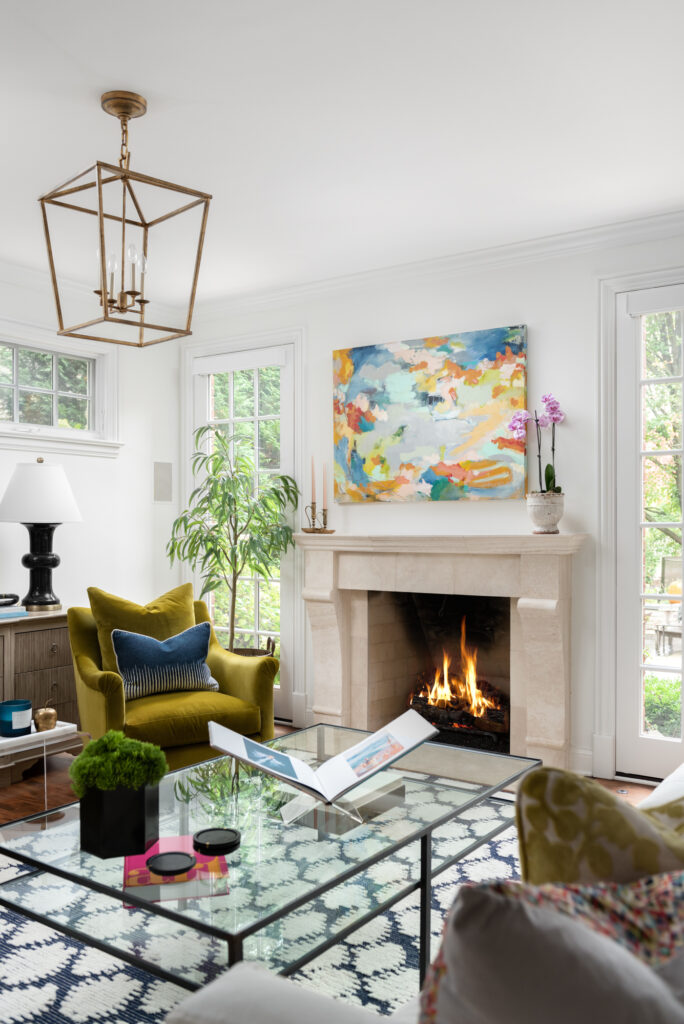
We said goodbye to gray walls and dark trim and painted everything Benjamin Moore White Dove, always a great backdrop for pops of color and bold artwork.
On to the kitchen …
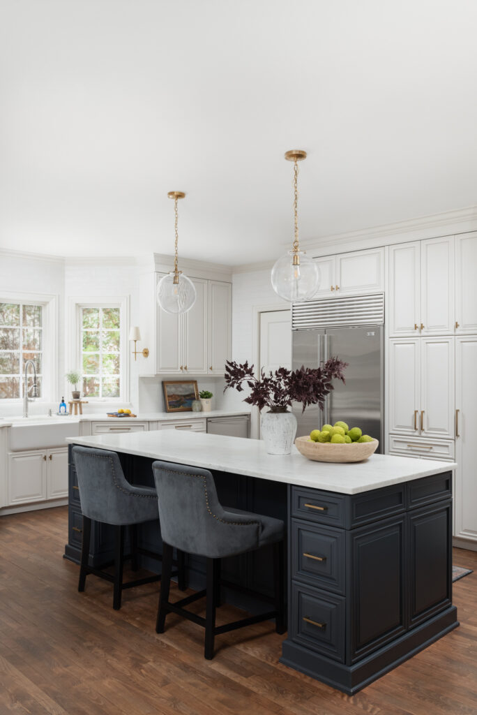
Besides just painting the perimeter cabinets (Benjamin Moore Classic Gray), there were other things we could do to make it not feel so heavy. Removing the cabinets above the windows was one thing that just opened up that whole area by the sink.
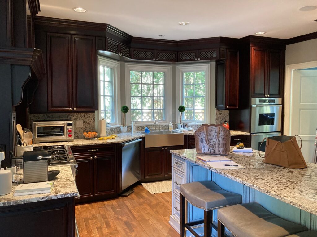
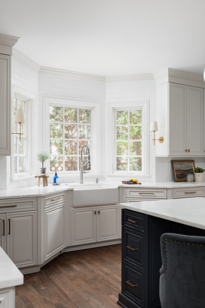
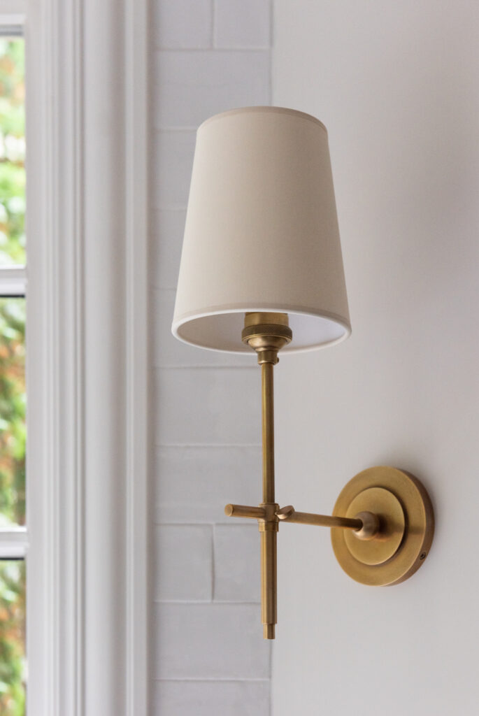
We also added a white farmhouse sink and more lighting with these classic sconces.
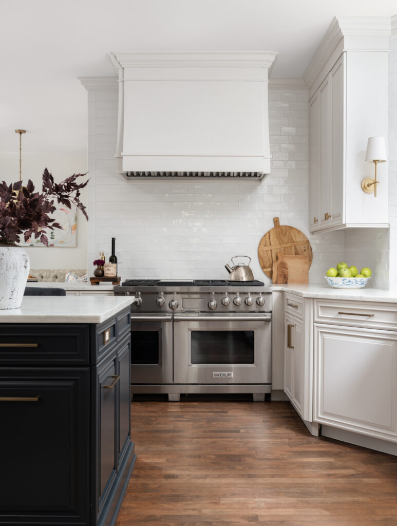
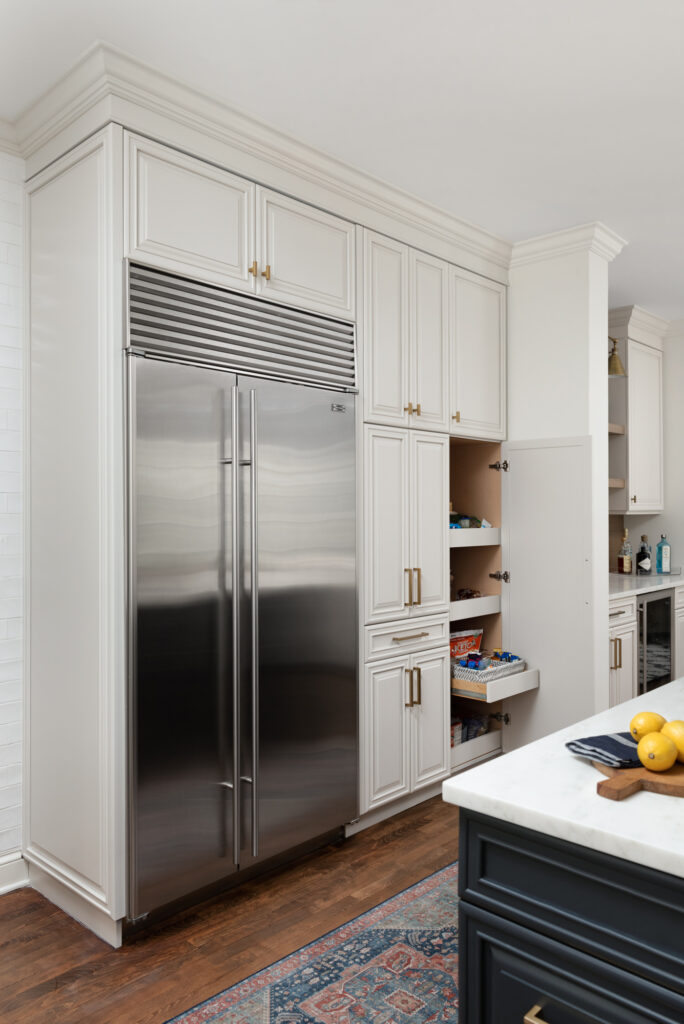
The cabinetry surrounding the range also felt heavy. Stephanie designed a beautiful and sleek new custom hood that allowed us to bring our backsplash tile all the way up to the ceiling.
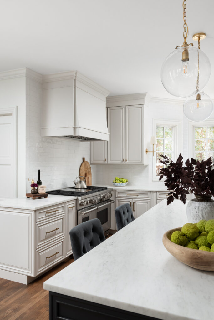
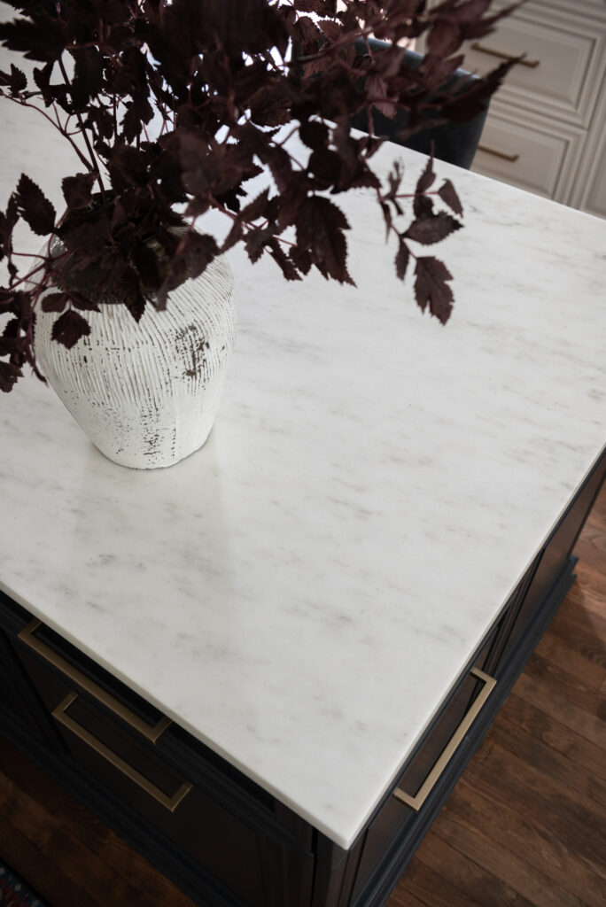
The island was originally painted with that distressed finish that was so popular for awhile. I suggested we bring our favorite navy color into the kitchen and onto the island. It was a hard-sell at first, but we landed on a pretty dark blue-gray custom color that just really ties into the family room and makes the new honed marble countertops pop.
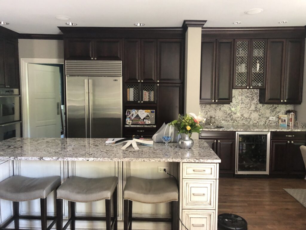
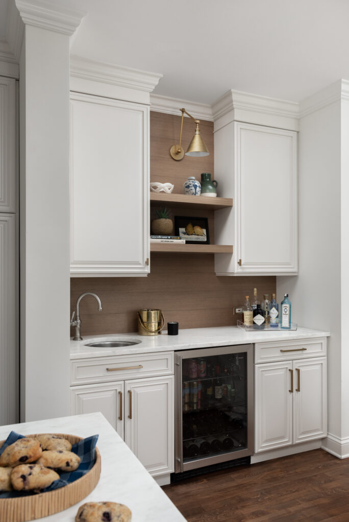
Let’s talk about this busy wall. We decided to simplify things by adding solid doors next to the fridge and giving the bar area a whole new look.
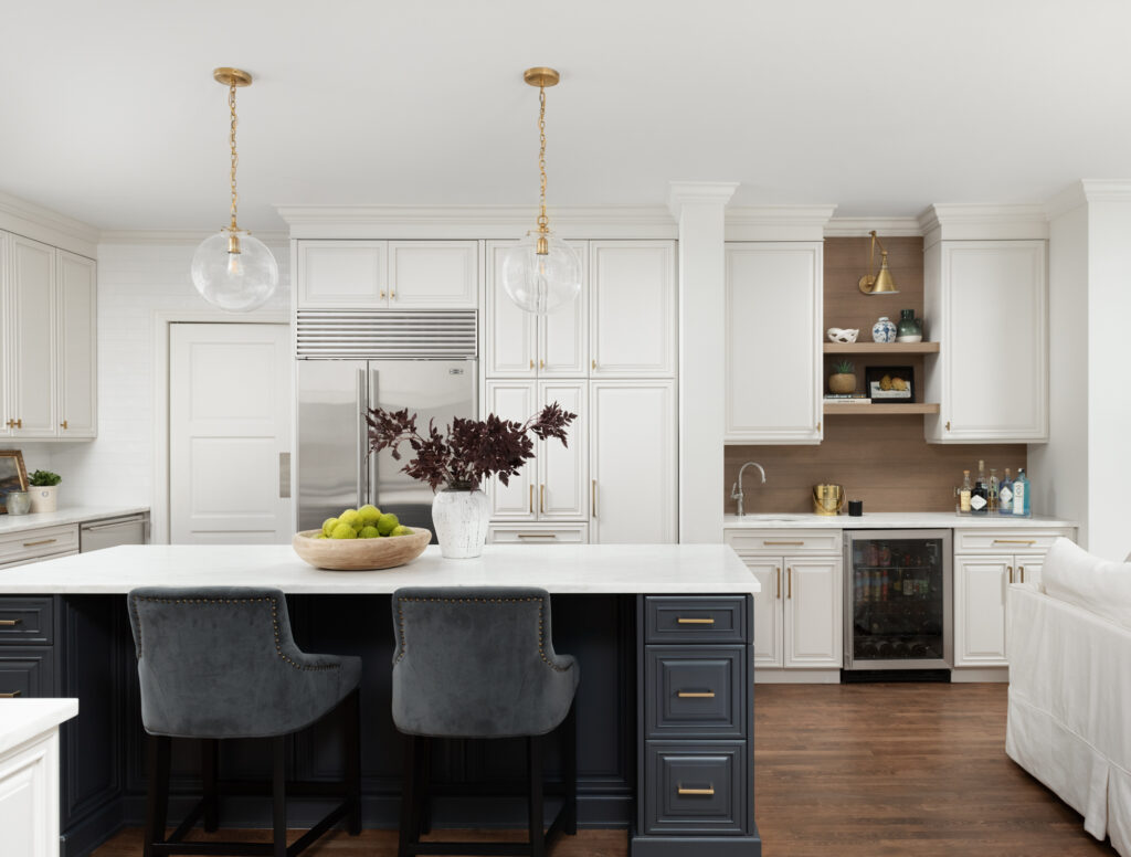
Rather than doing the same backsplash in this area, we wanted it to feel a little different … and the natural wood shiplap and shelves bring some nice warmth to this white kitchen.
As you can see in the before picture, this large kitchen never had any pendant lighting over the island. We chose the Katie Globe pendant to tie in with the other brass Circa Lighting fixtures she had in the space. And you can see the Boston Double-Arm library light there above the shelves in the bar area.
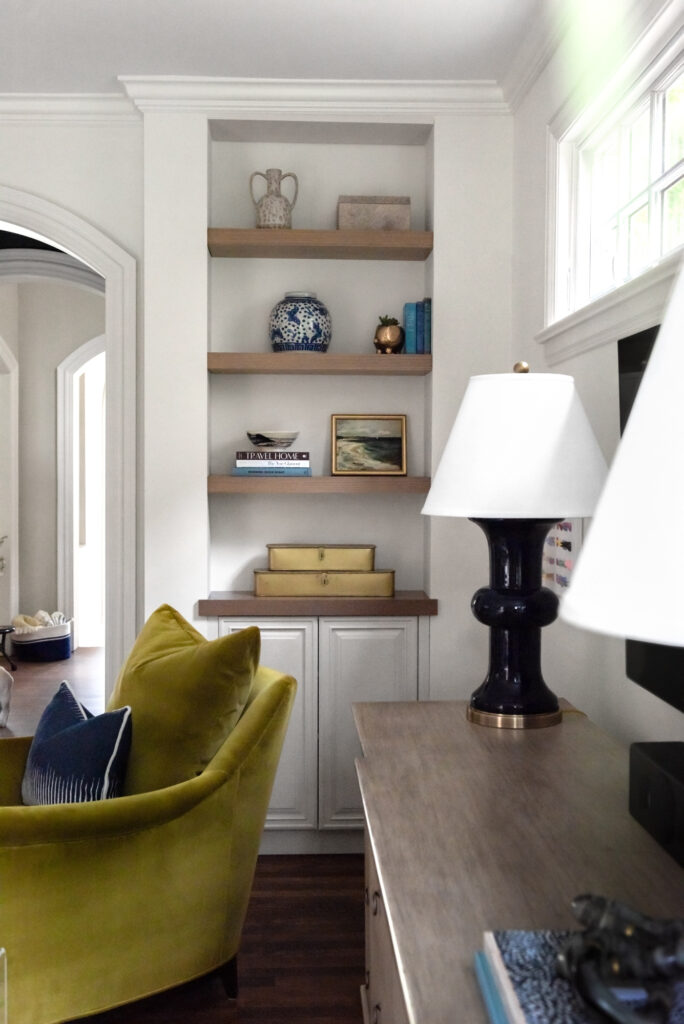
The dark cabinetry of the kitchen also carried into the family room in the form of this corner bookshelf.
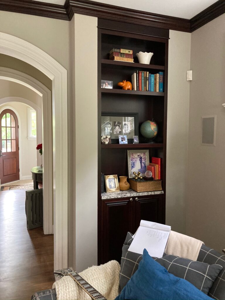
We lightened it up as well and used the same wood shelves from the bar area in a custom stain.
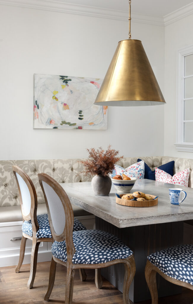
Finally, the breakfast nook got a little love too …
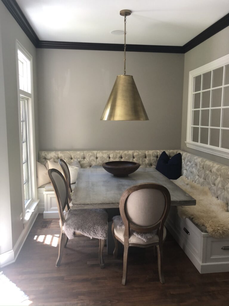
We needed to bring some fun pops of color to this area as well and these chairs presented the perfect opportunity.
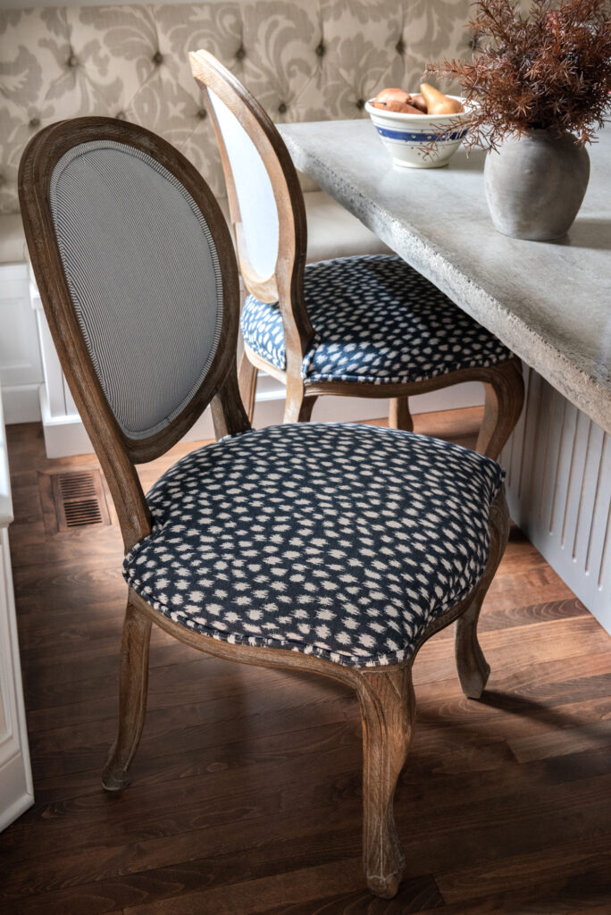
A mix of navy cheetah print and pinstripes and instantly the space feels much more fun!
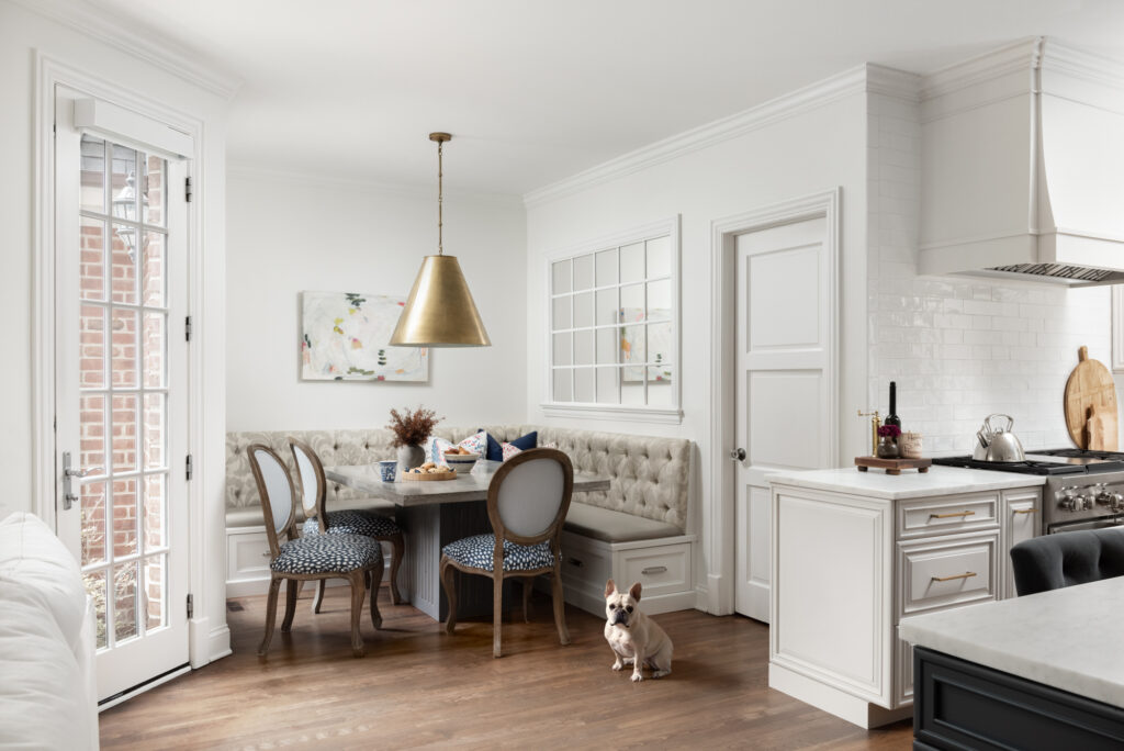
Stella agrees!
As we all have been spending more time in our homes during this crazy pandemic, creating spaces that feel happy, bright and uplifting seems even more important. Bring in colors, patterns, and artwork that bring you joy. Simplify spaces that feel chaotic or heavy so that you can feel the comforts of a home that makes you happy.
Photography by the talented Maria Storm of Picture Perfect House. Thank you, Marina!