Ok – so it’s been awhile! I apologize. I know that one blog post every few months does not make for a great blog. But blogging has definitely changed a whole lot since I started this in 2011. Let’s face it, the best blogs are the ones where the bloggers make make it their full time job. They blog daily or maybe weekly. They change their furniture, art, rugs, paint colors, even houses (!) monthly, semi-monthly, or annually to create new content for their blogs. While this can be a great gig, it is just not realistic in most people’s lives and certainly not my own. Staging a ‘Mother’s Day Tea’ tablescape that no one will ever use, or decorating for Christmas in October so that I can have holiday blog content up the day after Halloween, is not my priority. Other design firms I follow have dedicated social media staff whose whole job is to write the blog posts and do daily Instagram stories. Hard to compete with that – so I’m not going to try. I have been fortunate to work on some amazing projects this past year and that means there’s less time for blogging. Plus, I believe a creating a good blog post takes time. I don’t want to slap something together just to say I got a blog post up. Instagram (which didn’t even exist when I started this blog – can you believe it?) makes it easy to share inspiration or sneak peaks of projects quickly, without the need for a full blog post. So I’m thinking this blog will become more of a place to feature full project reveals, before and afters, etc. and more noteworthy things – not the little stuff we all get bombarded with already through email, Instagram and other social media. If you are anything like me, perhaps you too sometimes feel overwhelmed by the sheer number of blogs and Instagram accounts there are to follow and keep up with. What do you think? I’m all for simplifying!
So, having said all that – I DO have a real blog post for you today! I am revealing one of my favorite projects of 2017 – a dramatic makeover of a large kitchen and dining room for wonderful family with great taste and ideas about what they wanted their dream kitchen to be. It was a fun collaboration with Stephanie Frees of Plain & Posh Distinctive Cabinetry Designs.
Want to see where we started?
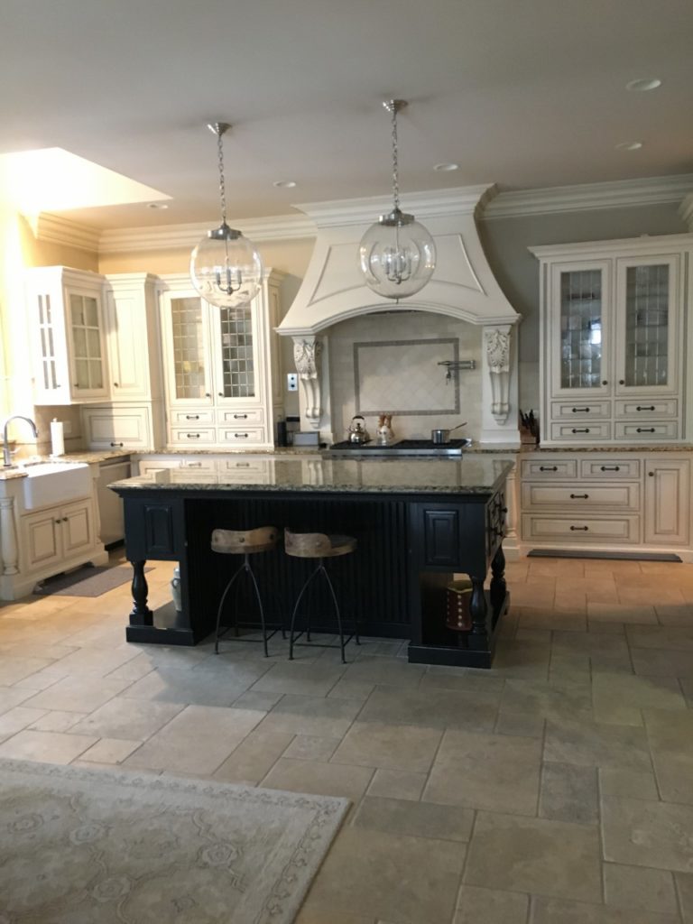
As you can see, we had a lot of space to work with! Despite the light cabinets and floors, the room still felt dark. The pendants over the island were new. Before my clients knew they were going to do a full renovation, they asked me to help them change out existing light fixtures which were way too small for the space … think little silk shades with tiny crystal drops.
But this kitchen was not working for them. Besides all of the ornate details, the layout and flow of the space meant many things were being underutilized.
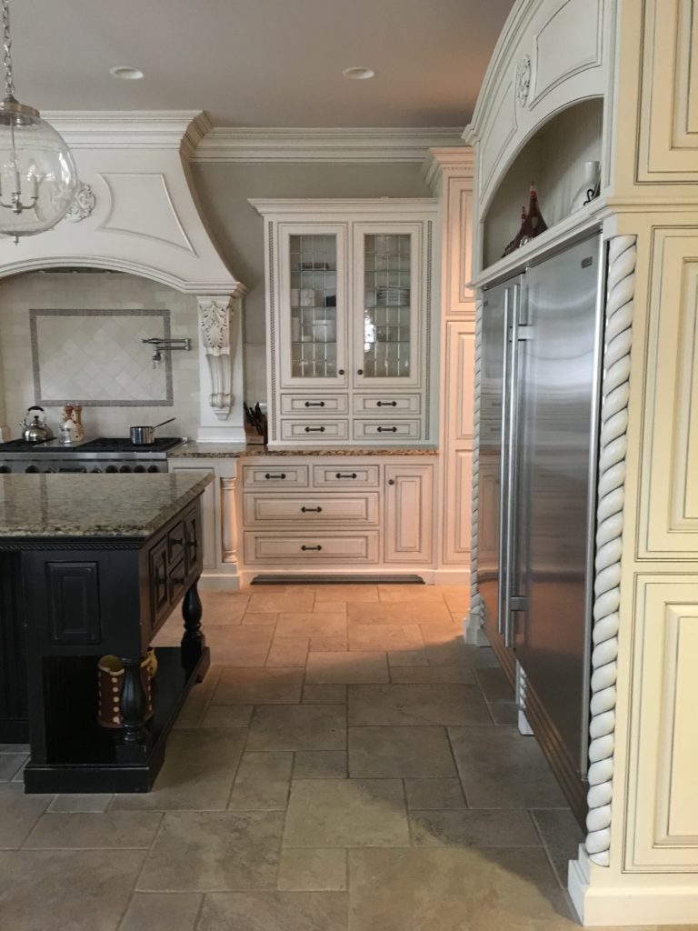
On the other side of this range wall is the dining room – which has large windows and is flooded with light. But the only way to get to it was to zigzag through a small dark corner Butler’s pantry, whose entrance, above, is where the light is shining from.
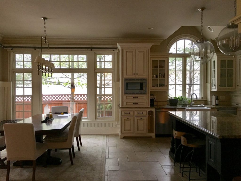
The floors were also a problem. They were very hard to keep clean – with so many thick deep grout lines – and tile that just seemed to hold on to dirt.
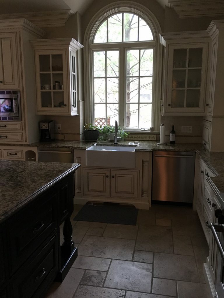
This was one of the big questions for this remodel … do we lay wood floors down to match the rest of the house? Normally this would be a good option, but my clients do not love the existing wood floors and did not want to bring that stain color into this new kitchen. If we were going to do wood floors, it would mean redoing all of the floors on the whole house!
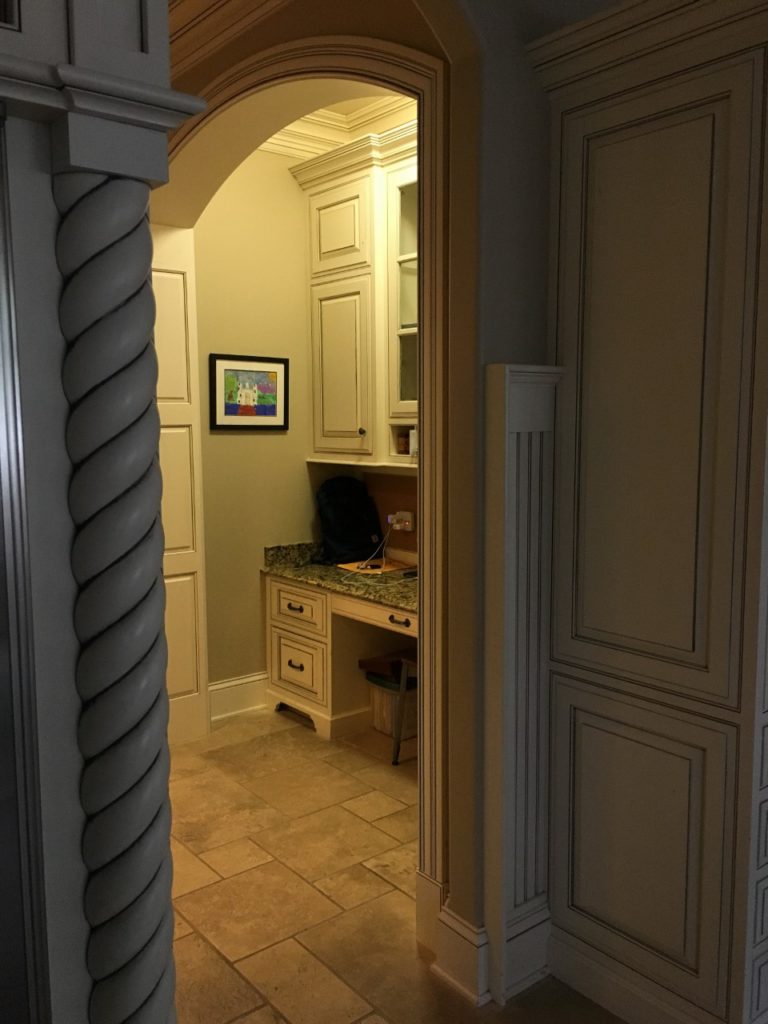
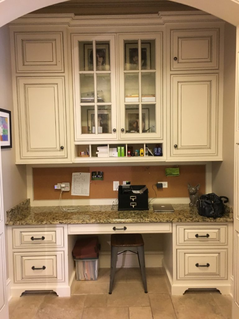
The main entrance to the kitchen from the front hall was through this little hallway with a desk on one side and a pantry door on the other. Not only was this desk space not needed since the family has a large home office space right across the hall, but, as most kitchen desks do, it became a clutter and drop-zone. And this was the first thing you’d see as you’d walk into the kitchen.
Ok – ok! Are you ready to see the After? Drumroll please ….
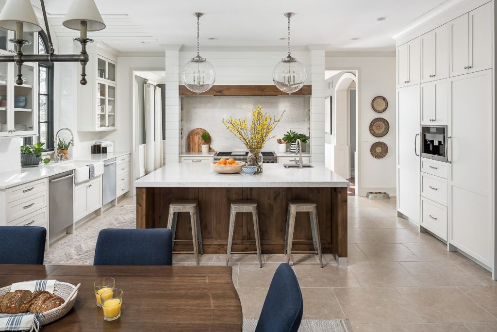
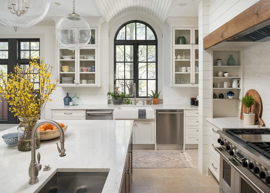
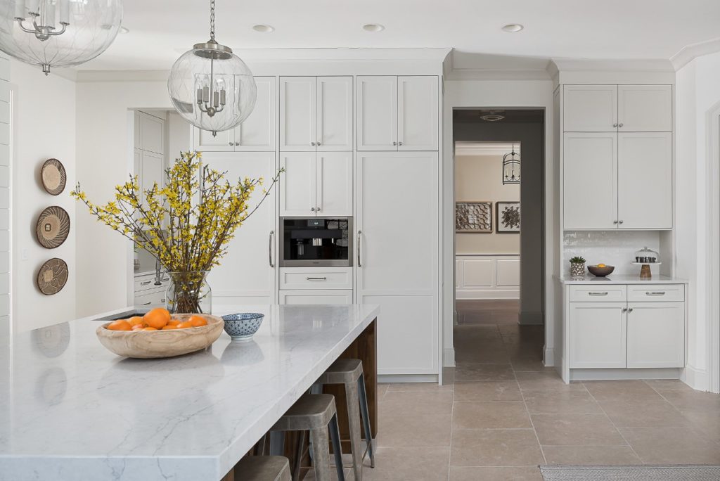
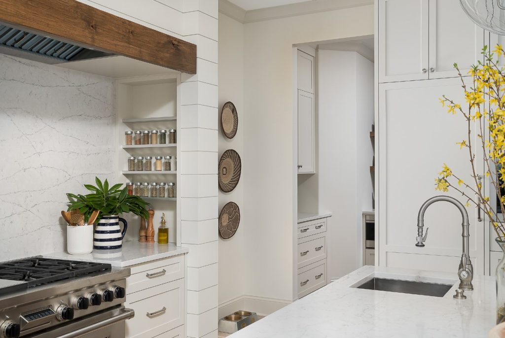
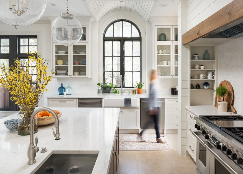
Where to begin? We opened up the wall on either side of the Range to create two entrances to the dining room and flood the kitchen with it’s beautiful light. Gorgeous cabinetry designed by Plain & Posh is more streamlined and functional and includes a deeper island in a custom wood-stain to warm up all the white. But actually … the cabinets are NOT white! They are painted Benjamin Moore’s Classic Gray … this is my go-to color for creating the illusion of light and bright, but with more warmth and depth. The walls are Benjamin Moore’s White Dove.
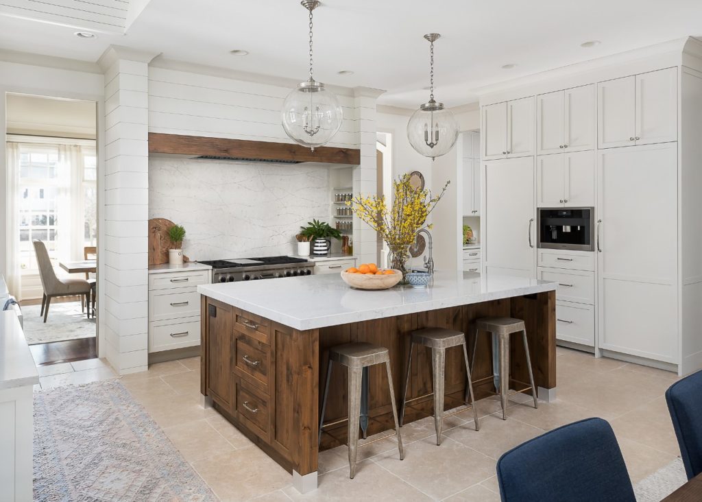
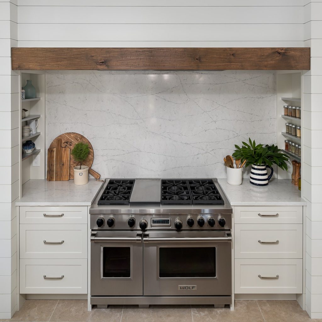
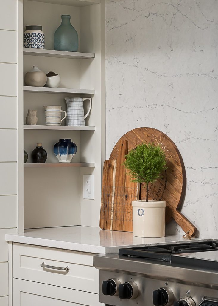
The countertops and back wall of the range niche are Silestone Quartz in Pearl Jasmine from their Eternal Collection. We wanted some veining and movement but not too much, so this was the perfect choice.
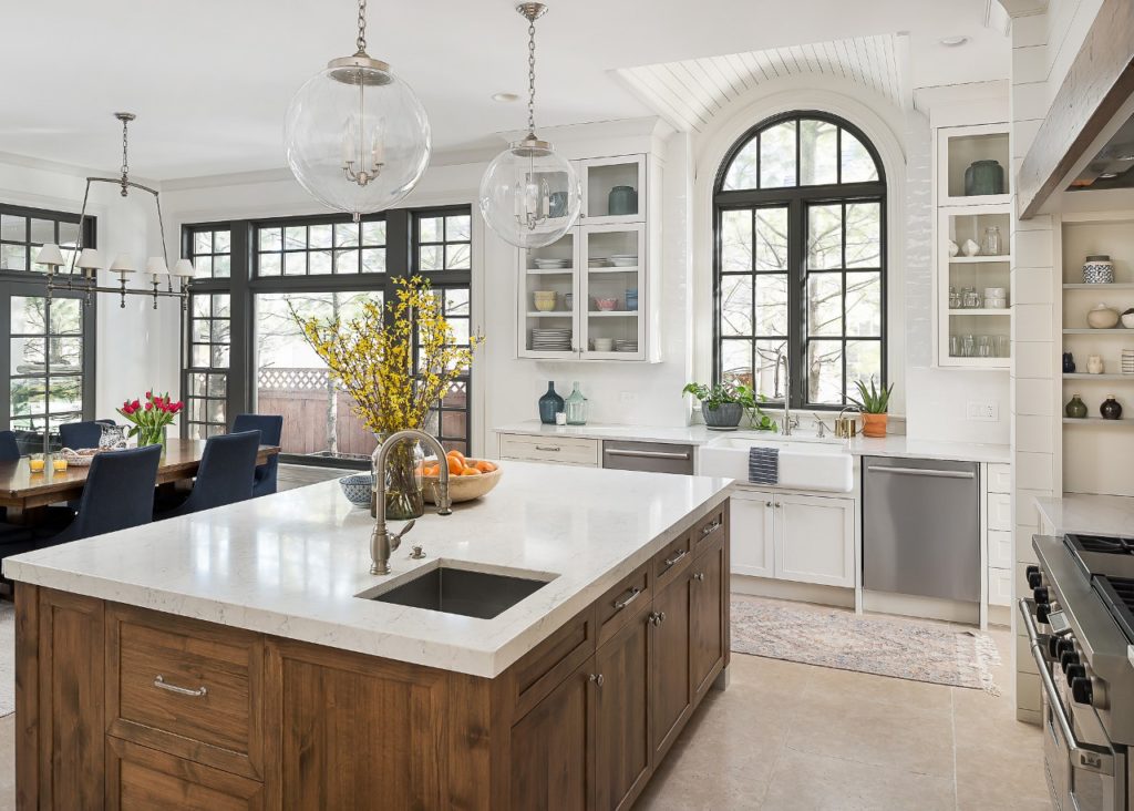
We also painted all of the window trim Benjamin Moore’s Kendall Charcoal. Another great way to bring added dimension to an all-white kitchen.
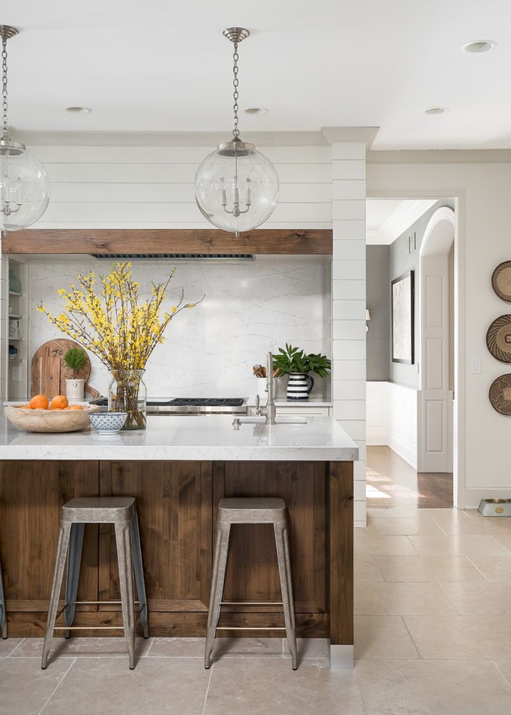
The floors! After deciding against wood floors, we looked at a lot of different stone options. We wanted much larger tiles to look less busy and for less grout lines. And … to get just the right color – not too gray or cold looking, but too not too gold or yellow either. We finally hit the jackpot at Exquisite Surfaces with these beautiful tumbled limestone floors.
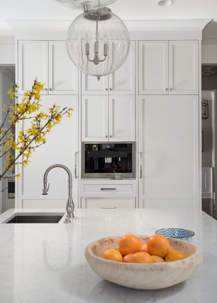
Check out this fun coffee station …
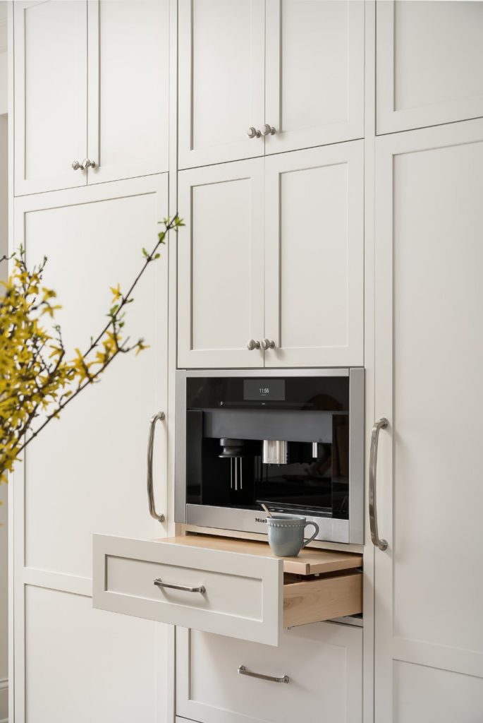
Stephanie at Plain & Posh has such a knack for designing functional little details like this.
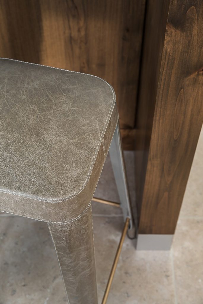
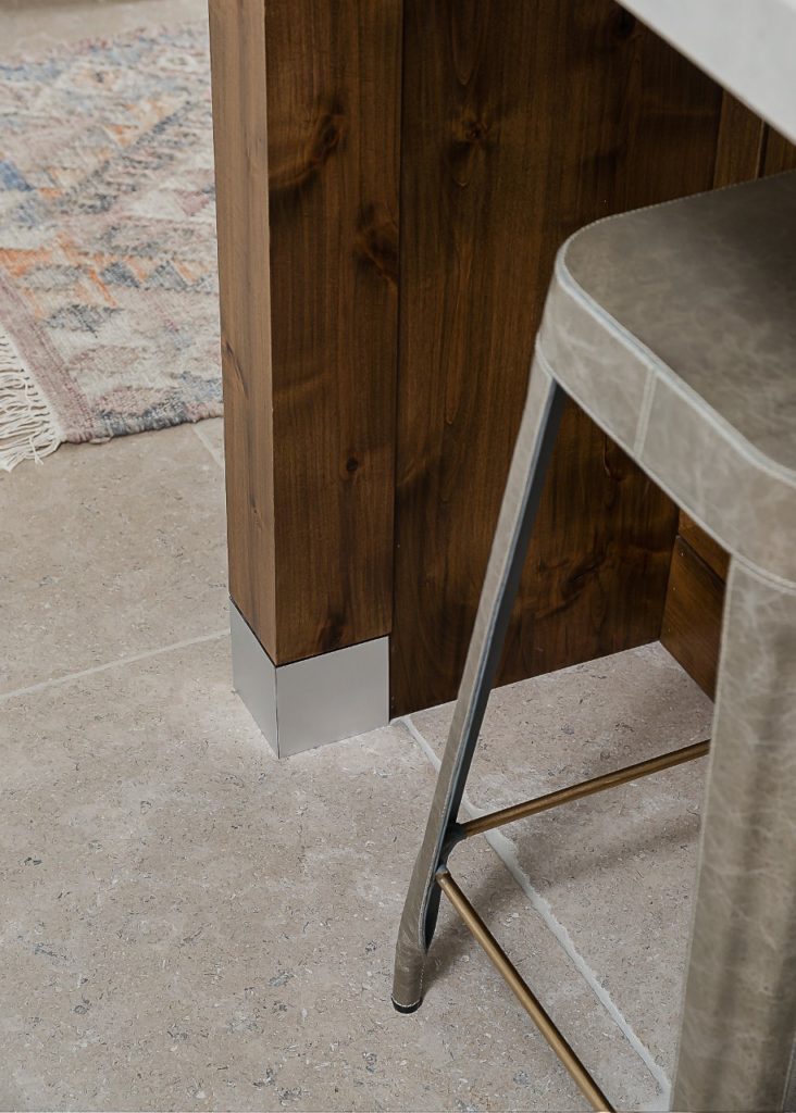
Here are some great closeups of the gorgeous leather barstools from Made Goods and the capped feet of the island.
Ok -so what about the former desk area?
Before …
And after …
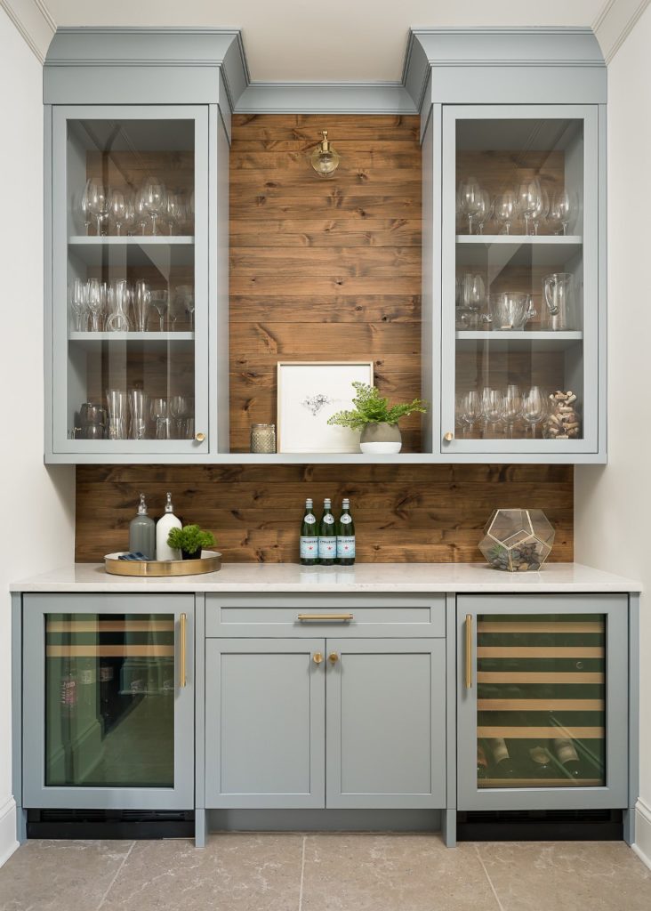
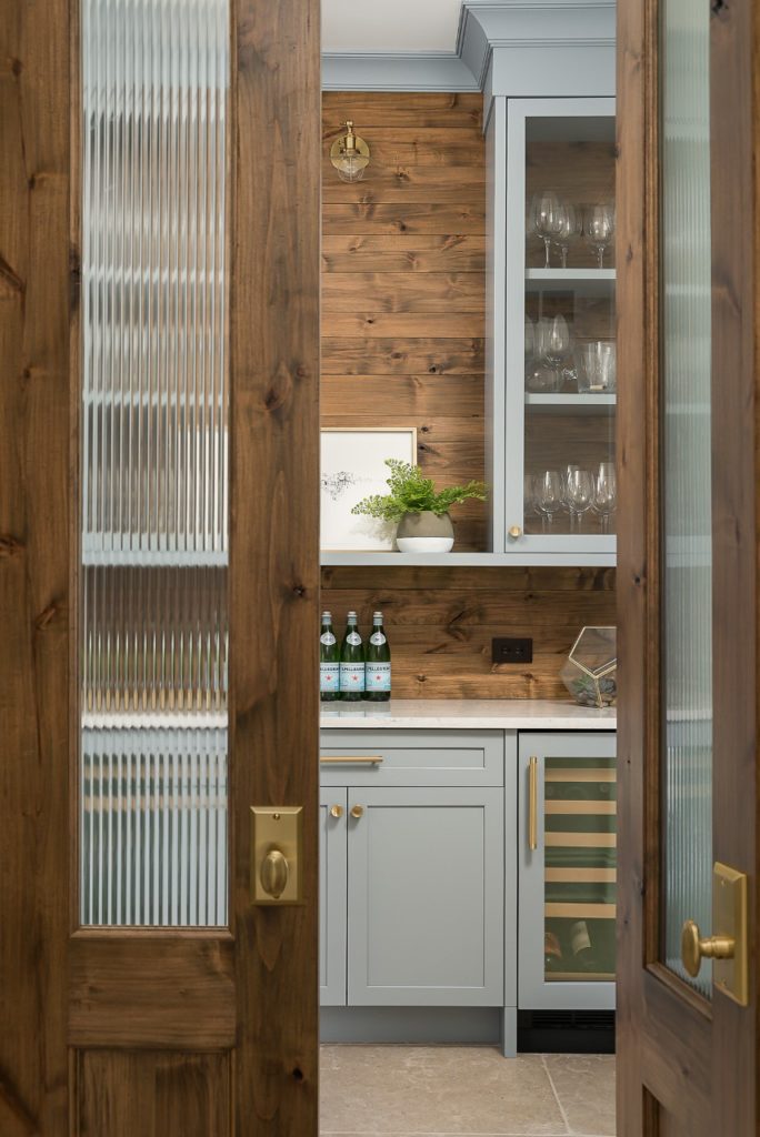
With beverage and wine refrigerators and beautiful glass front cabinetry, it is now so much more useful to the family and a more lovely way to enter the kitchen. The warm wood planks were stained to coordinate with the island and wood beam above the stove niche. I love mixing metals -so this little area was a great place to play with antique brass hardware and accents.
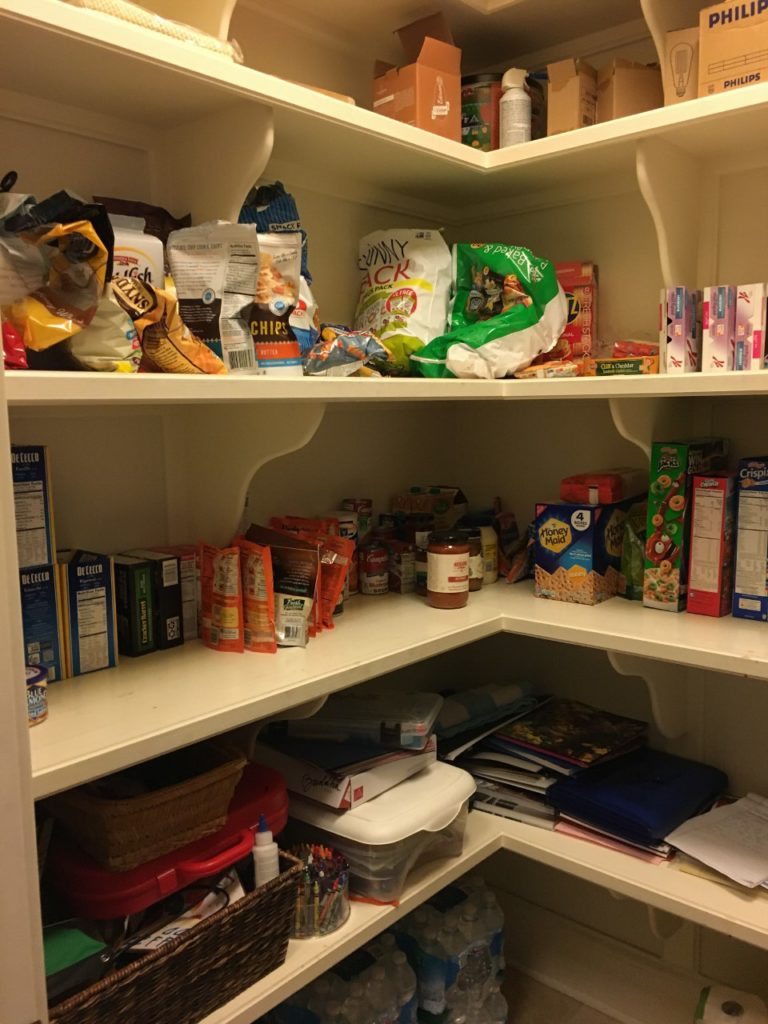
Across from the previous desk was a door to a walk-in pantry with very basic shelving that was hard to keep organized and not very pretty to look at upon entering the kitchen.
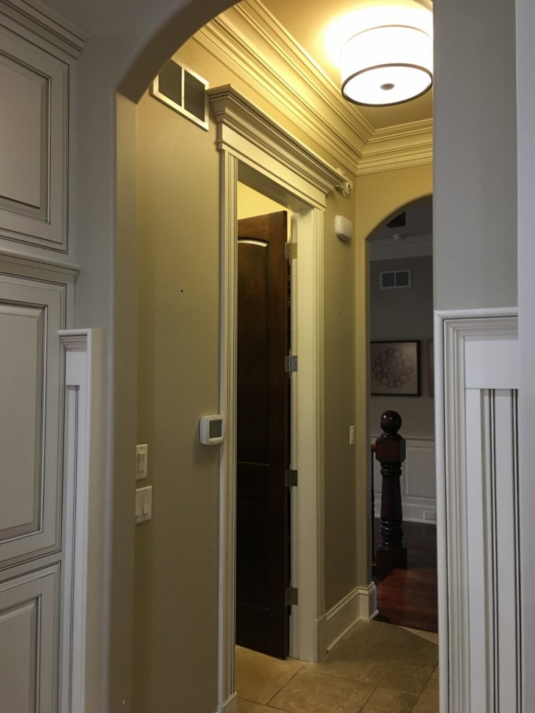
The new plan called for breaking through that pantry wall into the former Butler’s Pantry and creating a functional yet lovely walk through pantry that could be accessed from either side of the kitchen.
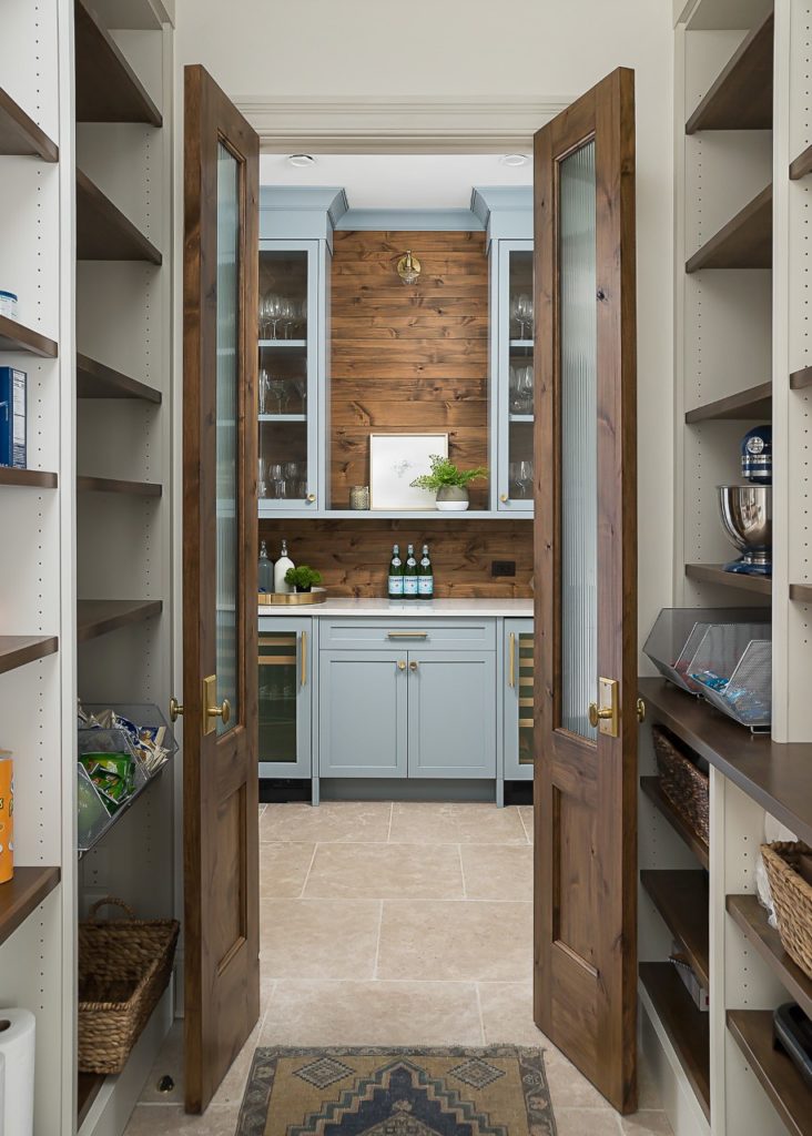
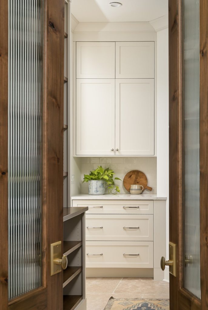
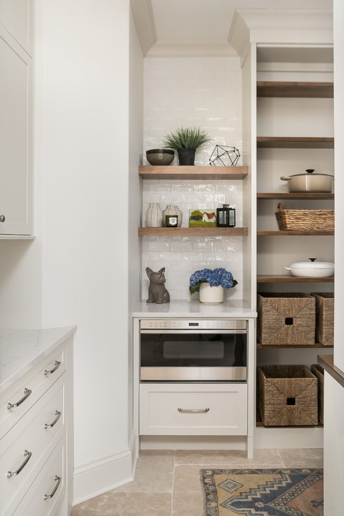
Wait … back up … did you check out those double doors? That was one of my favorite last minute design decisions! Why have one plain door when we could do 2 charming doors with fluted glass and fun brass knobs?
So what do you think? I am so in love with this bright airy kitchen and it was so fun to style and accessorize. But wait … there’s more … let’s check out the new adjoining dining room, shall we?
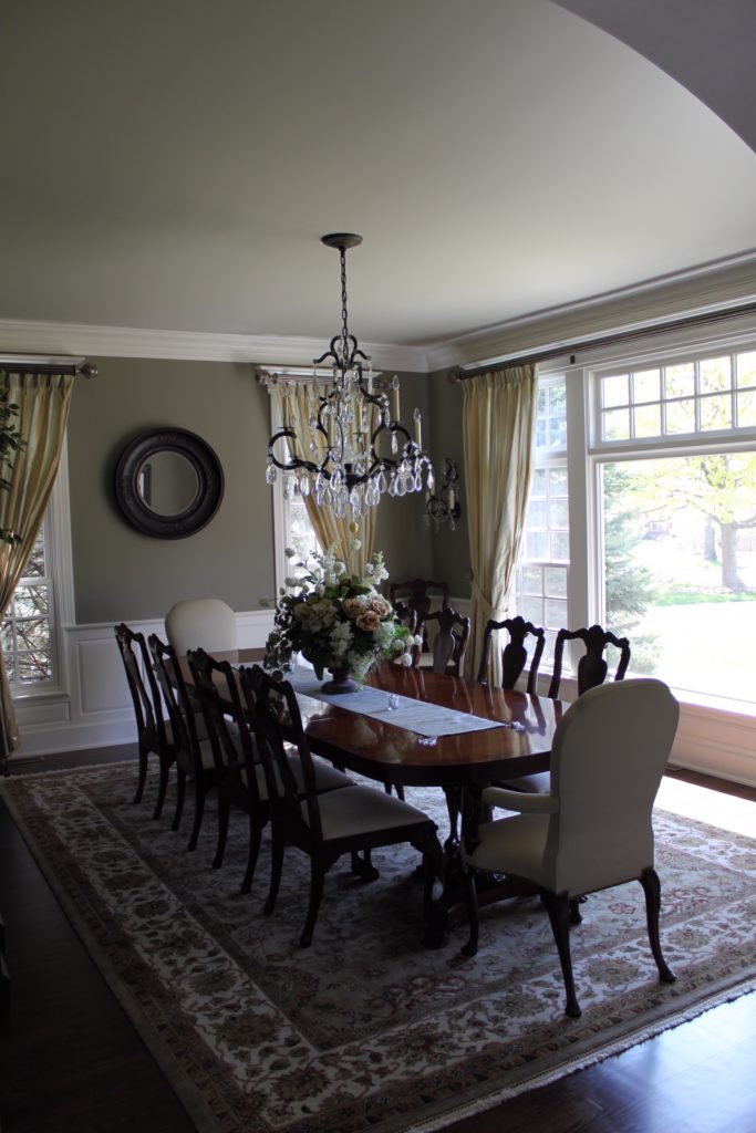
First – here is an old photo of the dining room from when my clients first purchased the house. They hadn’t done much to it since besides moving in their old dining room furniture.
And now …
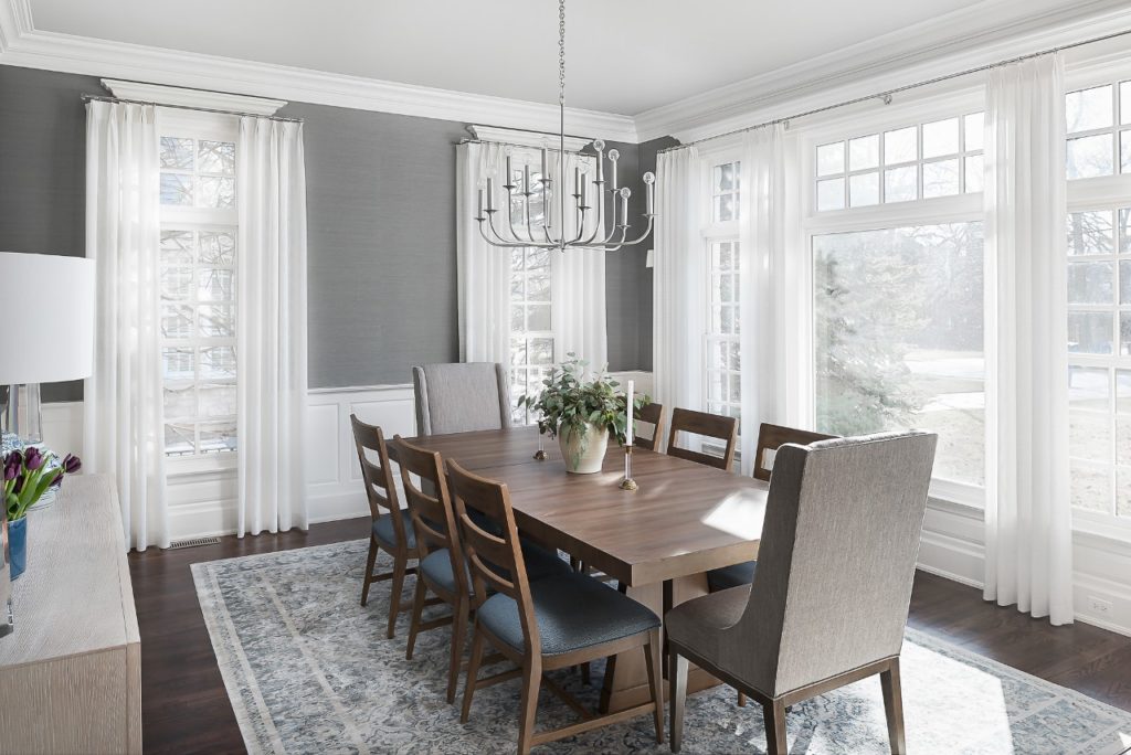
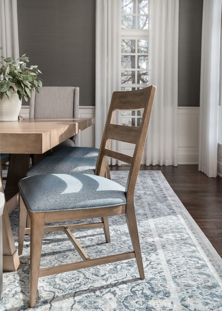
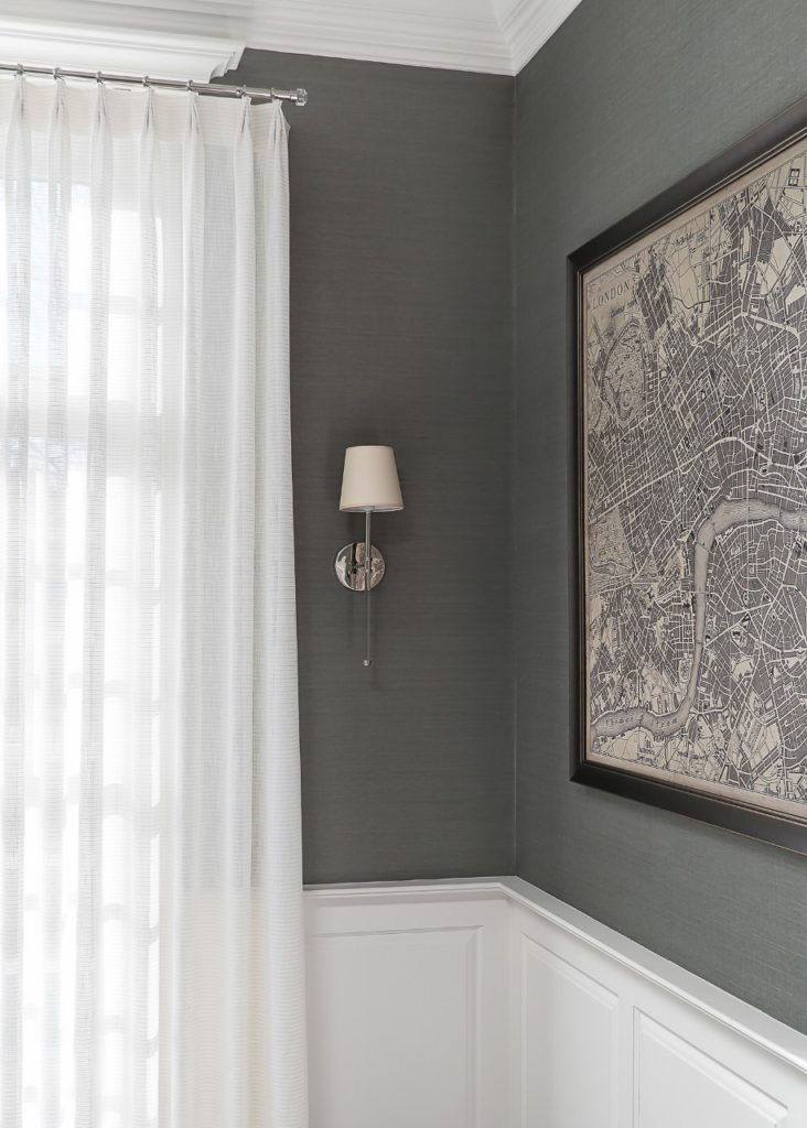
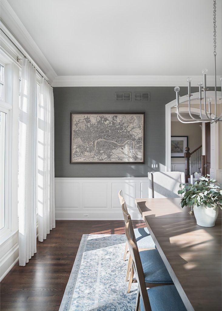
We wanted a light and soothing color scheme and the design all started with this gorgeous green-gray grasscloth wallpaper. My clients wanted it to feel elegant but not too fussy or formal. I think we achieved that with the lighter wood tones and the more casual side chairs.
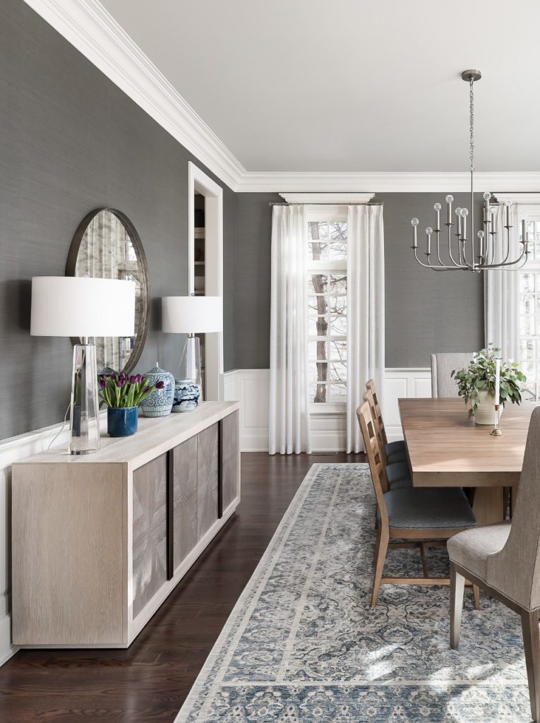
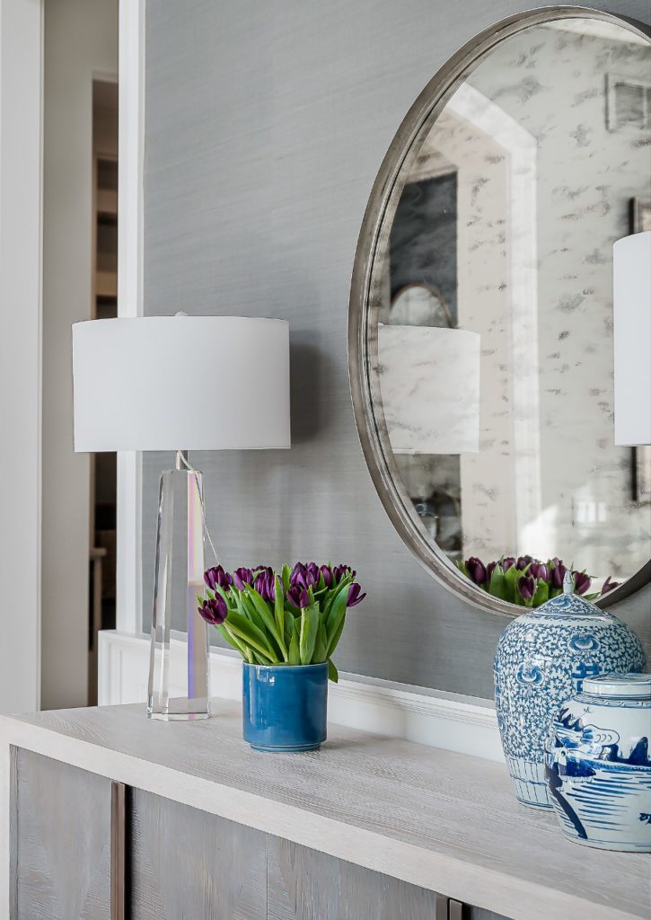
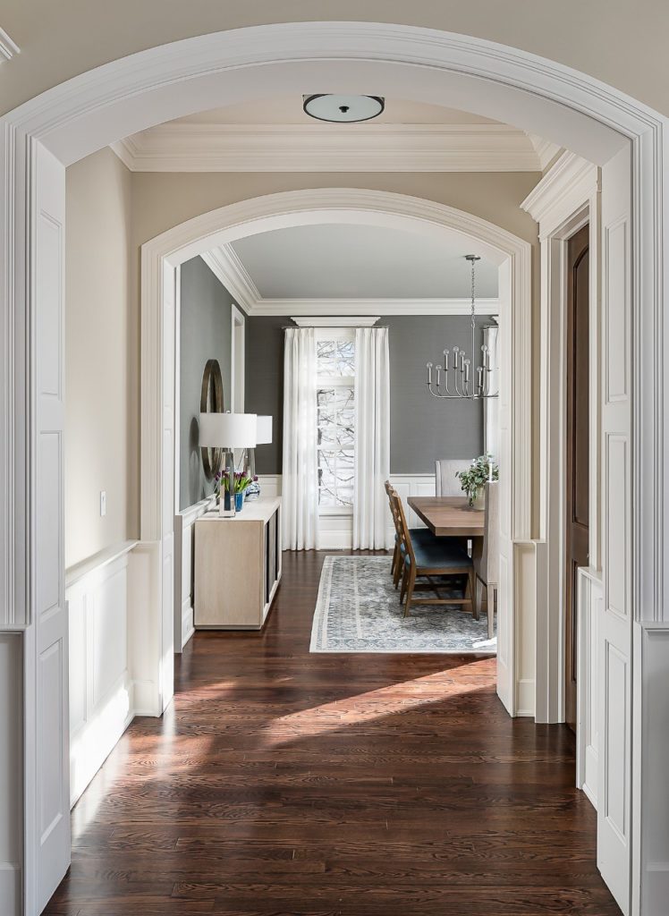
I love the sleek lines of this two-toned sideboard.
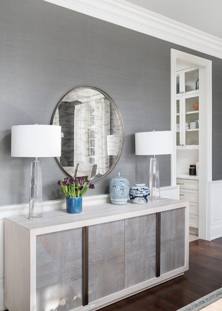
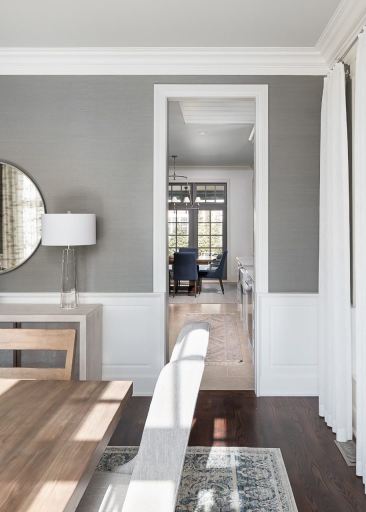
And a round mirror is a great way to break up all of the linear features of a dining room.
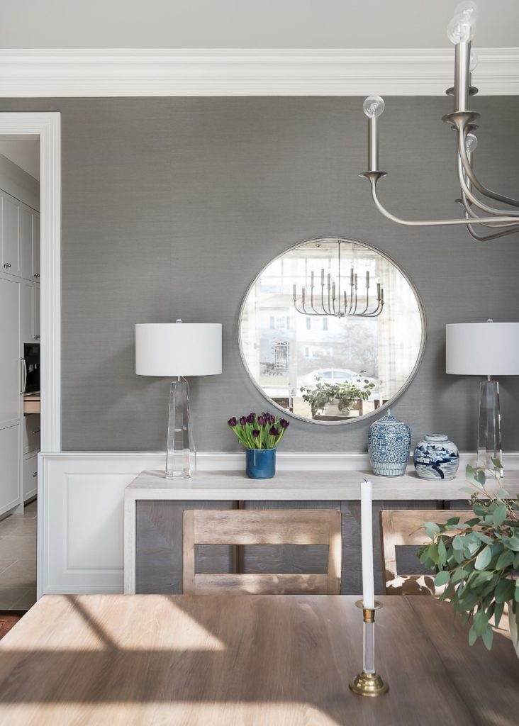
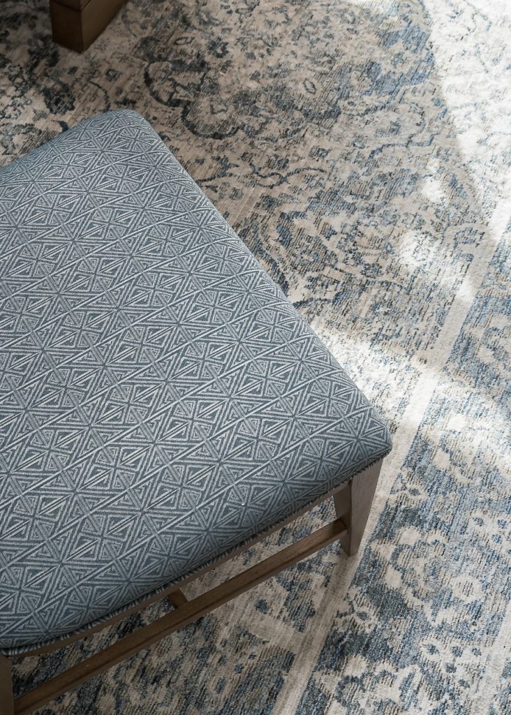
Also, I love the mix of patterns here between the rug and chairs – the rug is more traditional yet the geometric pattern on the chairs is a fun modern pop.
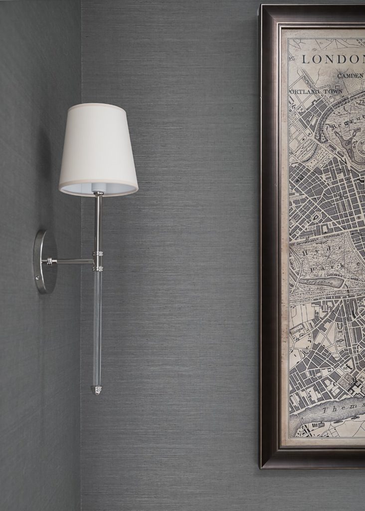
Here is a closer look at the wallpaper and gorgeous Camille sconces from Circa Lighting.
Custom draperies by Mimsie O’Hara in a pretty sheer fabric with metallic threads running through.
All the sunlight filters in so beautifully!
This is the view from the front entry hall …
And then, the view into the new kitchen …
Well … that was a long post! Thanks for sticking with me! This was such a fun project and I am thrilled that my clients have this new wonderful space to gather. It is truly the heart of their home!
And finally, a great big thank you to Marina Storm of Picture Perfect House for her wonderful photography of this project. She captured everything beautifully!


