When it comes to home remodeling projects, what’s better than getting a whole new space? Getting three of them! When my clients decided to update their Master bathroom, we talked about how their laundry room and powder room where also needing some love. While the Master was a full gut remodel, the other two spaces were completely transformed as well. Working again with Stephanie Frees of Plain & Posh Distinctive Cabinetry Design, we came up with a plan. Today I’m revealing the Master Bathroom. Are you ready to see where we started?
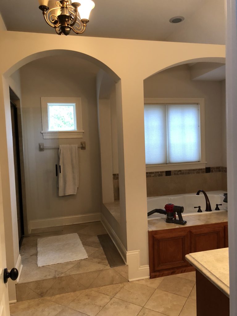
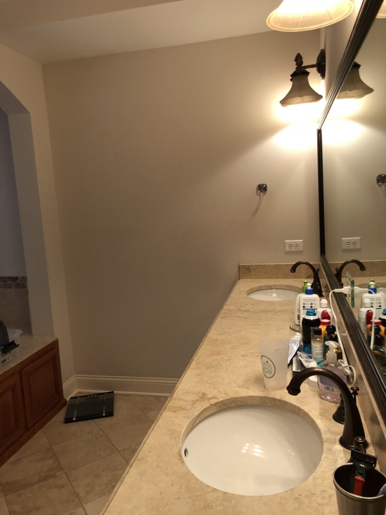
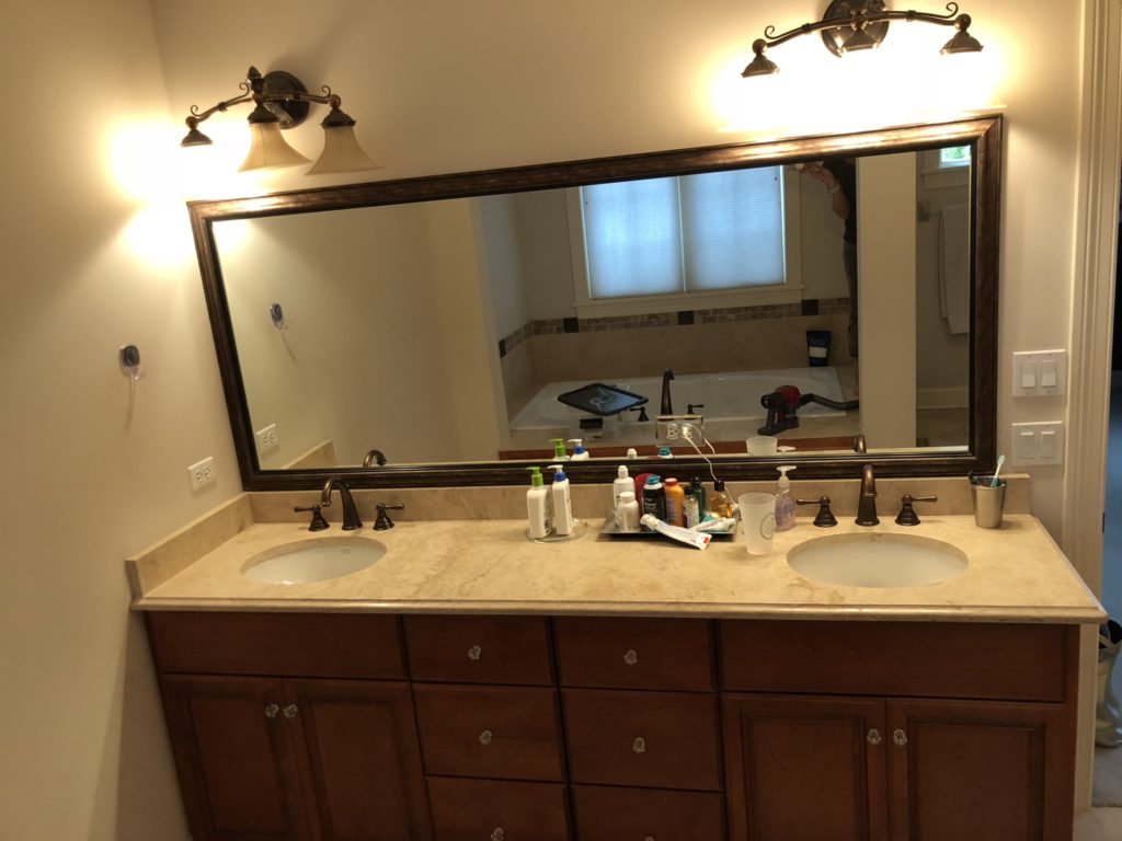

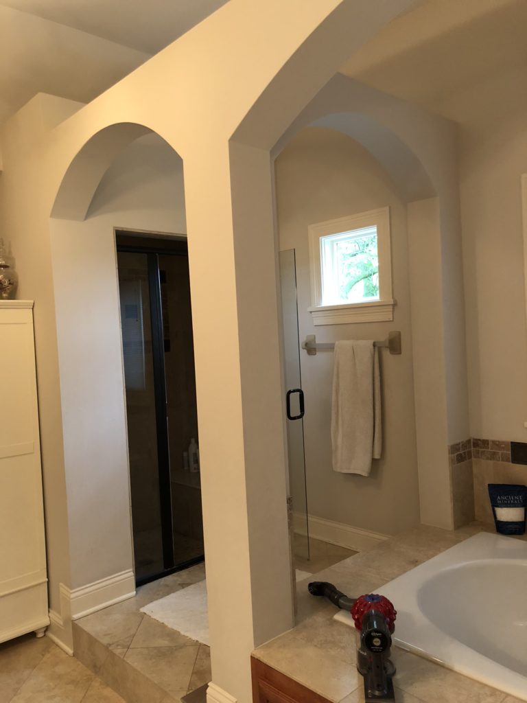
The builder of this home was obviously of a “More is More!” mindset … more arches, more walls, more steps – all if it making what is not a huge space to begin with feel even more cramped and choppy. While the colors were neutral, they still felt dark and dingy. We wanted to make the room feel light, bright and luxurious … and to tie in with the style we created for this family’s kitchen remodel a couple of years ago. (See A Modern Rustic Kitchen Reveal.)
Ready to see the afters?
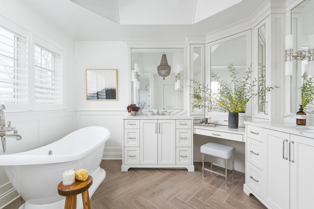
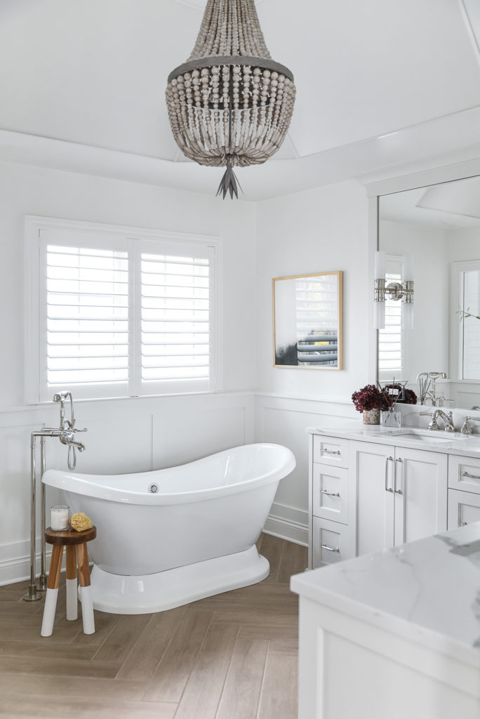
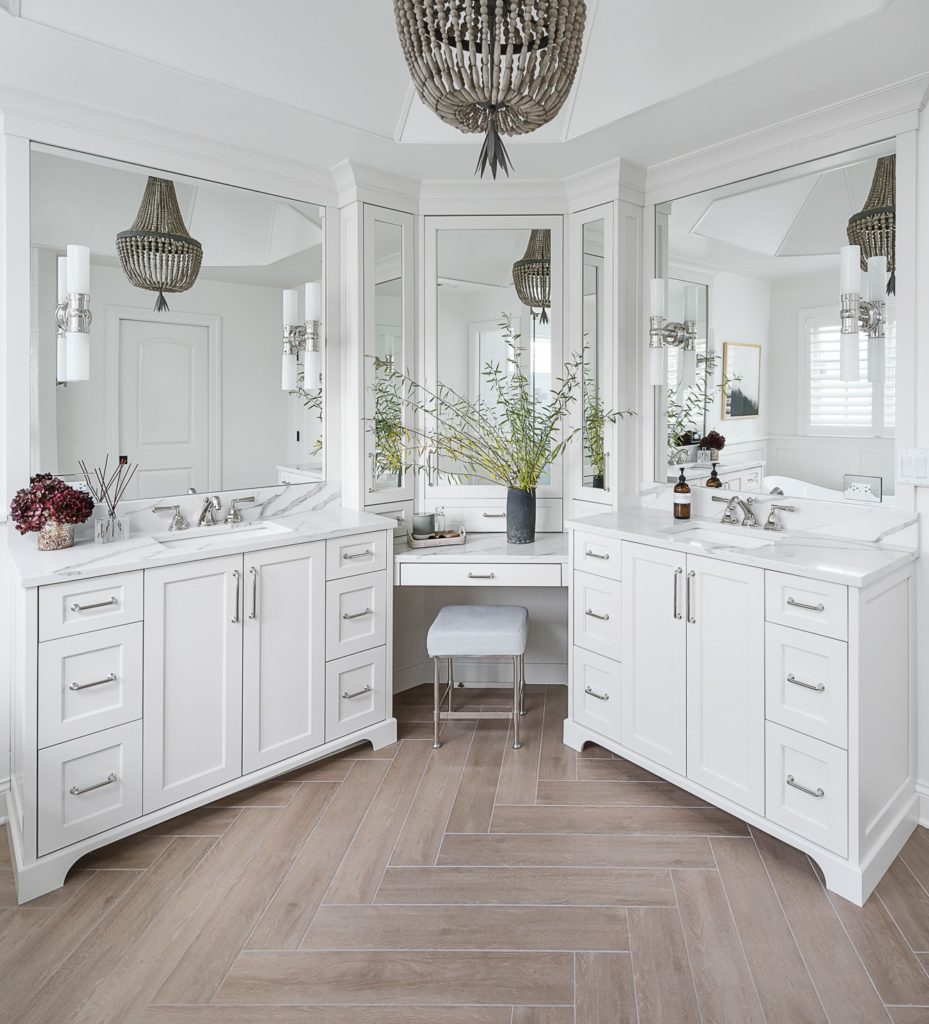
Our clients could not be more thrilled – and neither can I! It is the exact same square footage as before but now it feels huge! Even with all of the lights off – it is so bright and cheery. And check out the ceiling! With all of the arches gone, we were able to create this unique hexagon shape from which to hang this gorgeous wood bead chandelier.
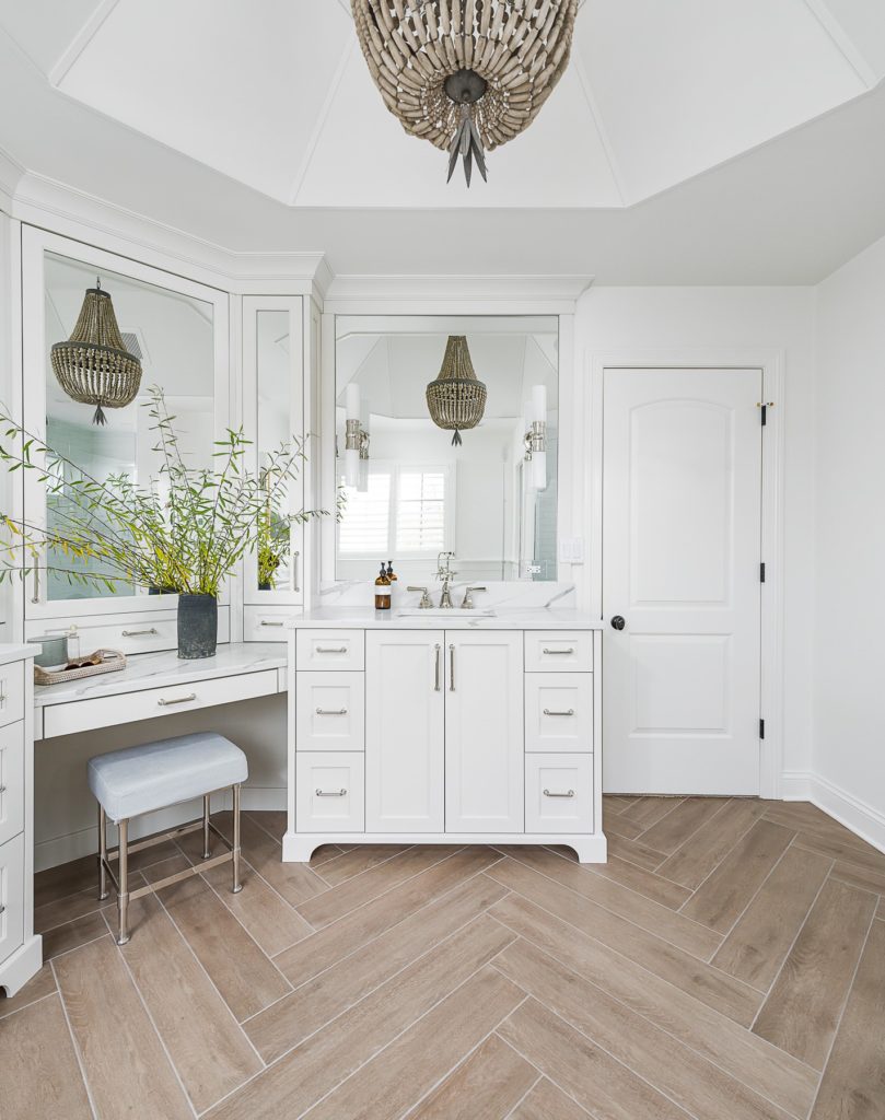
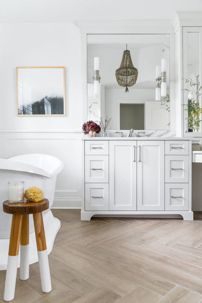
One of my preferences when doing bright white spaces is to bring in a warm element. We could have easily done a light floor – white or gray marble, and it would have been beautiful, but maybe a little cold – and certainly not as cozy feeling. When I approached my client about doing a wood-look tile in a herringbone pattern for the floors – (especially since the adjoining bedroom is carpeted … we wouldn’t be competing with more wood), I wasn’t sure if she would be on board. Thankfully, she loved the idea of giving the room a slightly more rustic, farmhouse element.
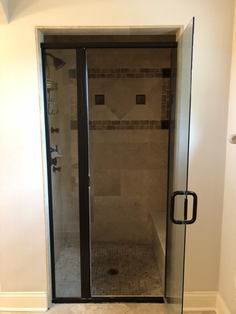
To refresh your memory – here was the old shower …
And the new …
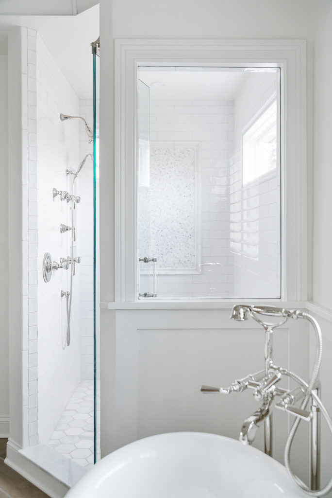
The entrance is now on an angle and a high window was added inside to bring in light. Another large window was added facing the tub to allow you to see through to the gorgeous mosaic tile on the back wall.
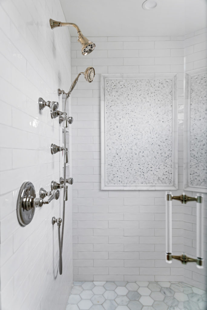
In addition to the sparkle the mosaics add, we dressed up a classic white subway tile with beautiful marble hex tile on the shower floor, gleaming polished nickel fixtures and a stunning lucite door handle.
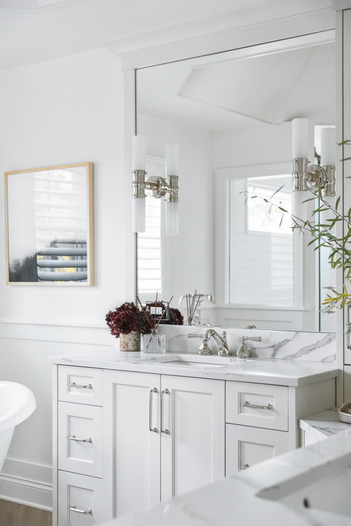
I have been dying to find just the right project in which to use these vertical double light sconces, and I knew this was the one. As big as they are, they don’t take up much visual space when mounted to the mirror, yet they still make such a statement in the room.
And … just the right quartz counter tops are still a win-win in my book, for both their beauty and durability. This one has such great movement and even some soft brown tones that tie in with the flooring.
Remember the old bathtub?
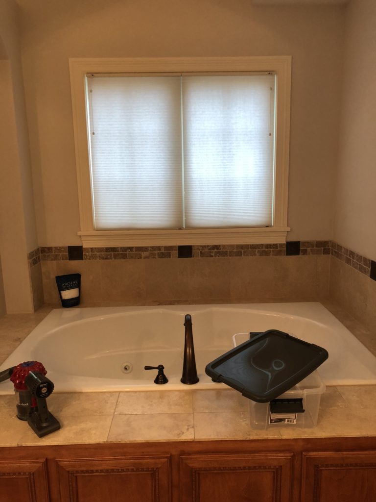
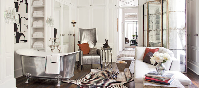
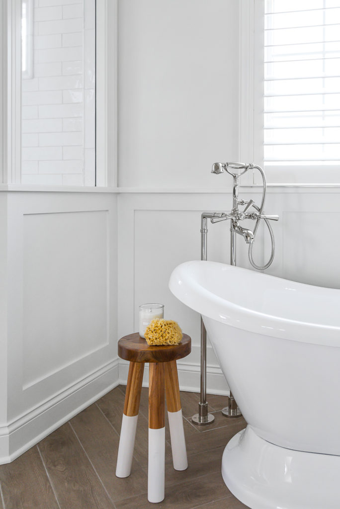
In it’s place is a curvy soaking tub with a gorgeous free-standing tub filler.

What used to be one straight vanity and a big empty wall …

… is now a beautifully designed double vanity that wraps the corner with mirrors and provides and extra spot with seating for putting on makeup.
What do you think? The perfect place to relax after the Thanksgiving guests leave – am I right? Stay tuned for Part Two of our transformation featuring the laundry and powder rooms!
Photography by Picture Perfect House.

