• Home
  • Portfolio
  • About
  • Blog
  • Services
  • Clients
  • Contact

Swoon Interiors

interiors that make your heart skip a beat.

Patience Makes Perfect: Part One

November 7, 2022

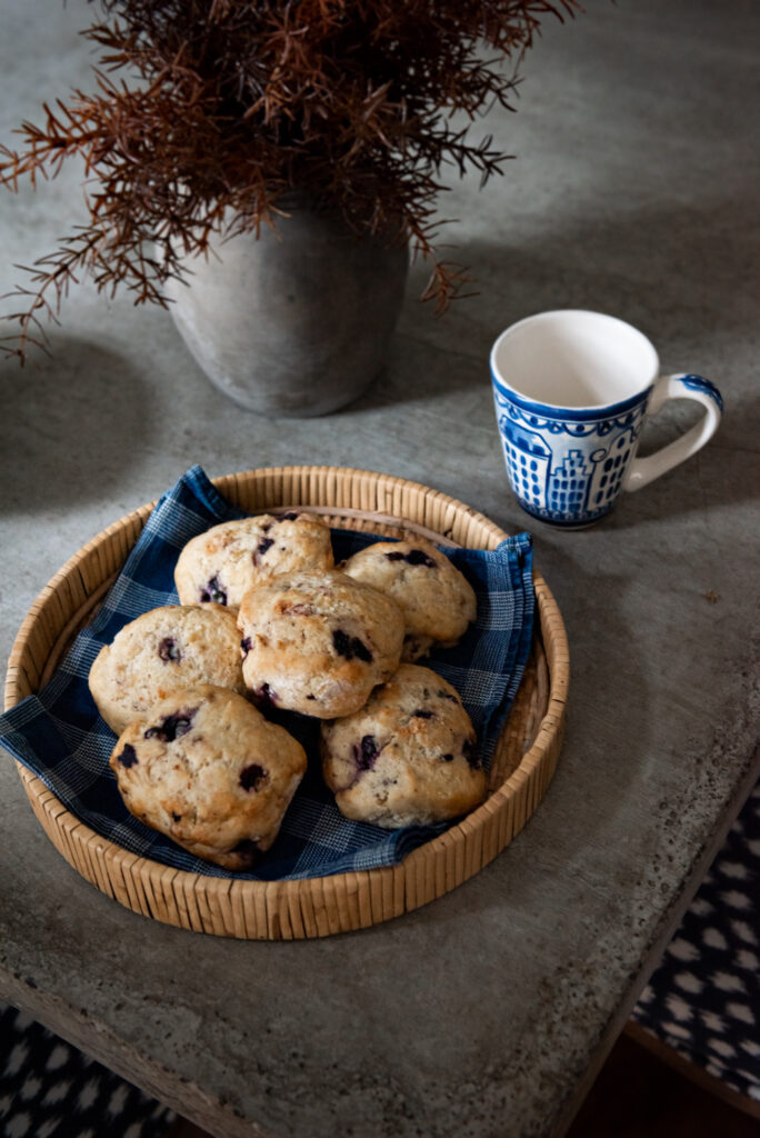
A beautiful transformation years in the making …

I am so excited to share photographs of this project with you today. I first started working with this client exactly five years ago. When we first met, she walked me through the house they had built 20 years ago. It was a beautiful traditional home on a grand scale filled with lot of antiques and furniture they had invested in. As in so many homes built and decorated at that time, there was lots of red and gold, formal custom draperies, honey oak floors and overstuffed upholstered furniture.

She explained to me that they wanted to start updating things. But in a house of this scale, they knew it would not be an overnight process. They weren’t interested in “quick fixes” and changes. She wanted to take time to make the right selections, save for pieces she really wanted, invest in custom pieces, sell many of the investment pieces she had collected but no longer fit her style, and have fun in the process.

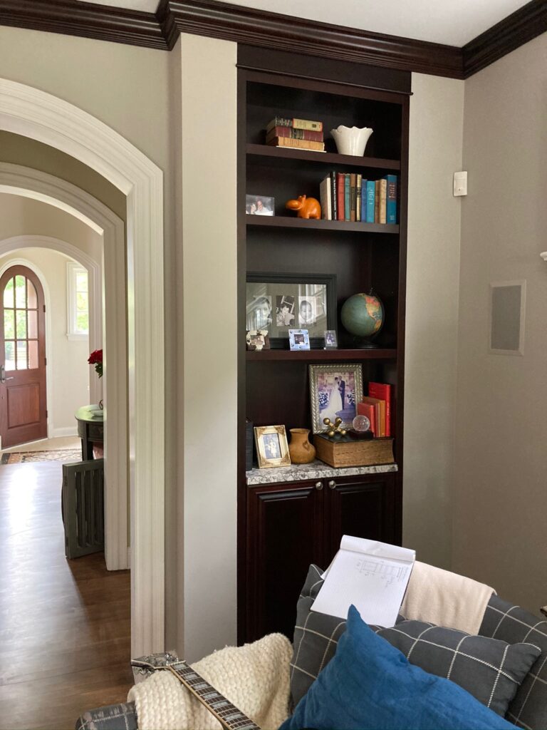
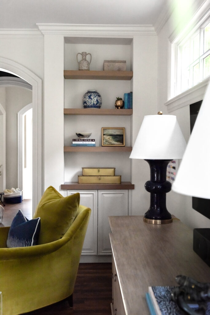
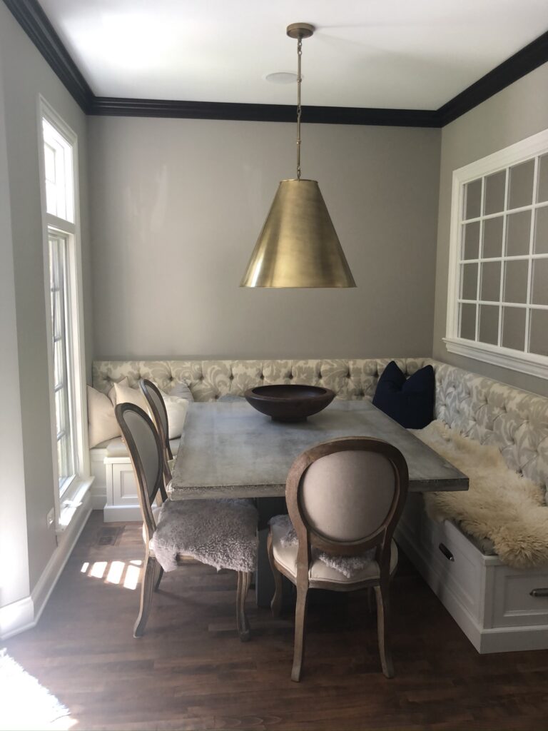
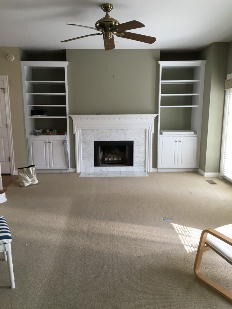
I am kicking myself that I did not take more “Before” pictures – but at the time, it didn’t feel like a typical Before & After project. We were on a journey and the destination seemed far off. Throw in a worldwide pandemic and the resulting product and shipping delays, and the years stretched on.

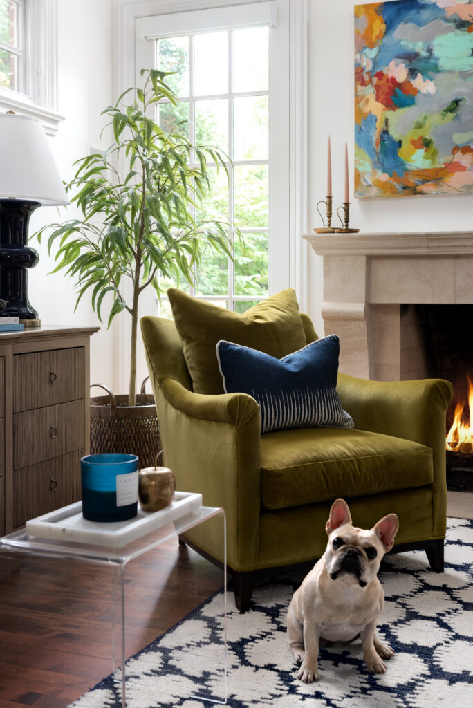
My client is also an avid art collector – and she had already purchased quite a few pieces she had fallen in love with. Many were abstracts, modern, light and airy with bold and fun colors. These certainly didn’t fit in with the traditional Red, Gold, French Country vibe of the rest of the house, but they became a jumping off point for our overall vision.

So floors were refinished, walls were painted shades of white, things started to be sold on Chairish, we decided what pieces could be incorporated into the new design (I still love a mix of vintage and modern) and started searching for the perfect … sofas, tables, lamps, rugs, nightstands, bedding … each and every item was very thoughtfully selected.

Of course, paint and furniture can only take you so far … what about an outdated kitchen? Well, of course, we brought my favorite kitchen designer, Stephanie Frees of Plain & Posh in for that!

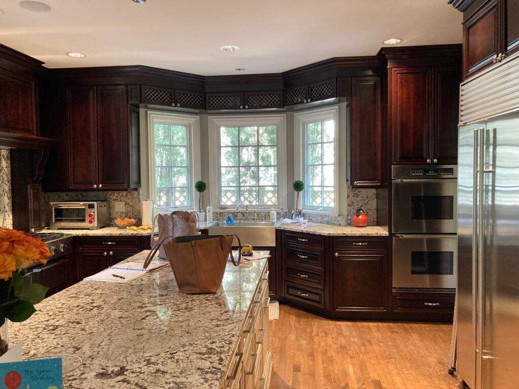
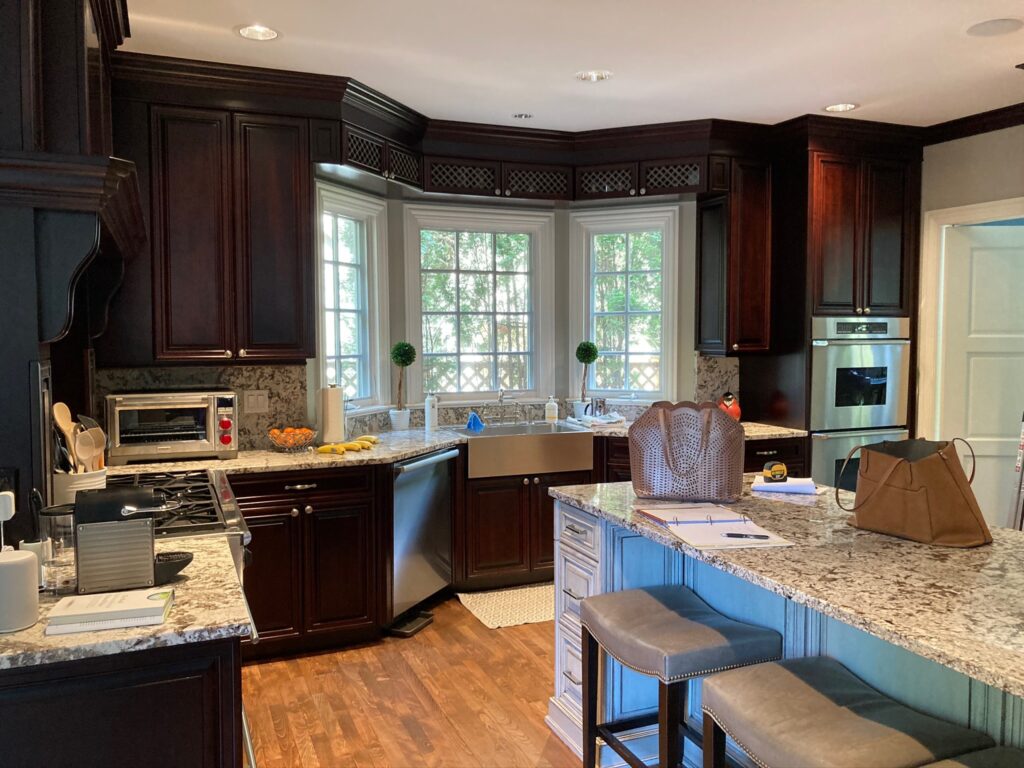
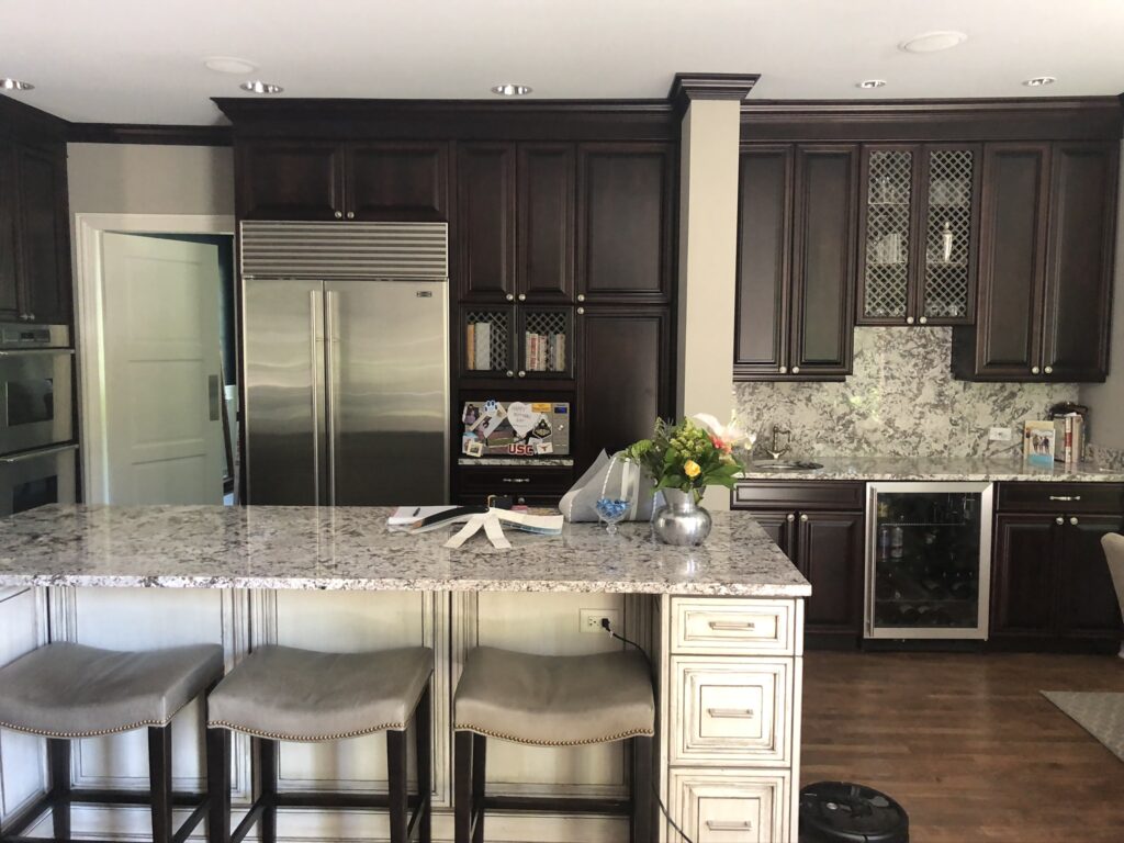
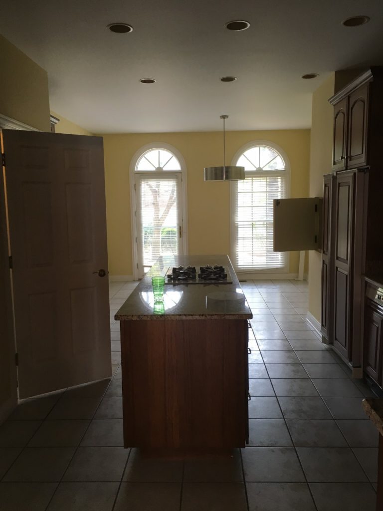
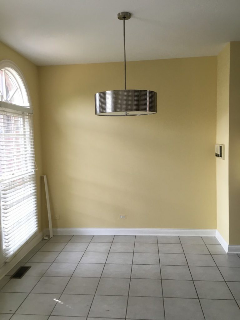
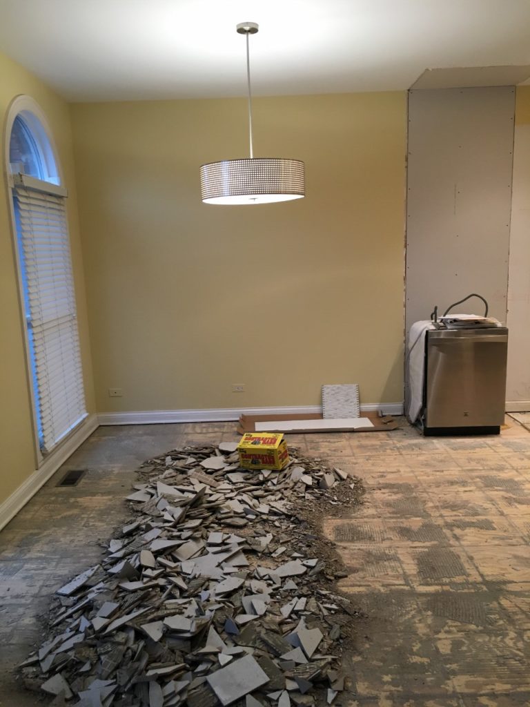
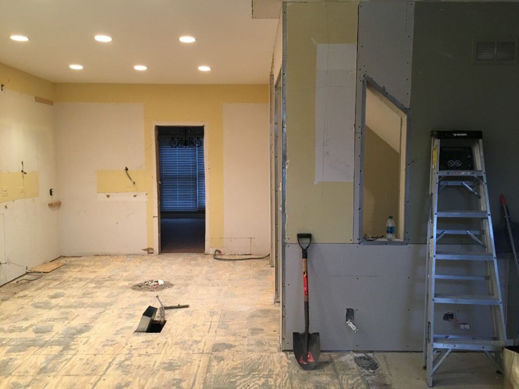
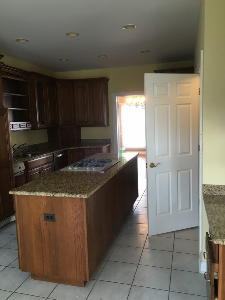
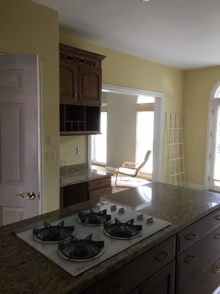
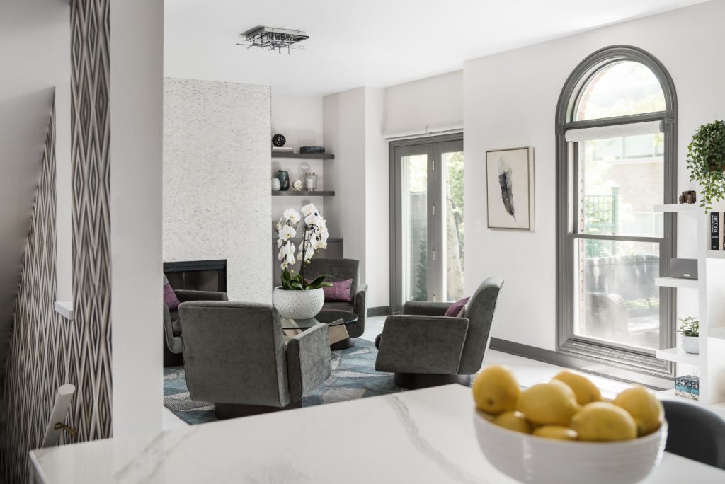
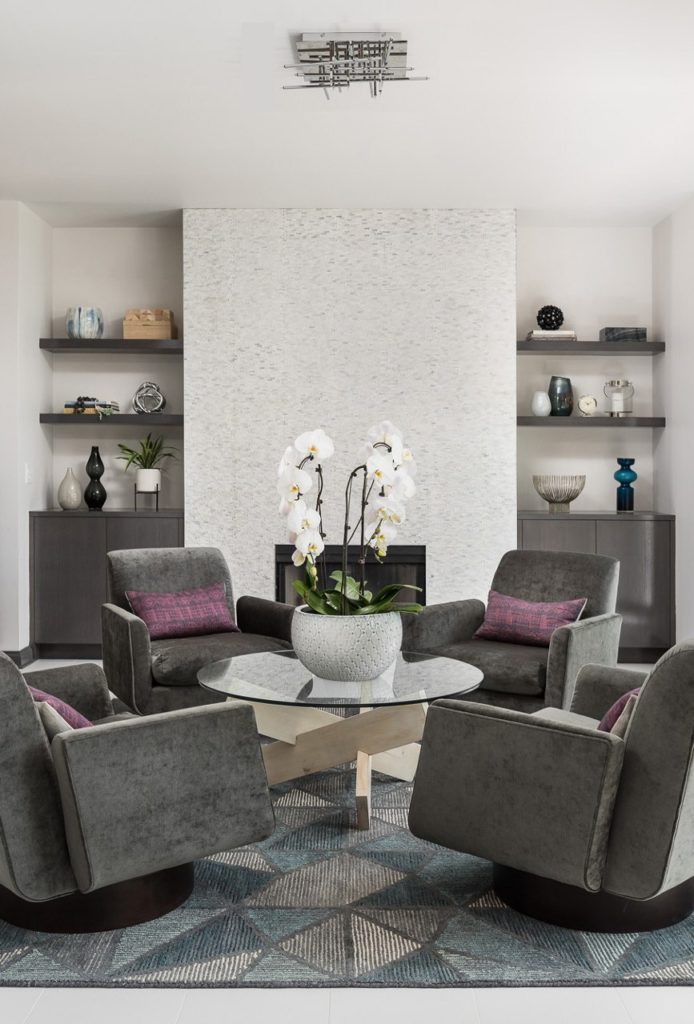
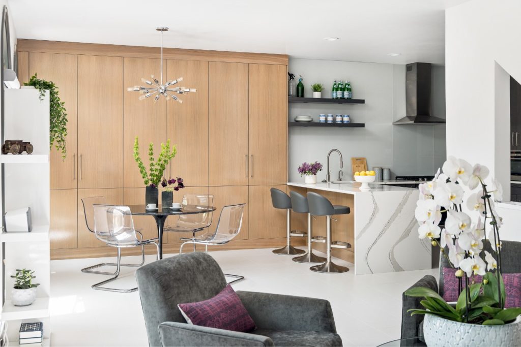
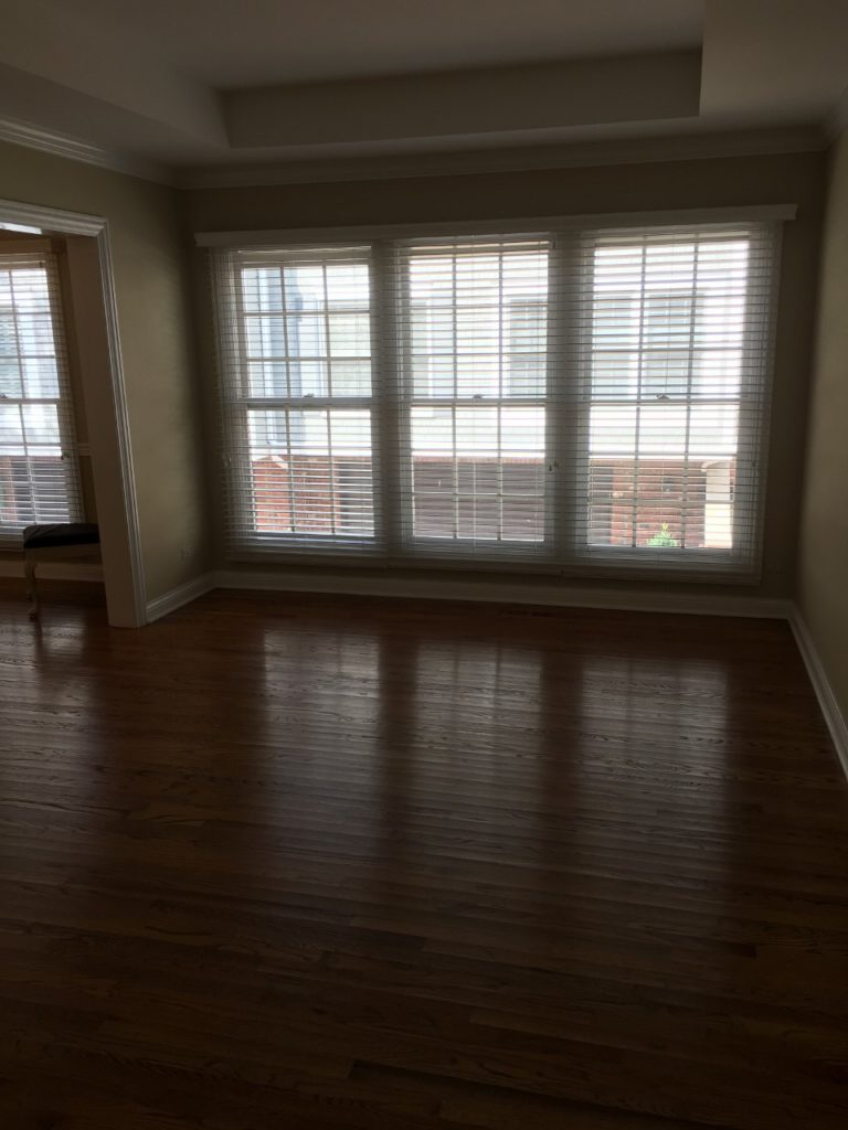
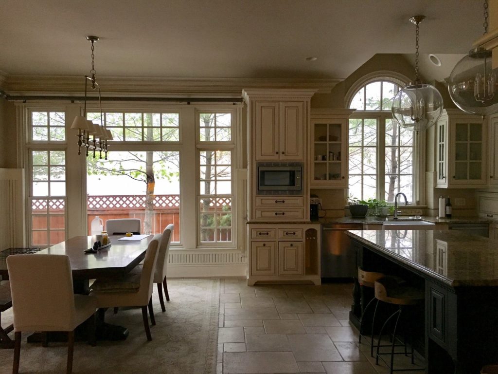
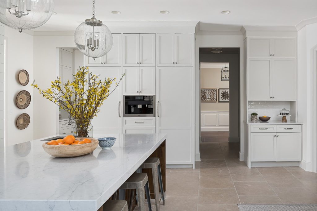
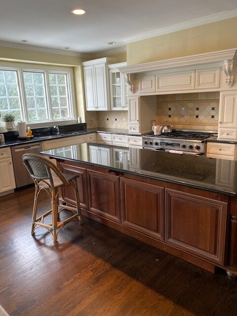
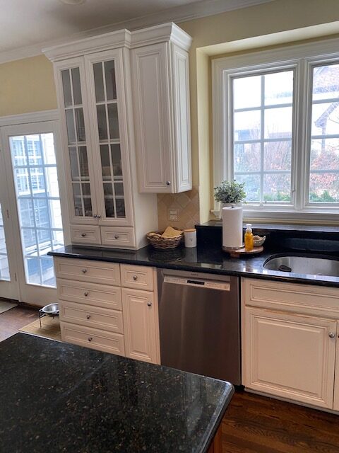
And so that is where I will start with the photographs. I am going to break this up into three posts of my three favorite rooms. Part One today is the Kitchen. We did take photos right before demo started and this is what it looked like.

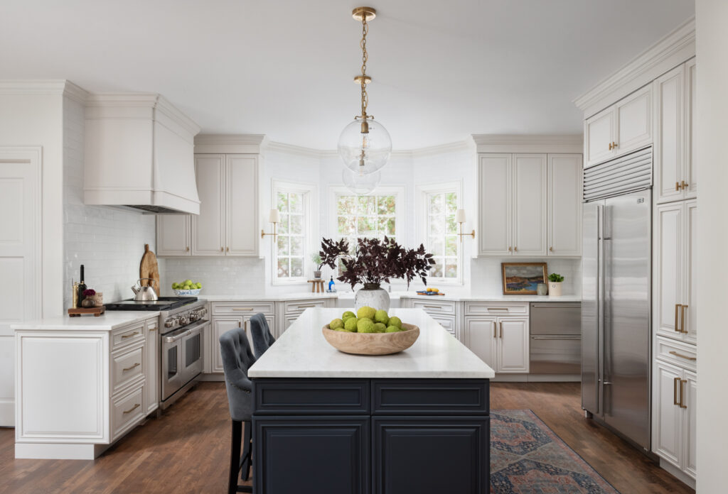
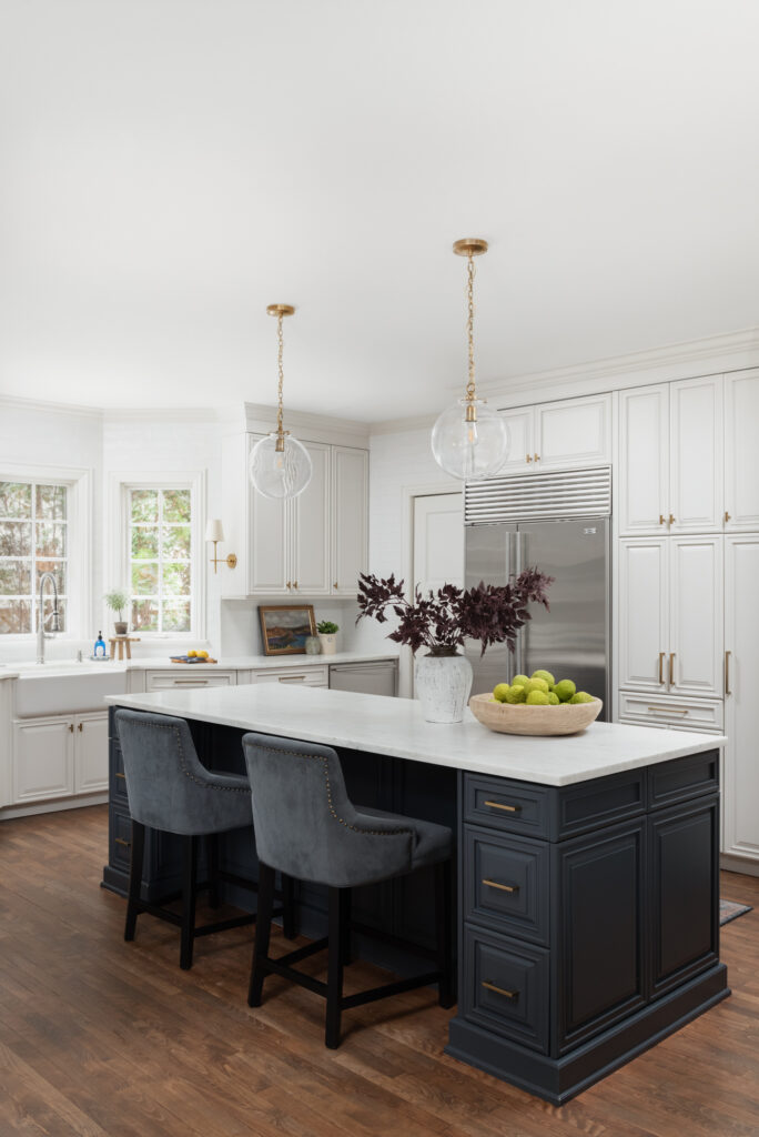
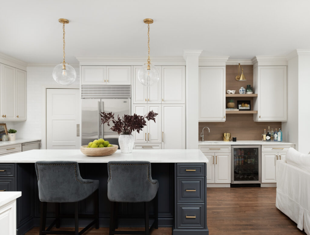
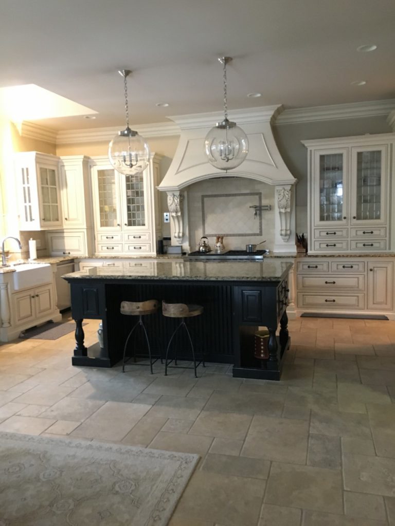
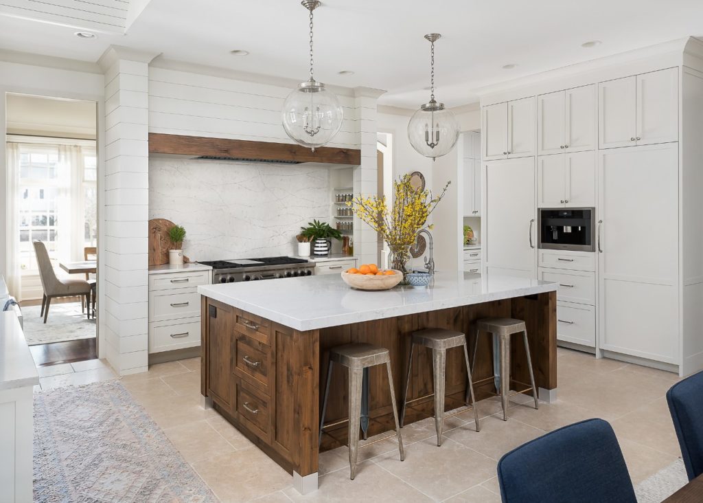
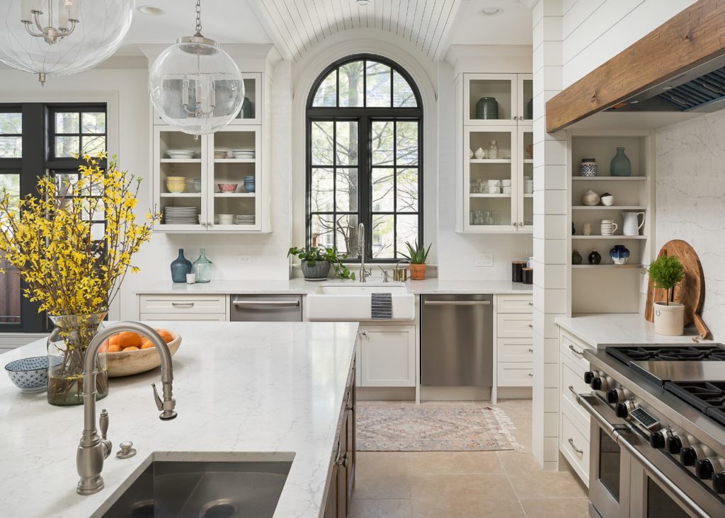
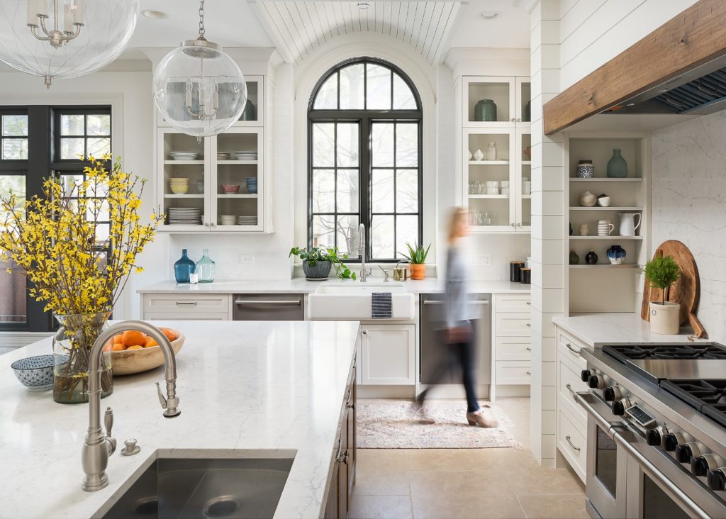
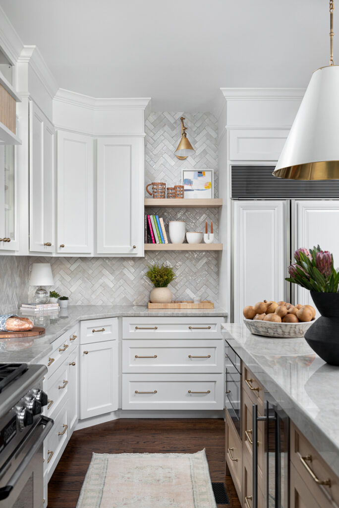
And here it is today …

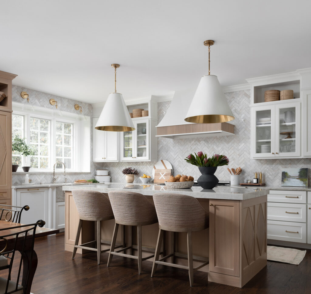
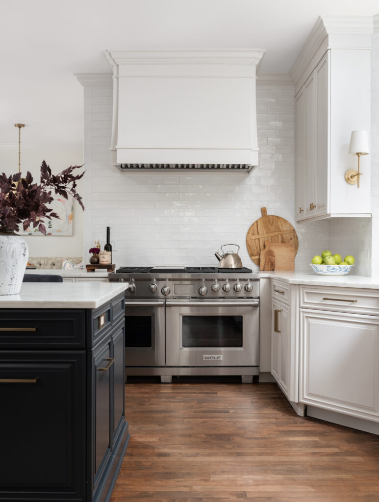
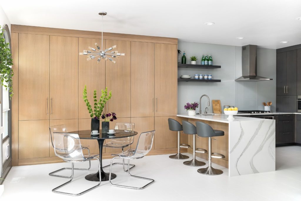
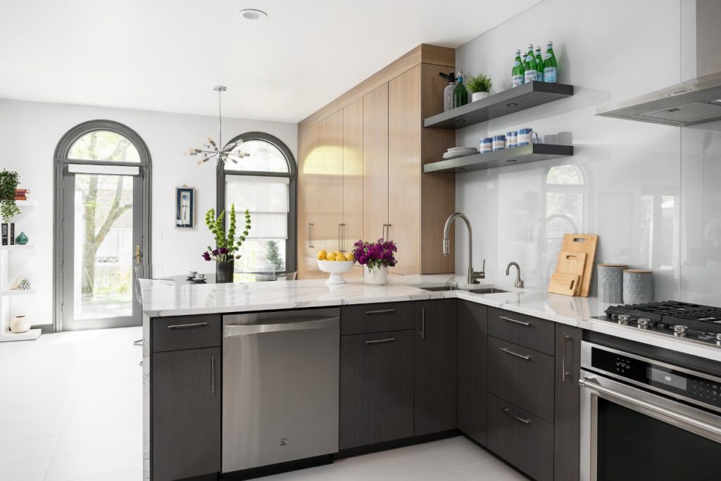
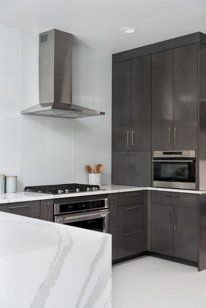
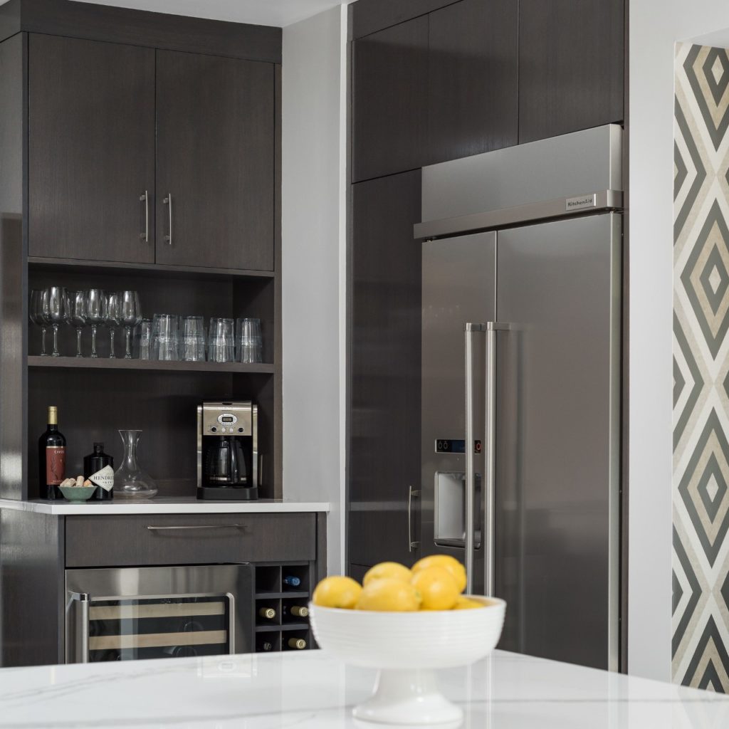
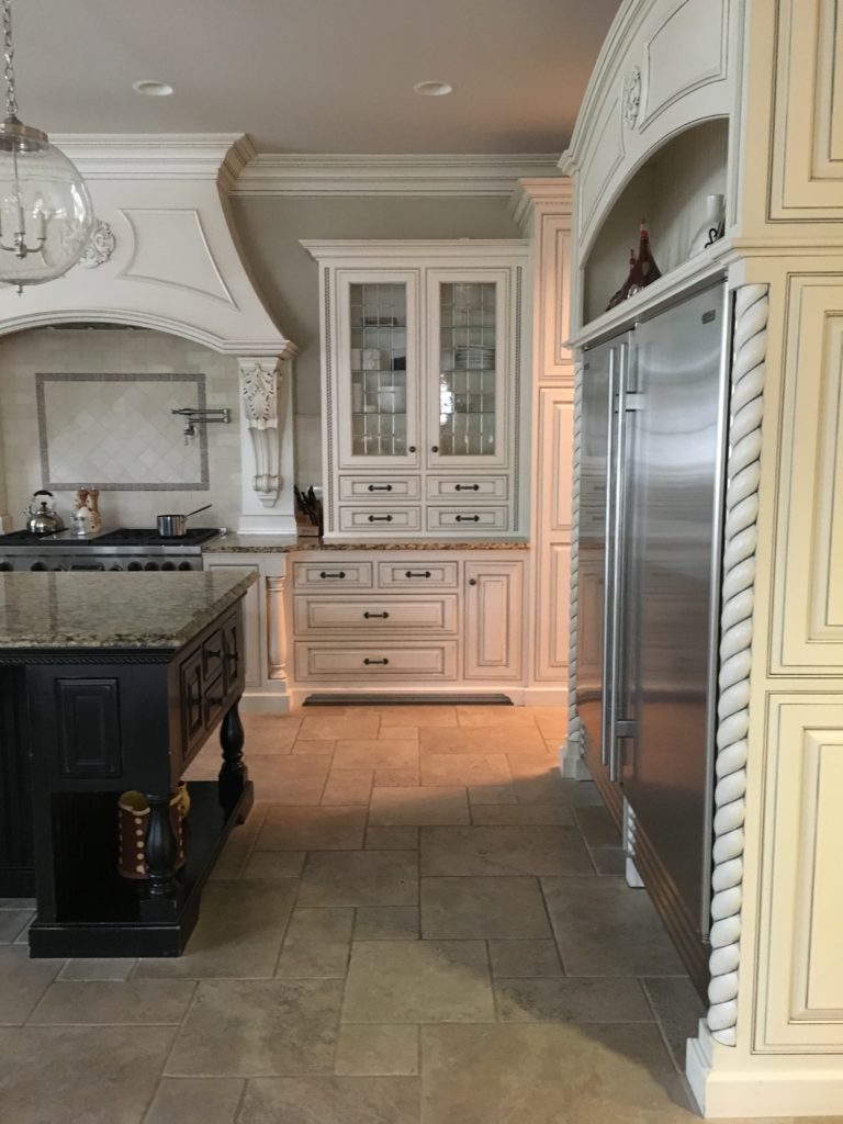
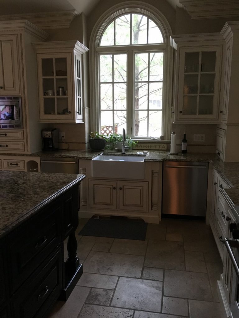
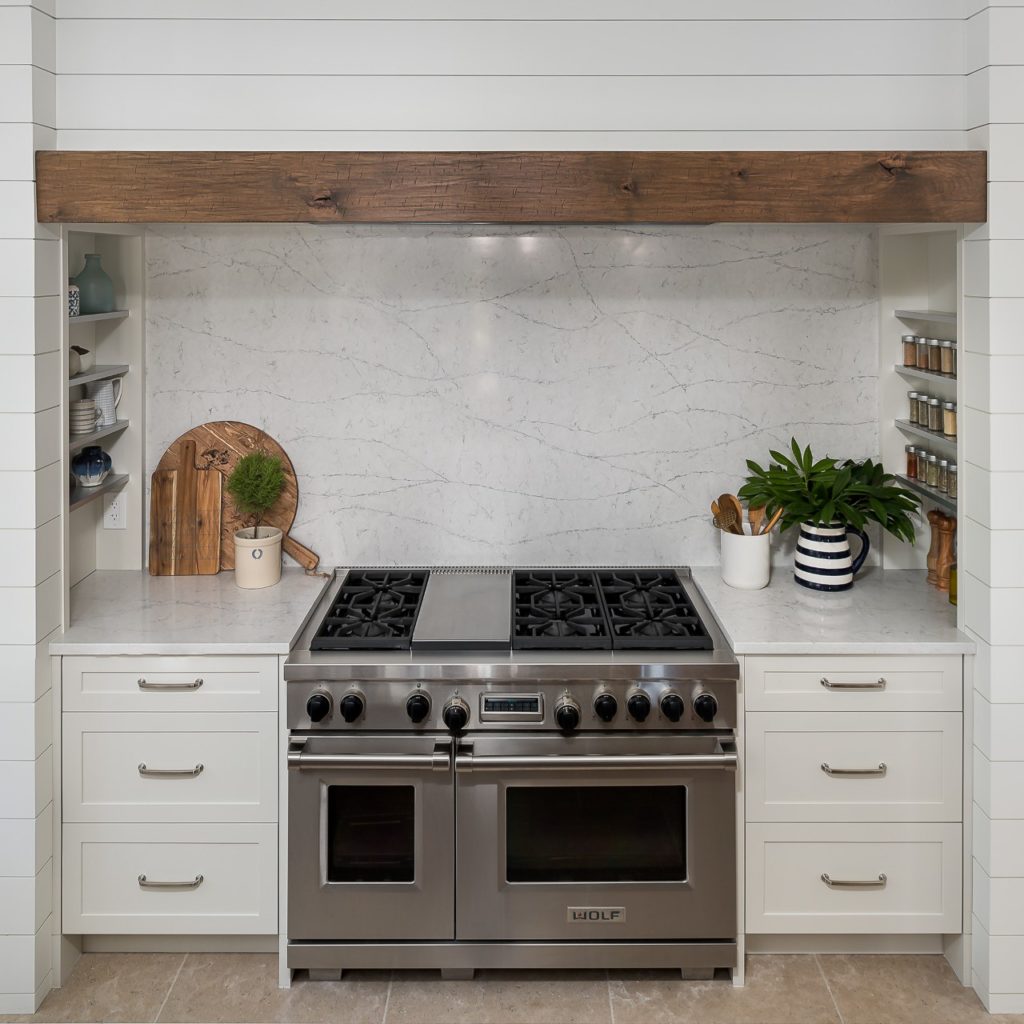
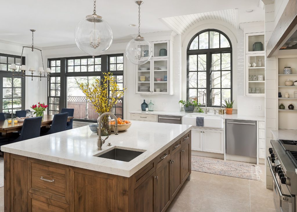
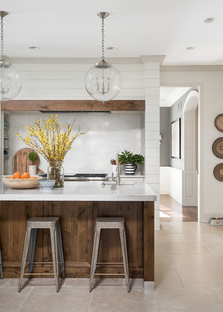
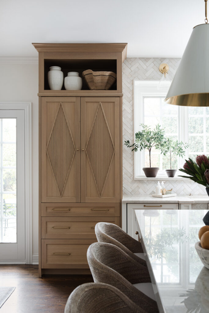
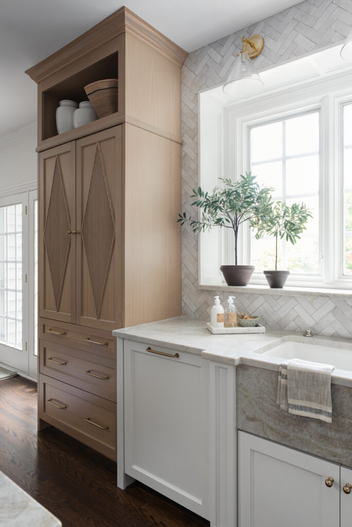
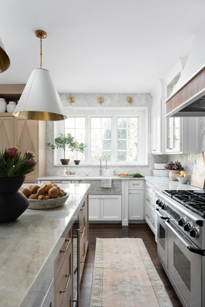
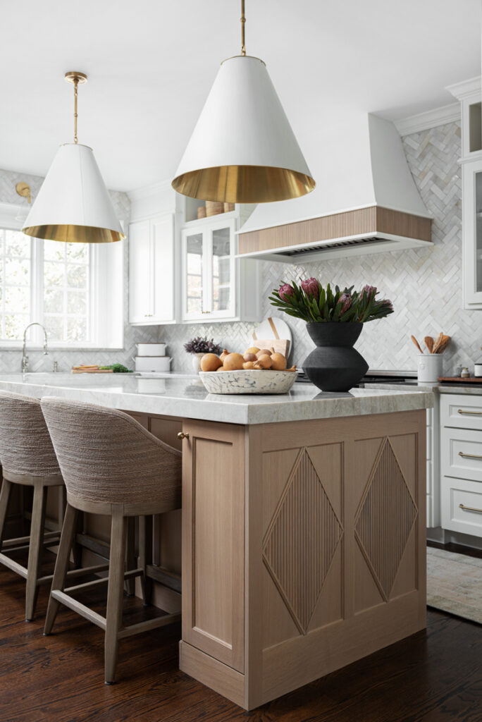
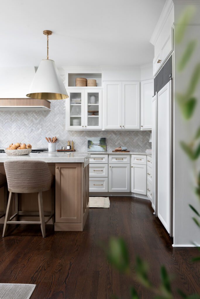
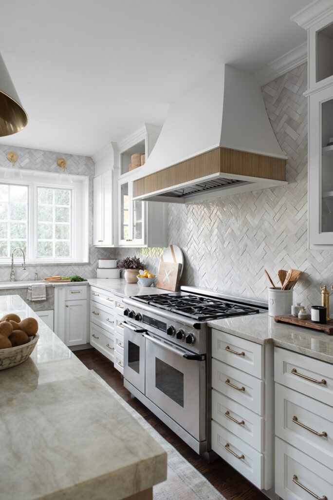
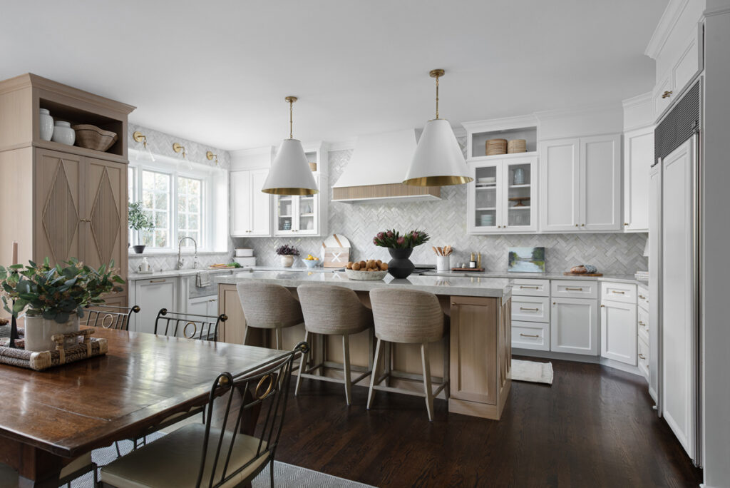
Can you believe it? And this was not a full gut remodel. The perimeter cabinetry mostly stayed but got new doors and height added at the top. The island and tall wood stained cabinet to the left of the sink are new and custom built and Stephanie hand-drew the design of the new range hood. Isn’t it gorgeous?

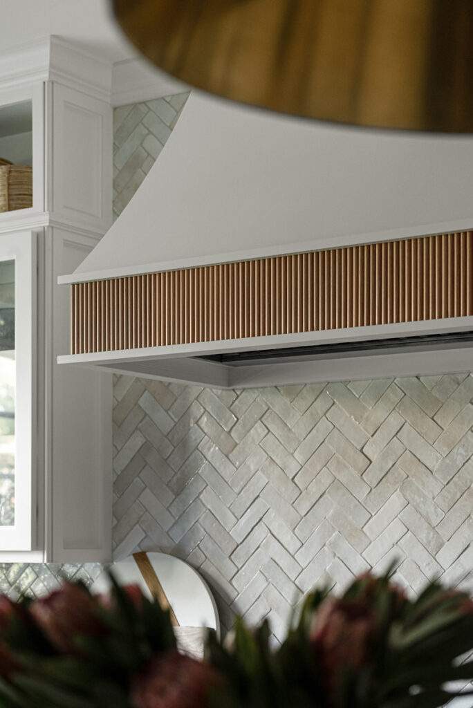
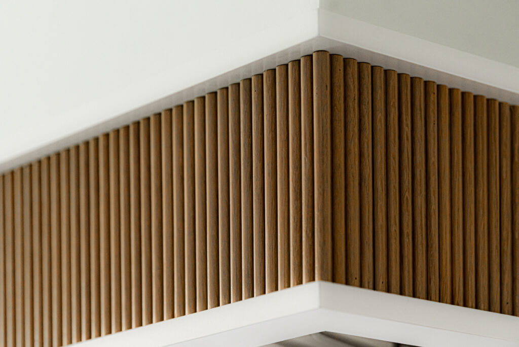
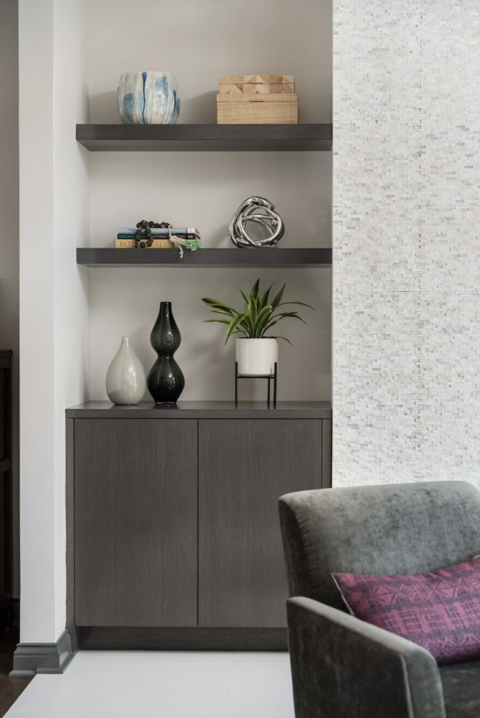
The beautiful reeded detail came from our idea to add this special element to the new island and cabinetry. Bringing it over to the hood just tied everything together, don’t you agree?

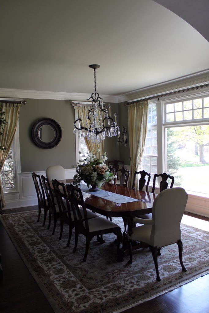
Here is that same view before …

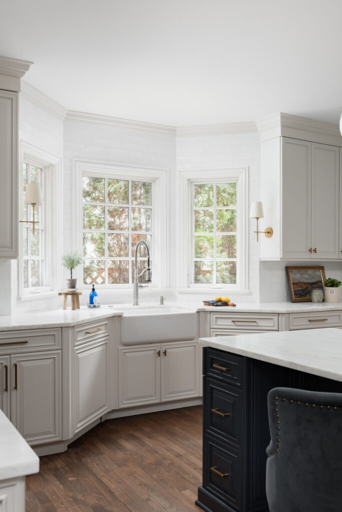
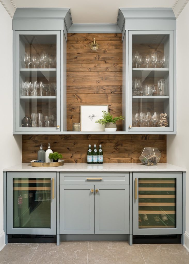
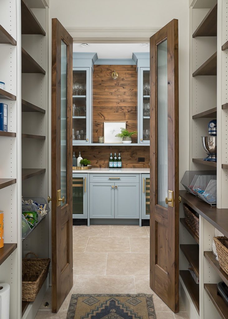
Lets talk about that sink, shall we?

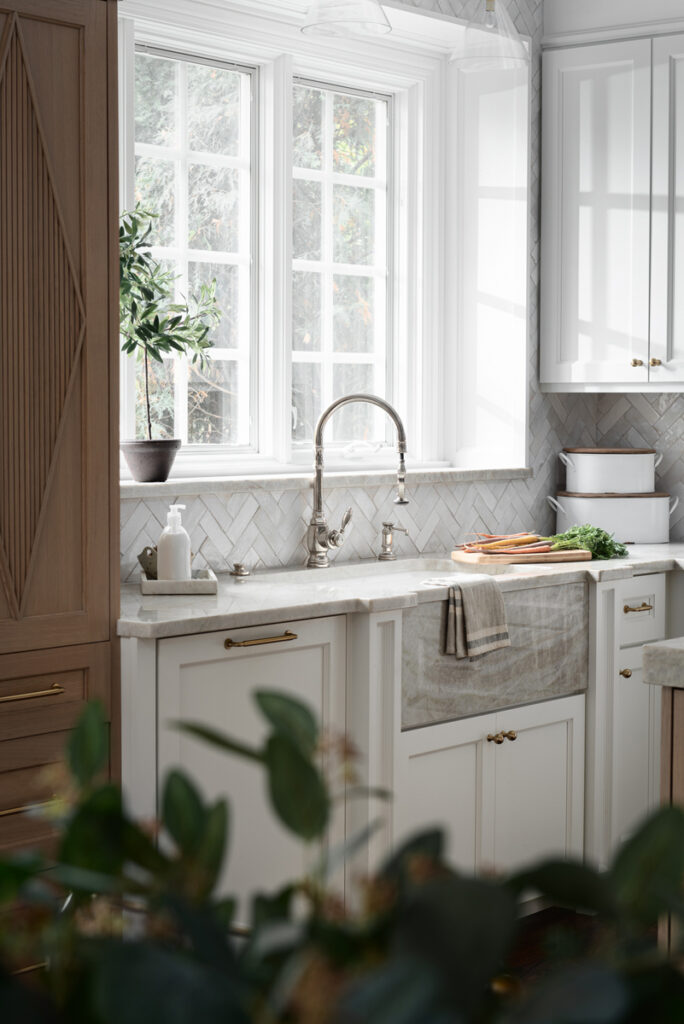
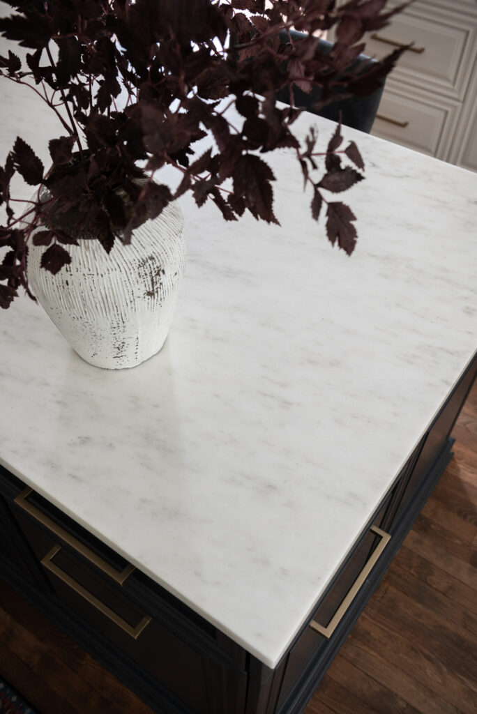
We were so in love with this stunning Quartzite we chose for the countertops we wanted to feature it further in a custom apron-front sink.

We scoured Etsy for vintage runners and this one was our favorite for pulling in colors from some of the artwork we commissioned for these spaces … such as this whimsical piece by Marissa Voytenko.

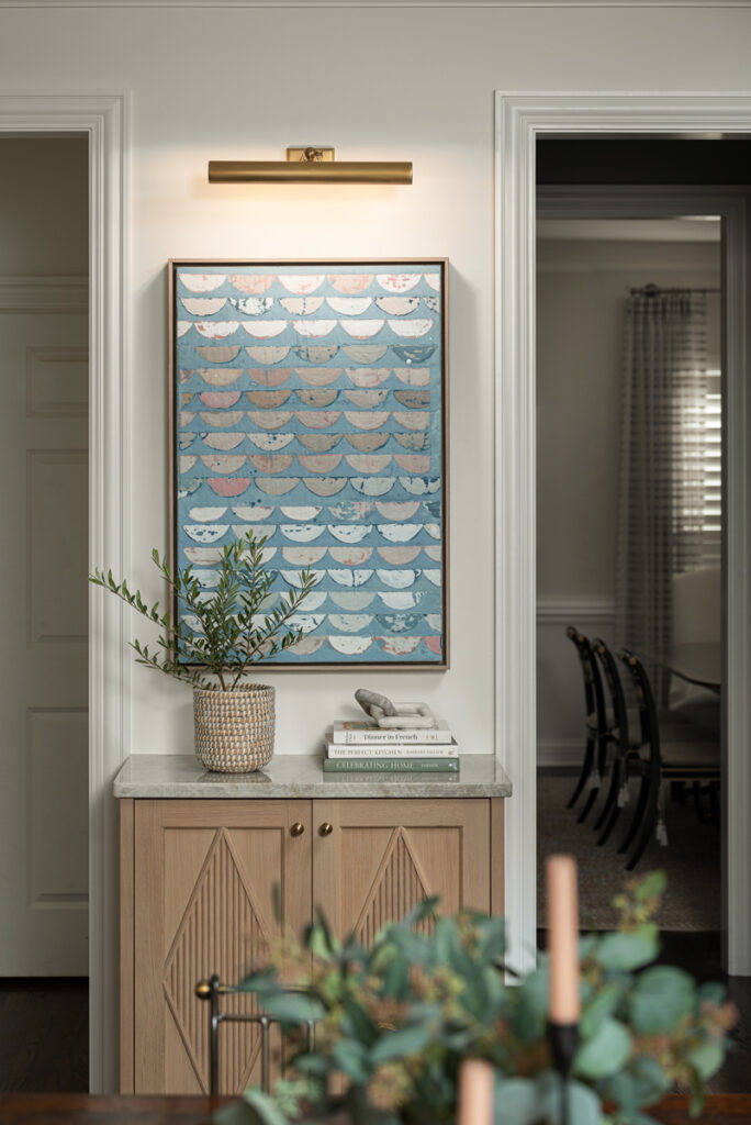
After falling in love with her work, we realized Marissa is local to the Chicago area. She graciously hand-delivered this piece to my client, saying it isn’t often she gets to see in person where her art will hang in someone’s home.

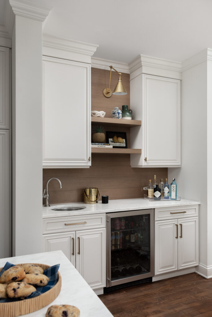
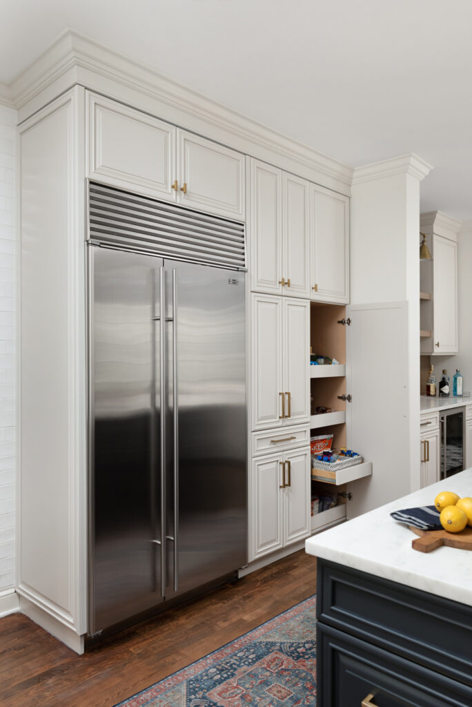
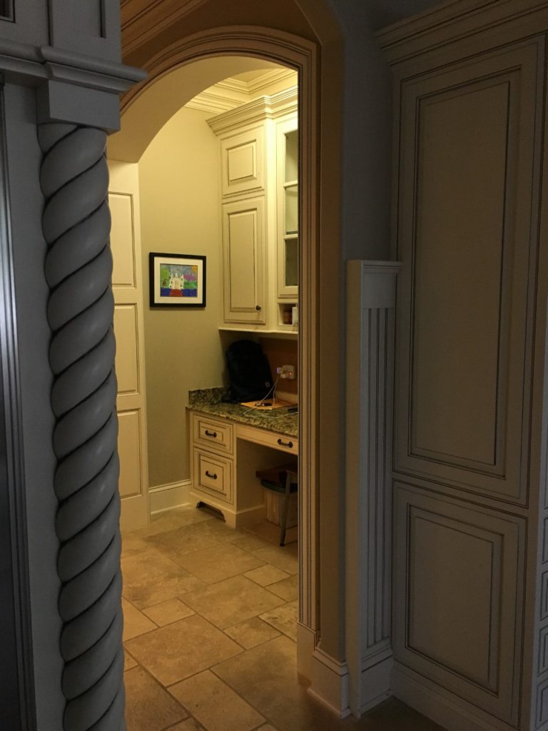
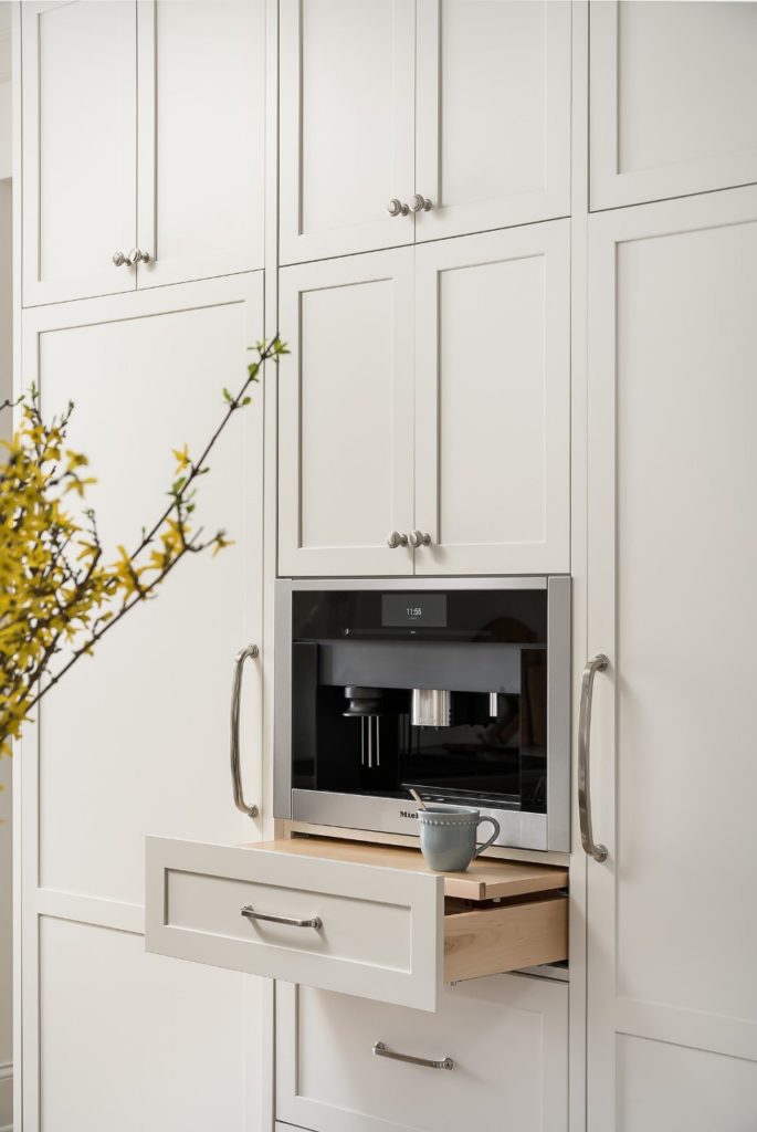
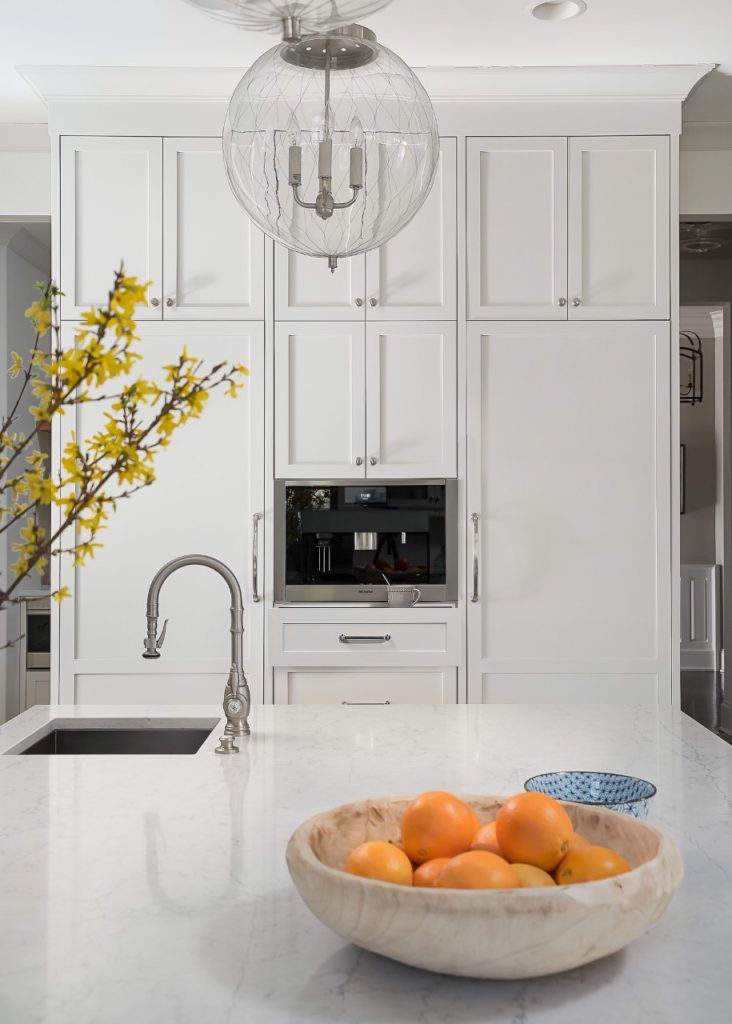
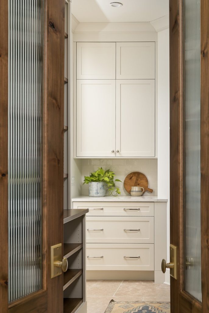
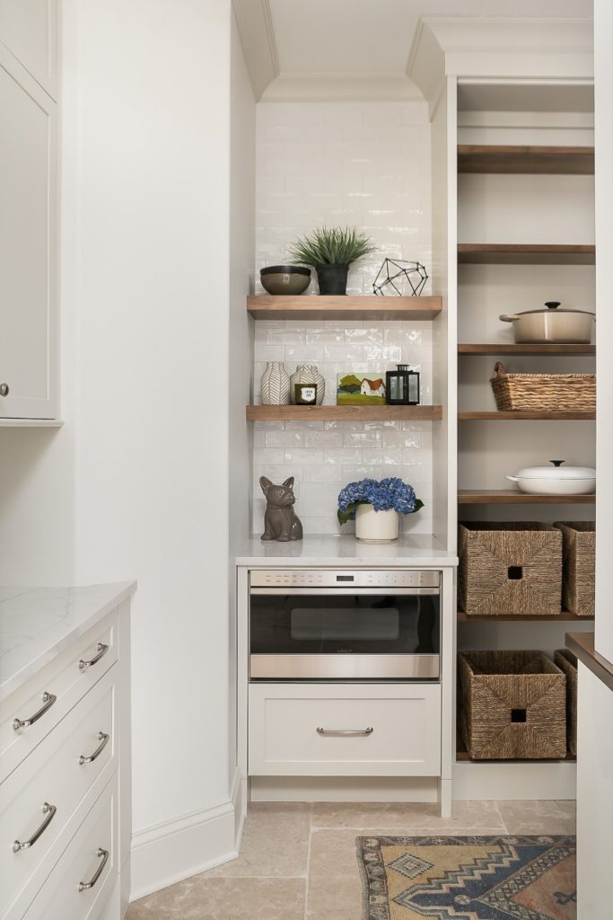
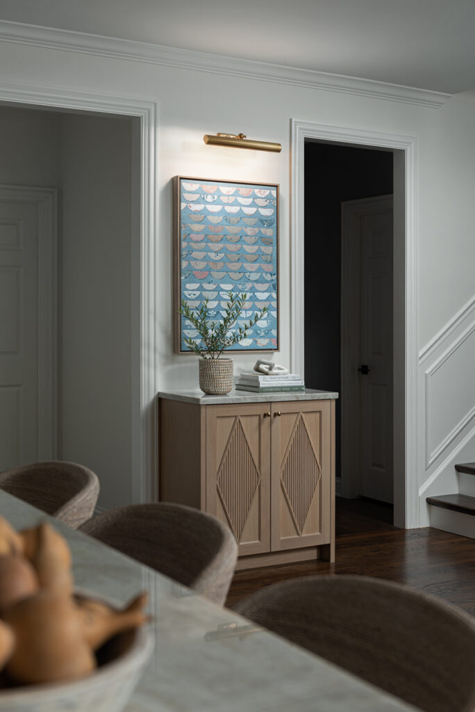
This area used to be a small desk – common in so many kitchens for many years, but no longer needed or practical in a modern kitchen.

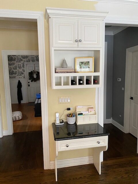
The new cabinetry by Plain & Posh is a beautiful replacement, don’t you agree?

artwork by @marissavoytenko

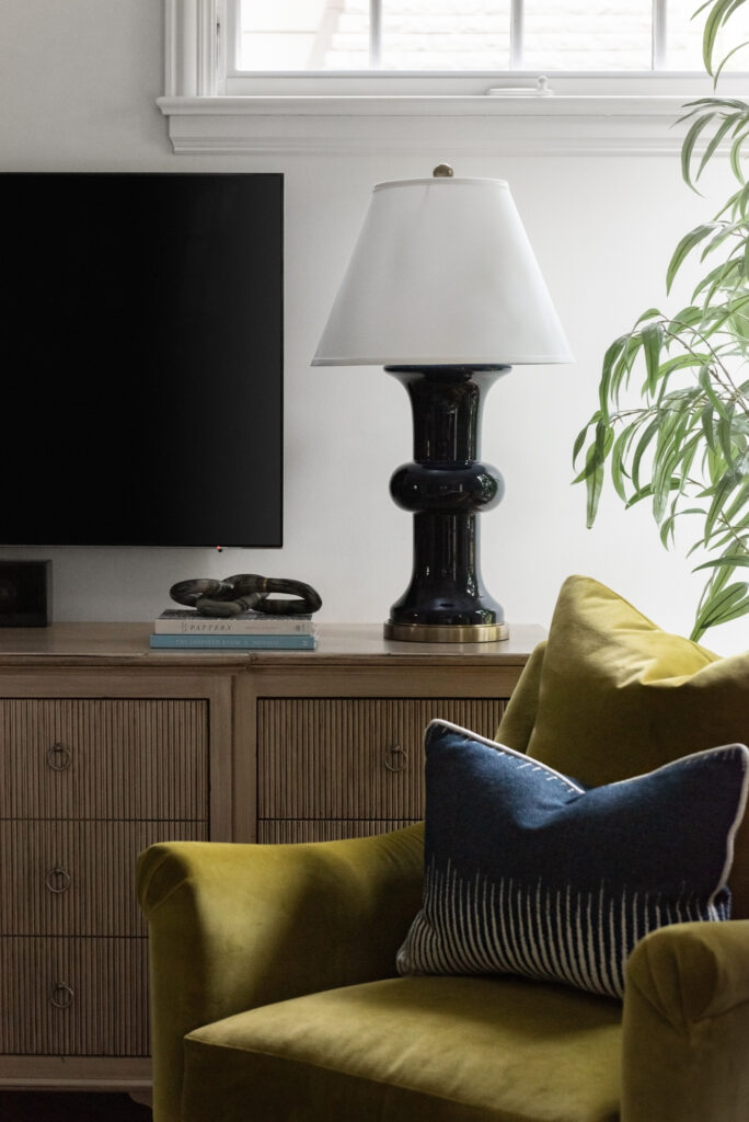
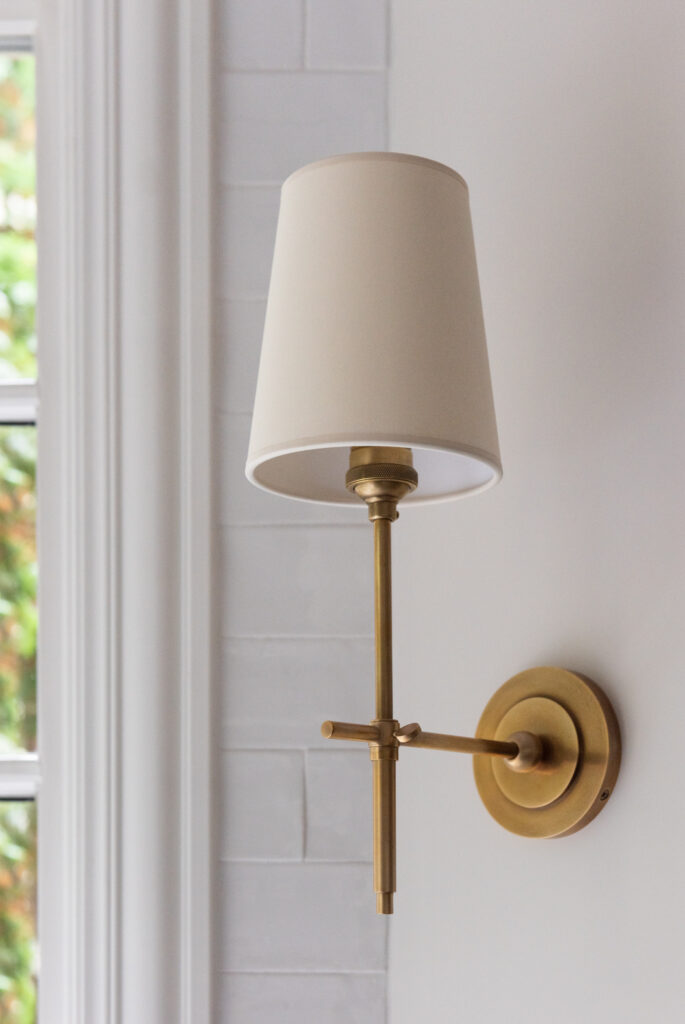
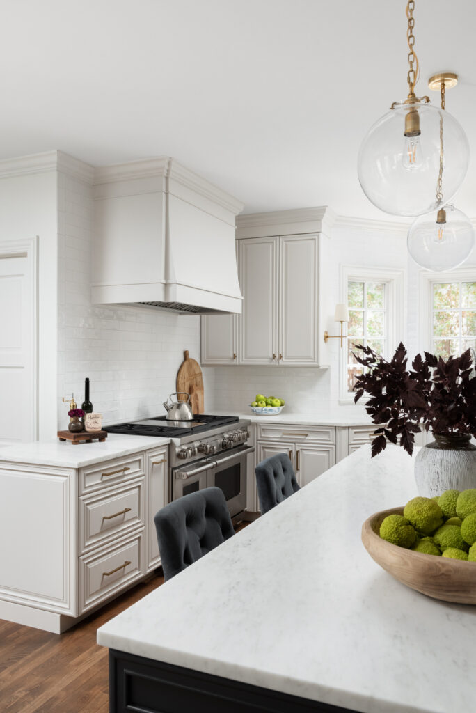
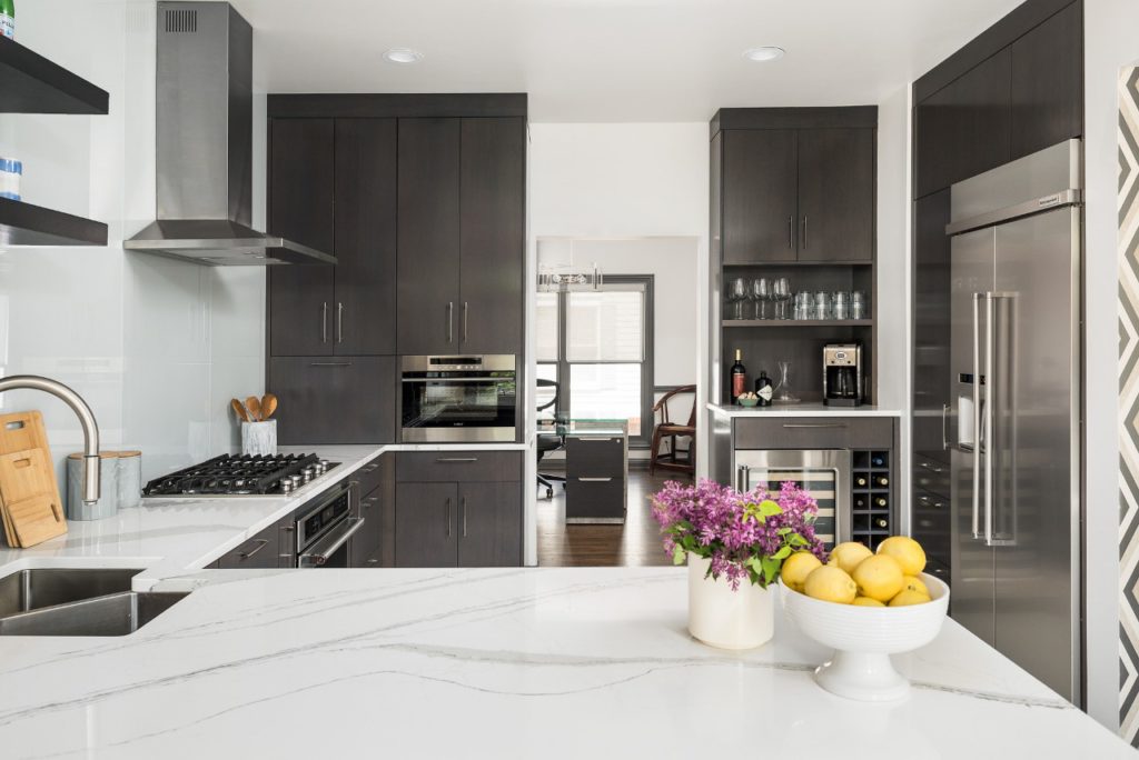
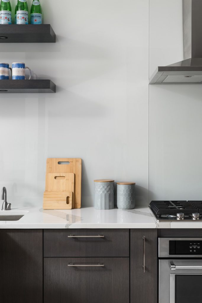
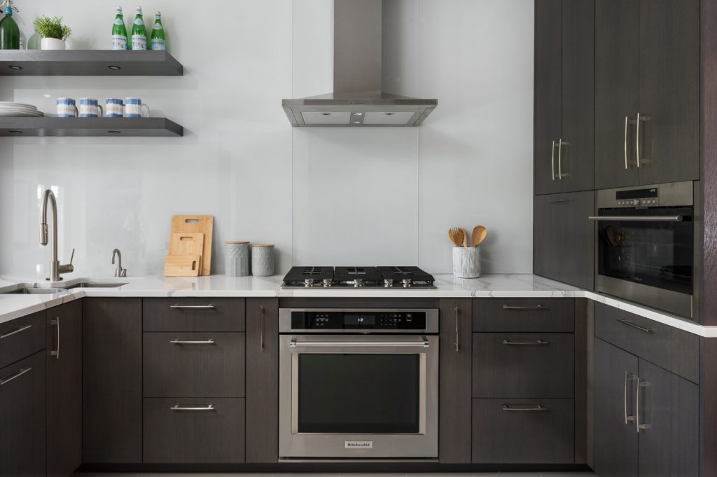
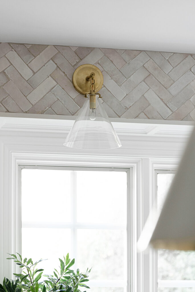
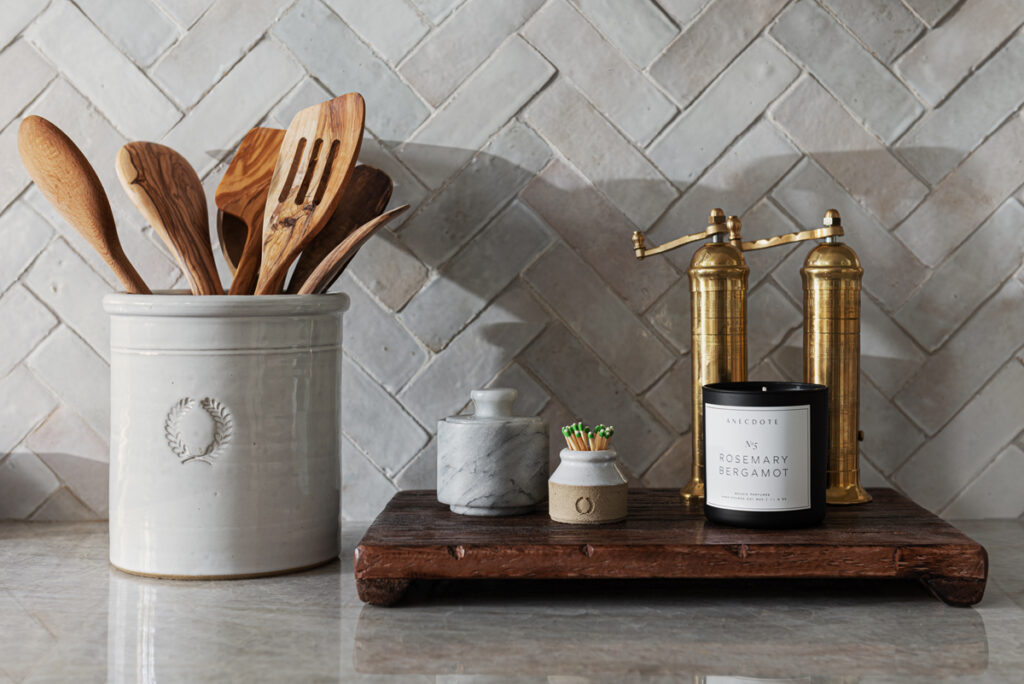
Some other special features of this kitchen – the lighting. That picture light above (a favorite), the pendants over the island and all sconces are from Circa. (I actually have those same Goodman pendants in my own kitchen – I love them so!)

artwork by Julia Rymer

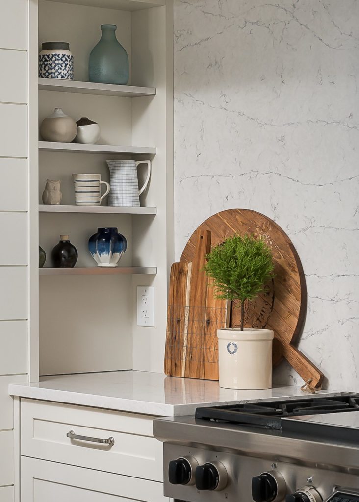
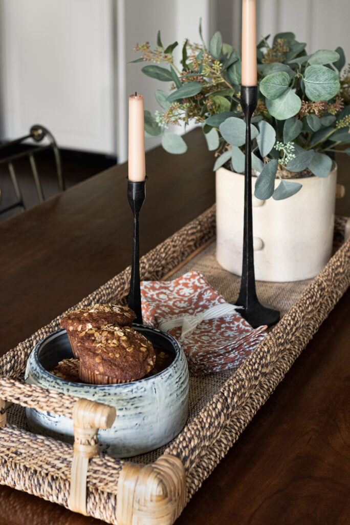
Styling this new kitchen was such a treat!

artwork by John Tee

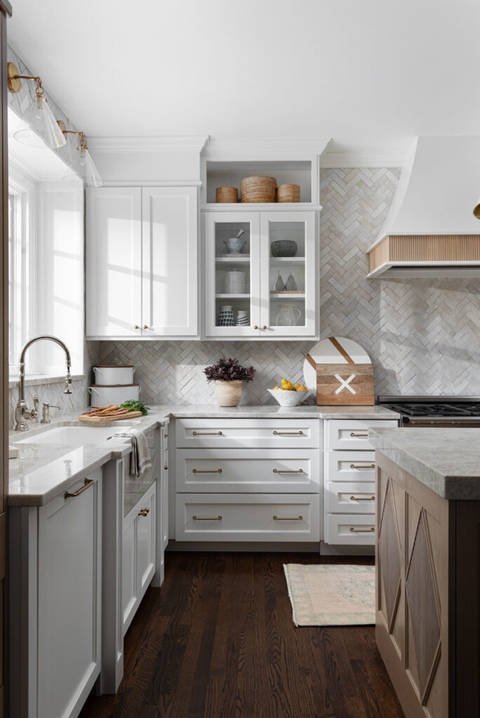
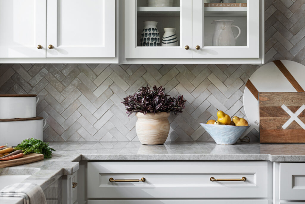
Of course, I must talk about this backsplash! There were so many times in the design of this house that my client and I could almost agree on things telepathically. We were both in love with the look of Zellige tile and it seemed that all of our favorite kitchens we had Pinned or saved pictures of used Zellige tiles … so it was just one of those … “Well obviously we are going to do Zellige!” moments.

Zellige Tile is a variety of glazed terracotta tile originally handmade in Morocco. It is kiln-fired over olive-branches, giving each tile a unique glaze, color and texture. No two tiles are exactly alike, so every application ends up being a unique tapestry of color and texture.

Once again, rather than make a quick decision, we got samples from a few different companies. And then, because there is inherently so much color variation, we ordered more samples over time to get an overall feel for the variation. Ultimately, we chose Clé Tile’s Zellige in Weathered White.

Installation of this tile, especially in the herringbone pattern we wanted, is not for the faint of heart! It took 5 days of labor and many hours of going through boxes to mix the colors. But definitely worth it!

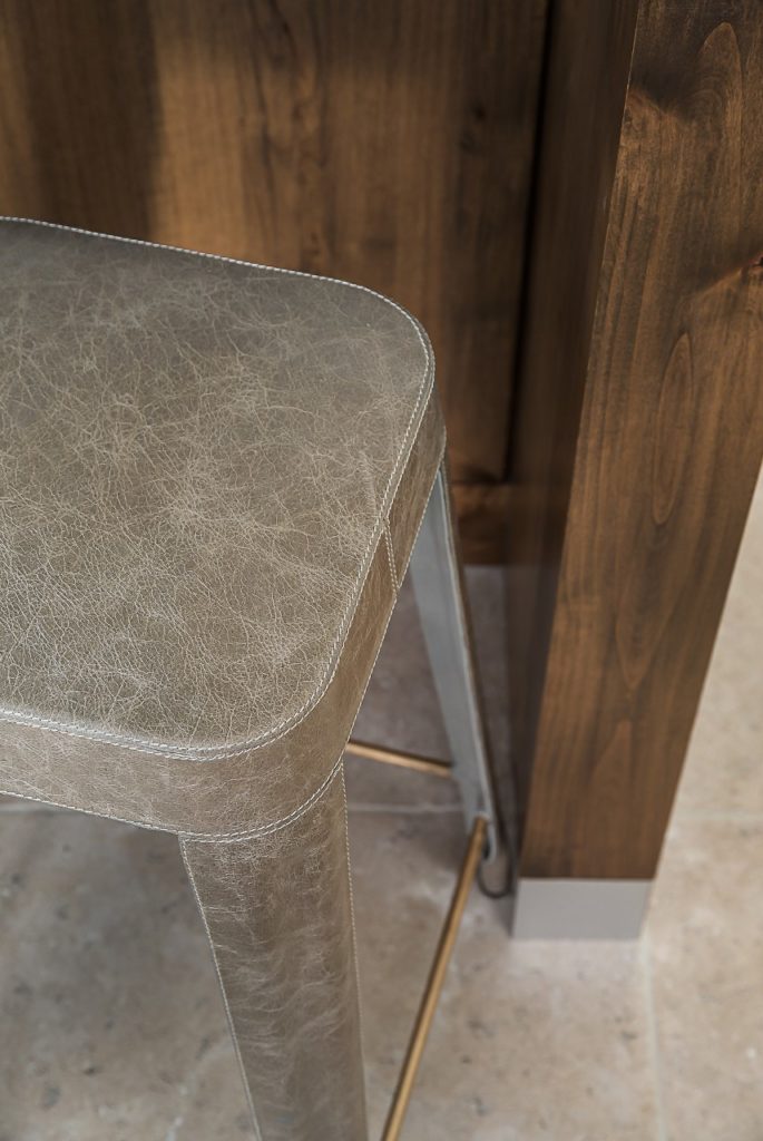
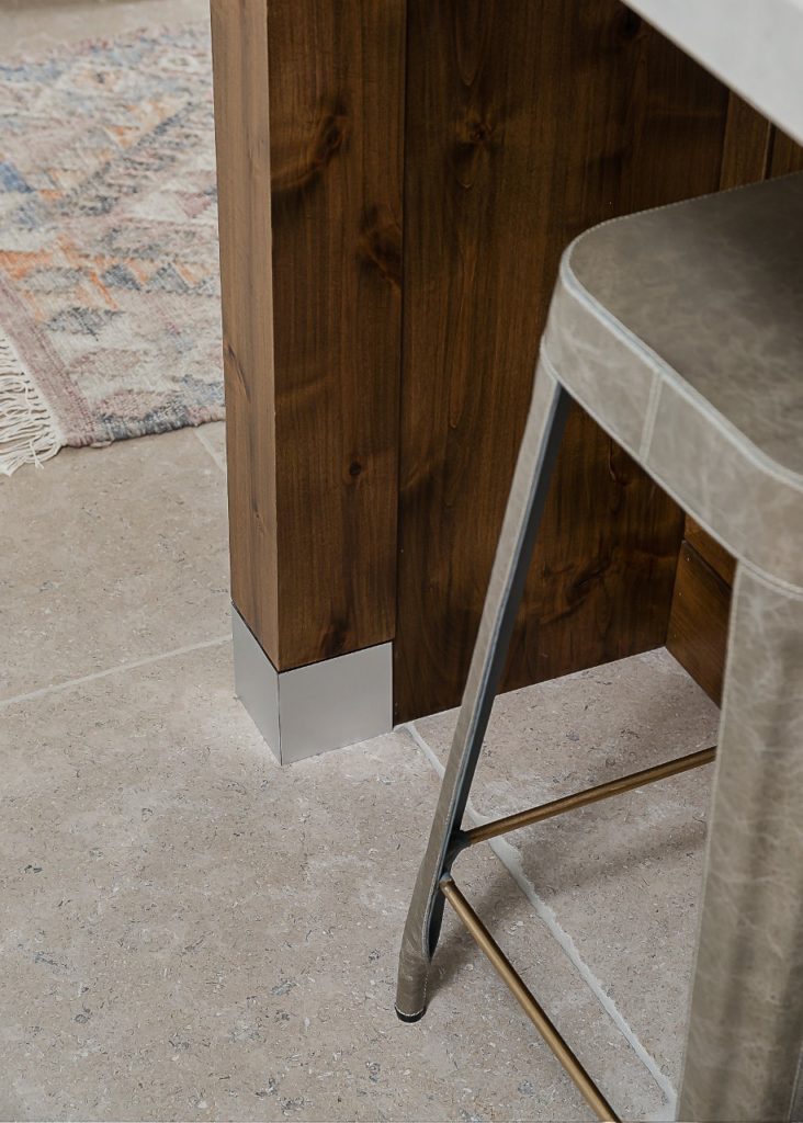
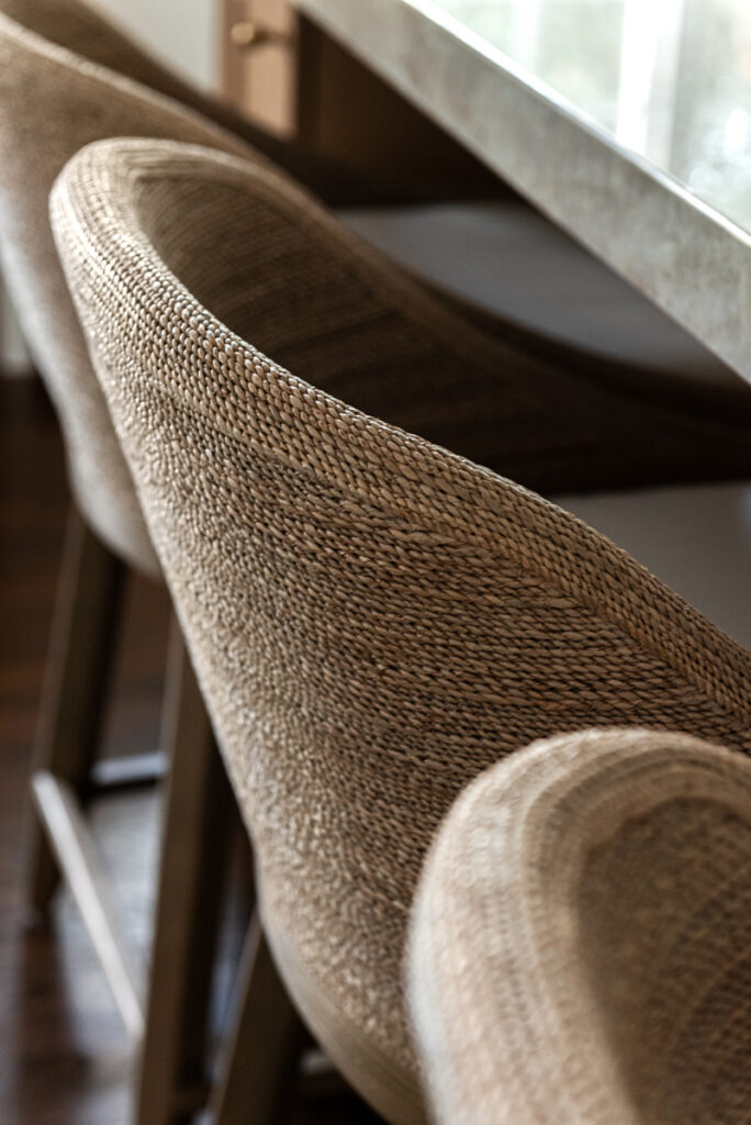
Another way we added texture … these beautiful stools from Restoration Hardware.

Marisol Seagrass Slope Counter Stool

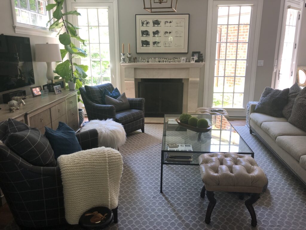
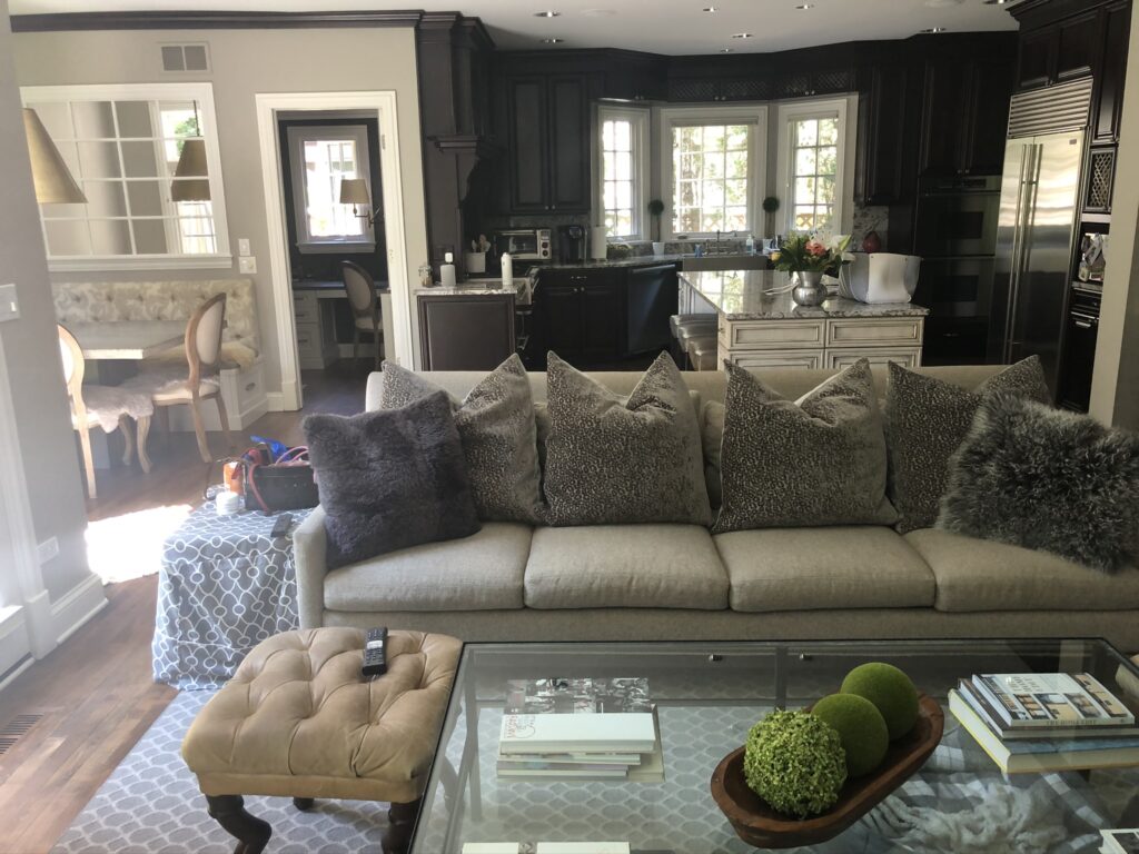
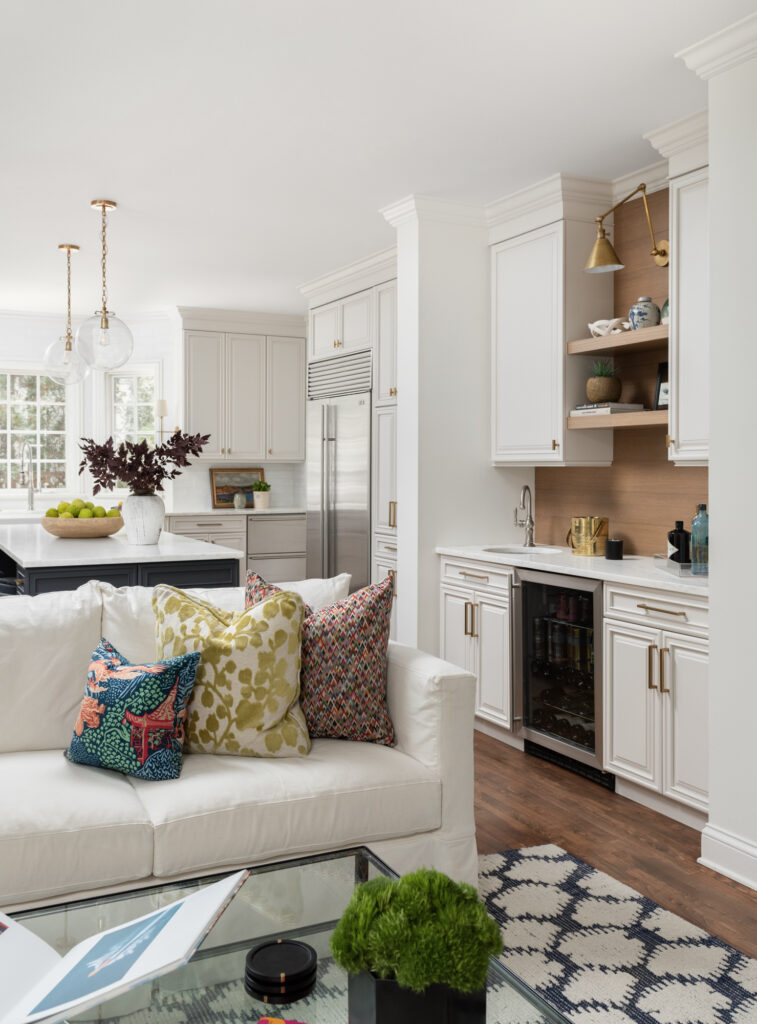
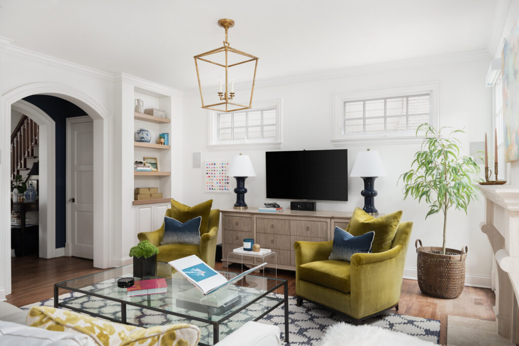
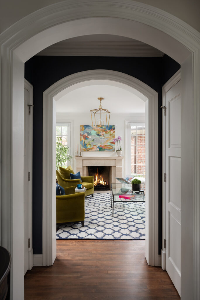
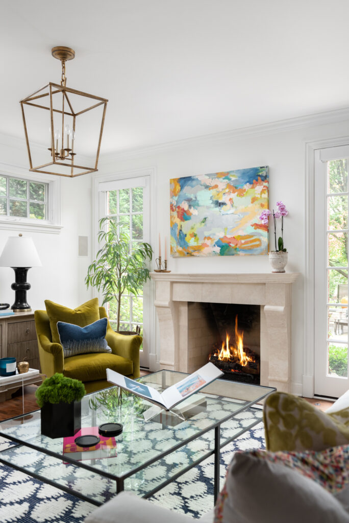
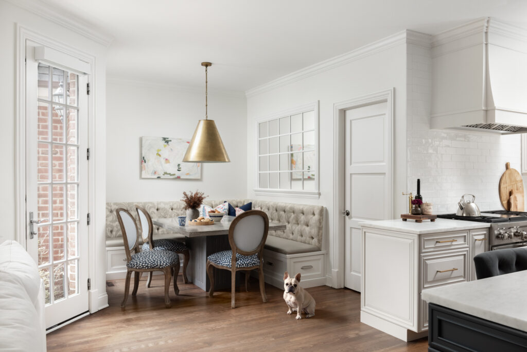
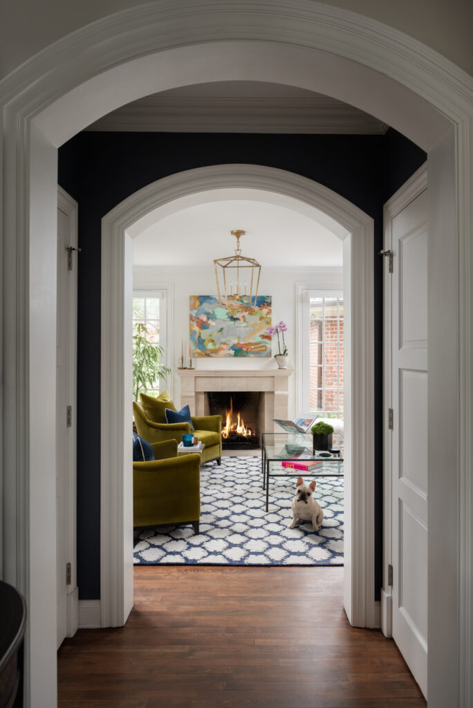
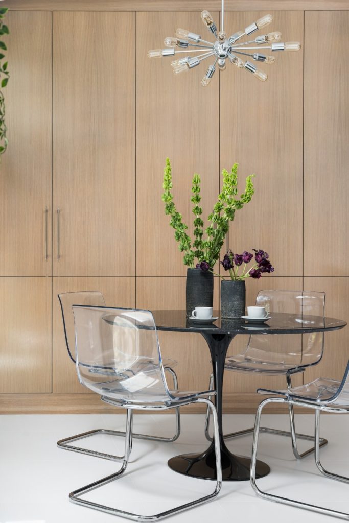
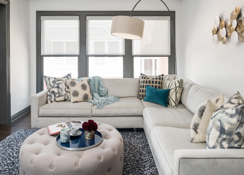
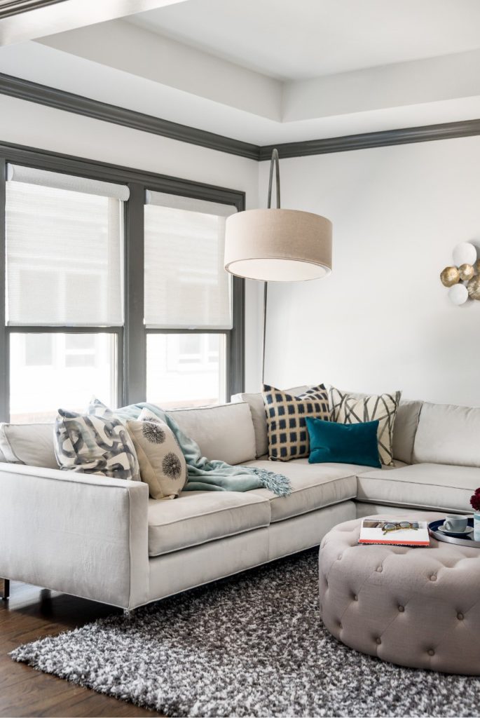
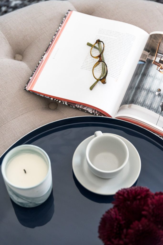
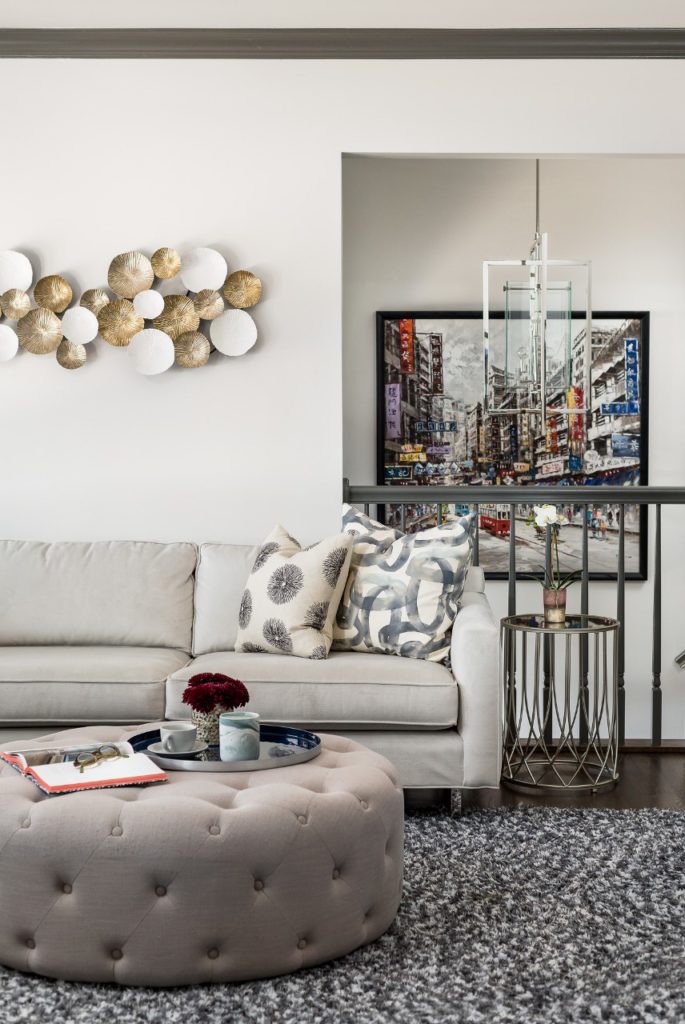
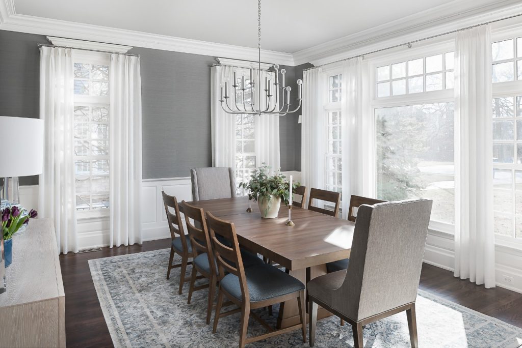
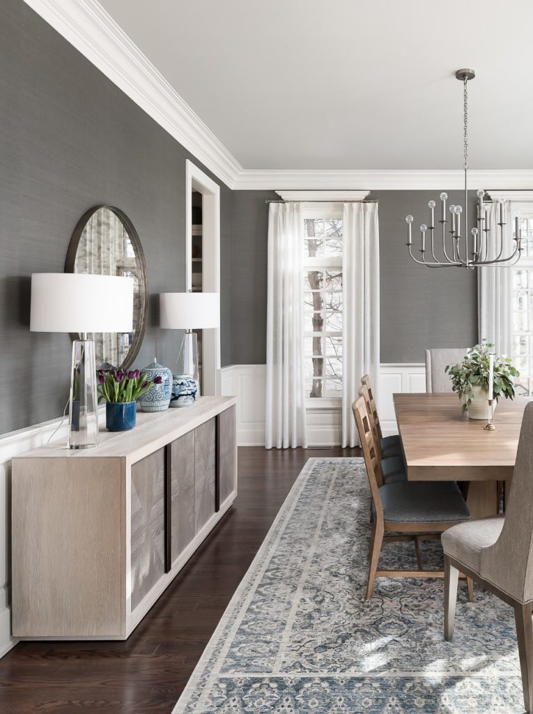
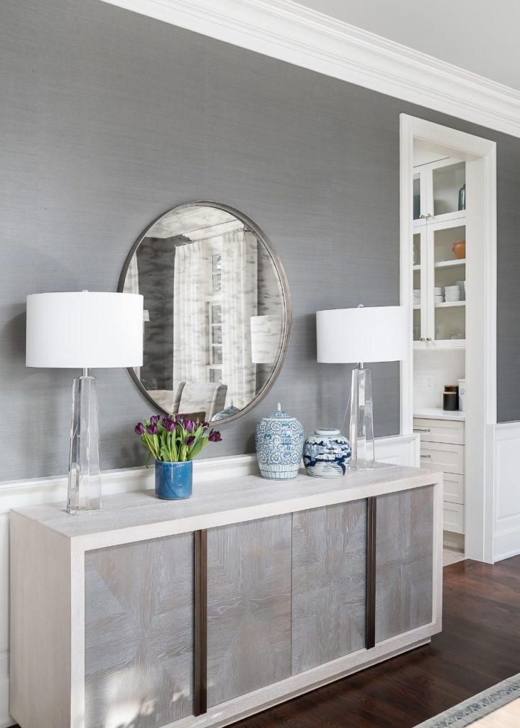
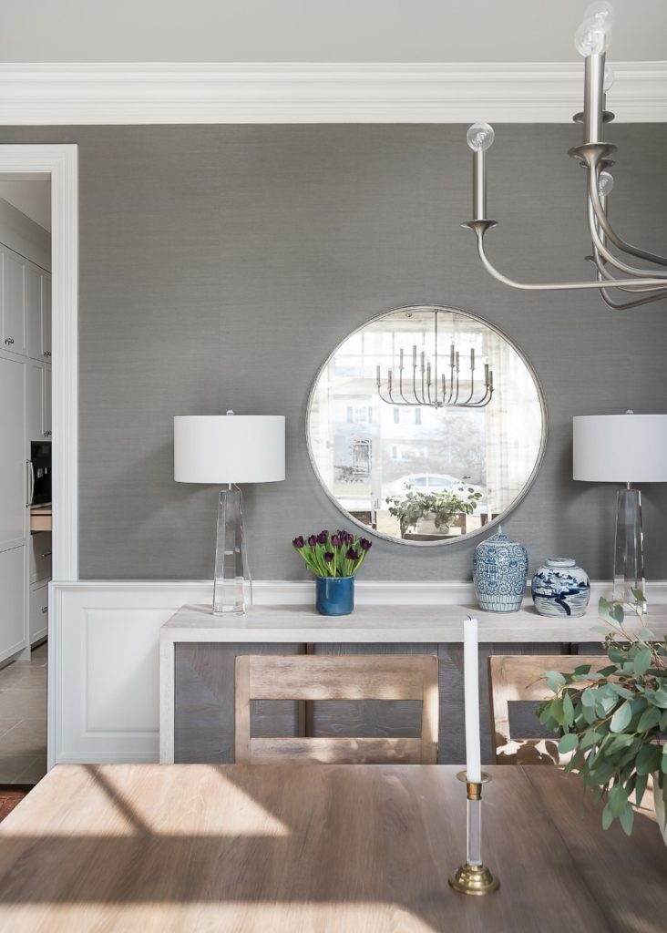
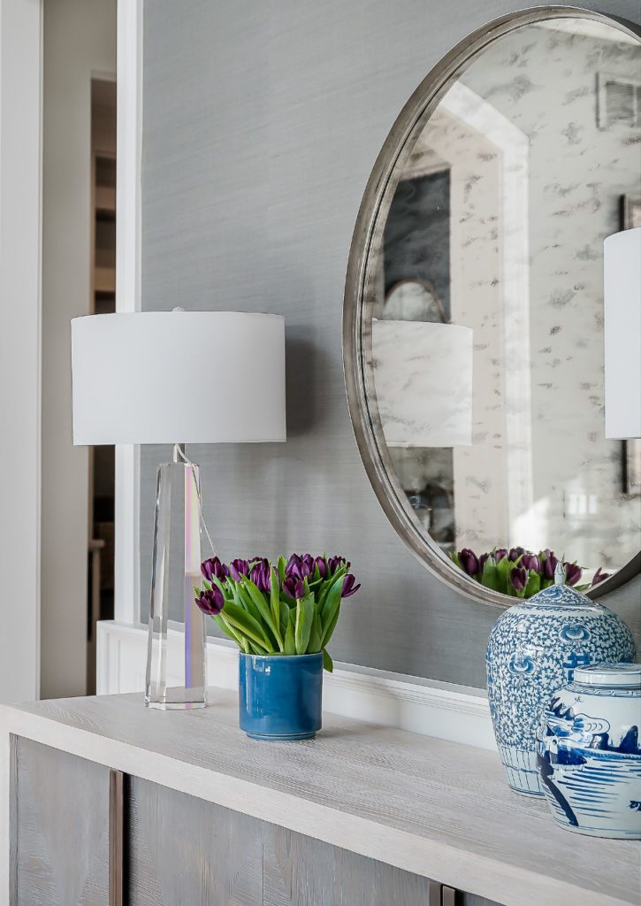
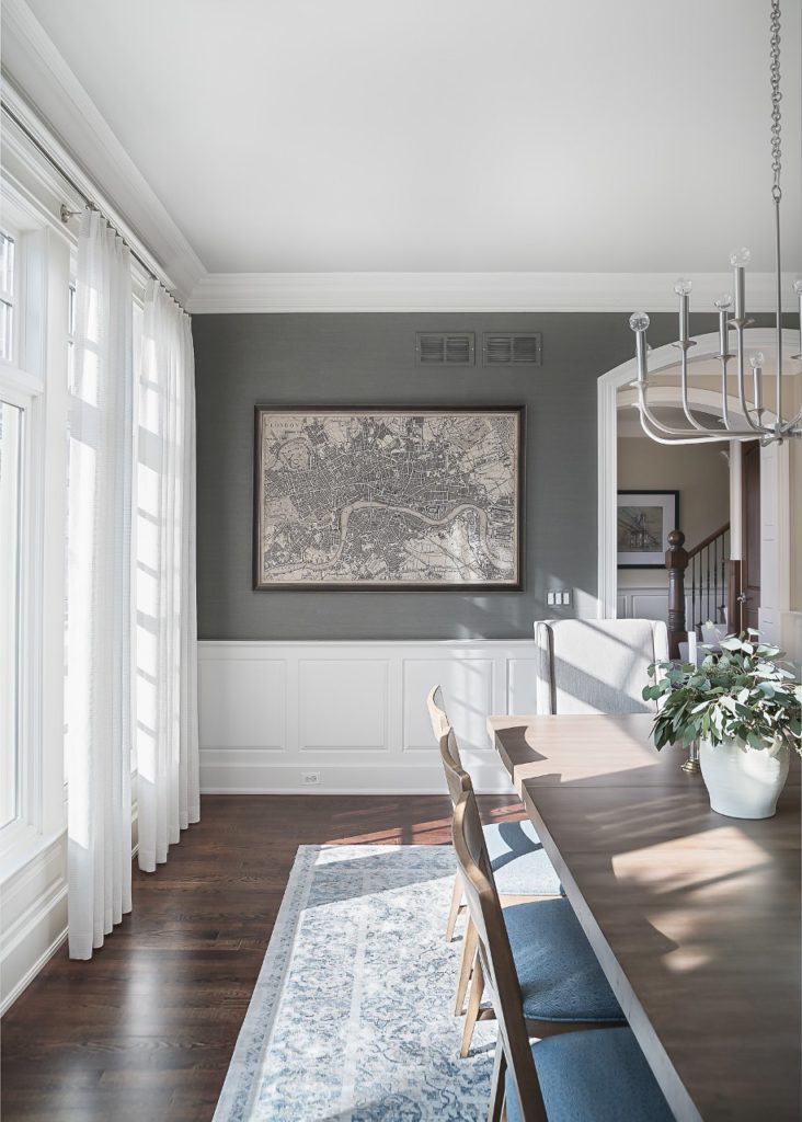
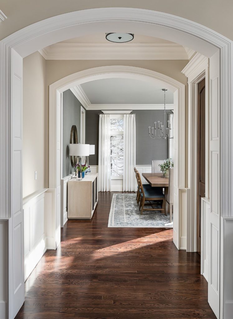
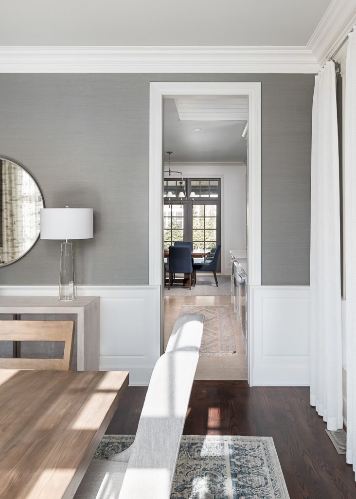
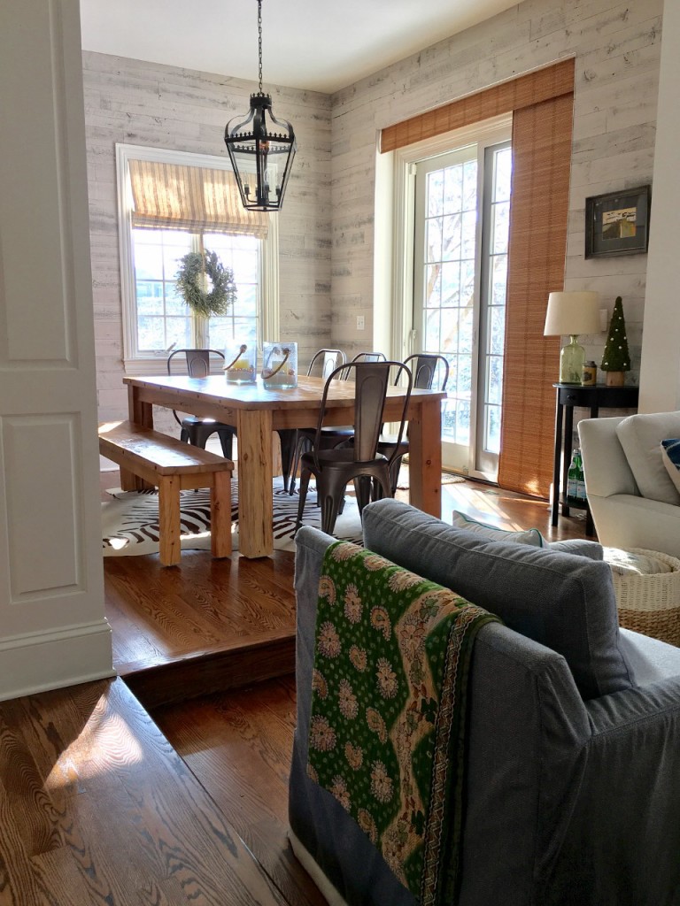
As we get ready to head into the family room in tomorrow’s post, these shots below give a good example of how we were able to incorporate the old with the new …

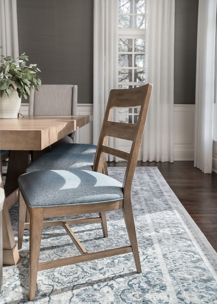
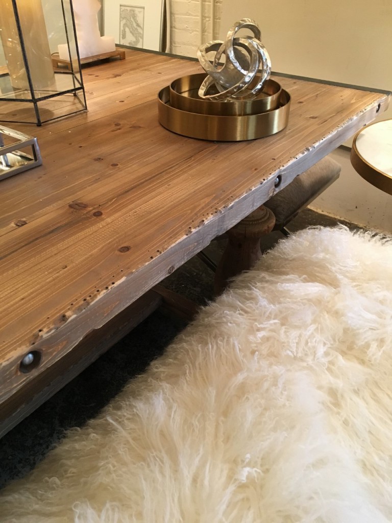
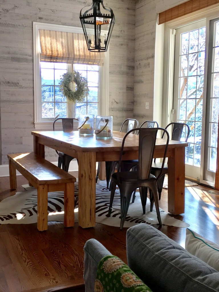
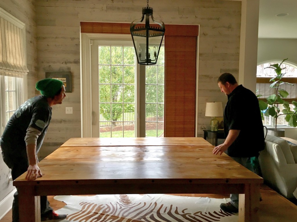
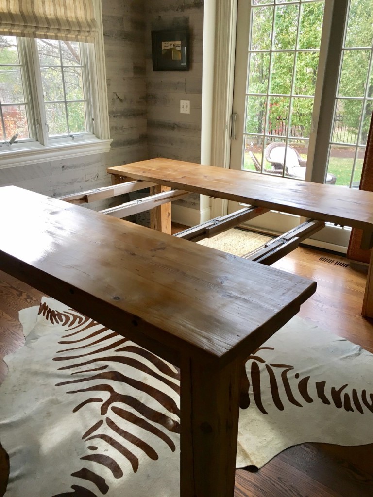
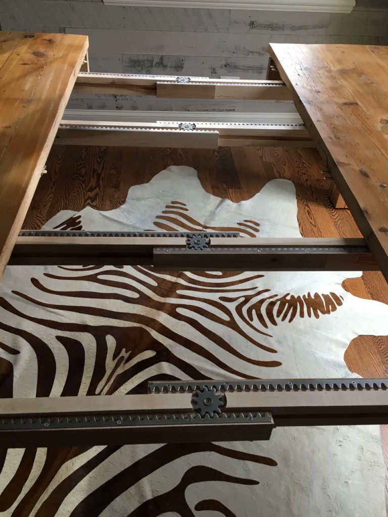
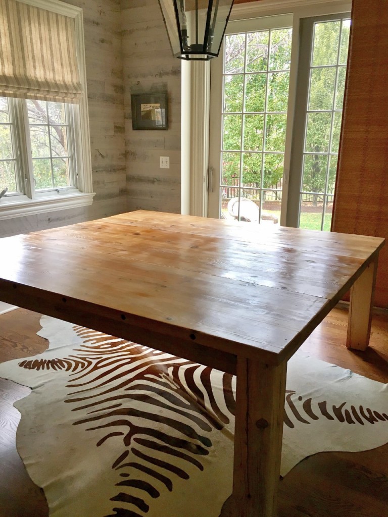
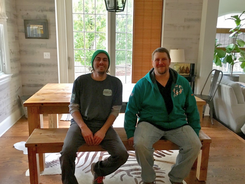
The dining table and chairs were custom well-loved pieces my client had invested a lot into years ago and wanted to see if they could still work.

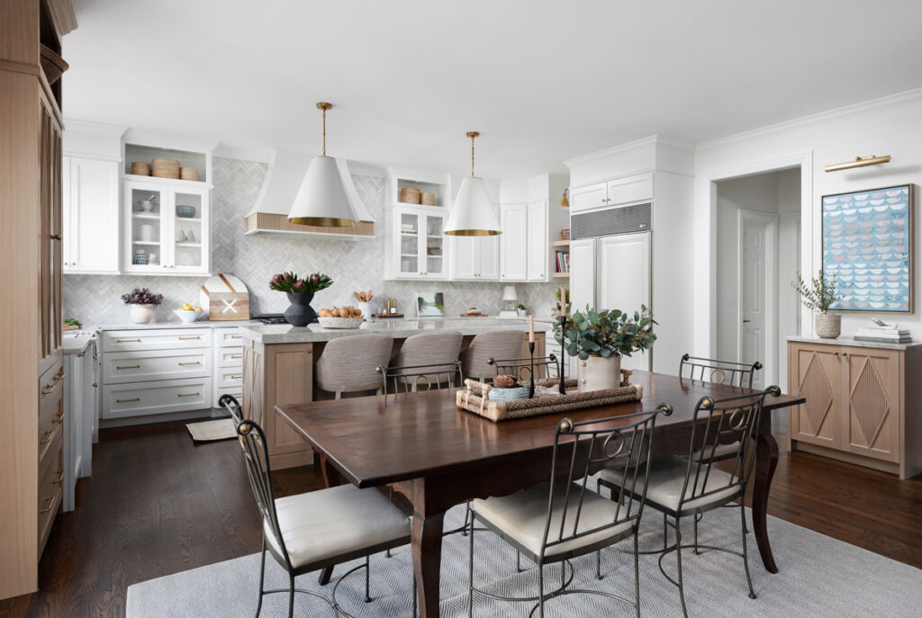
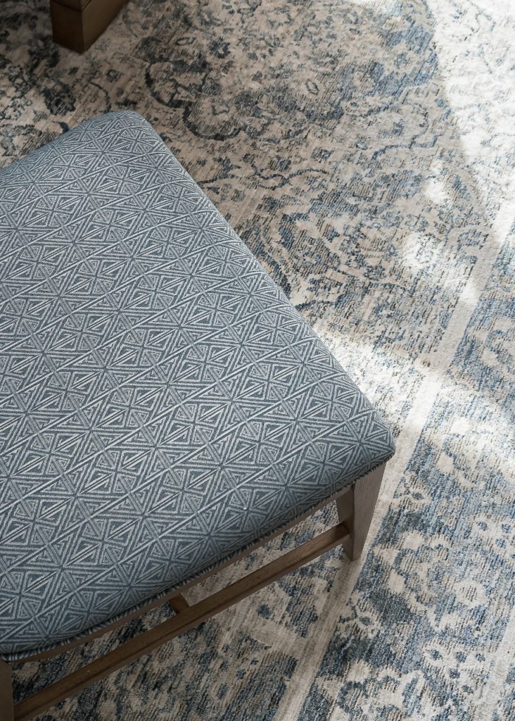
The chairs were so unique I definitely wanted to be able to keep them. We had new cushions made of faux ostrich leather by Sew Special Designs and a custom rug made by Carpet Showcase to break up the wood-on-wood. I think the setup ads a lot of unique character to the space.

A huge thank you to Marina Storm of Picture Perfect House for capturing this space so beautifully. Be sure to come back tomorrow to see the Family Room. It’s a beauty!

Leave a Comment · Filed Under: artwork, Before & After, cabinets, client files, client projects, hardware, house tour, kitchen, kitchens, light fixtures, lighting, mixing metals, rugs, styling, tile, Uncategorized, wall art · Tagged: Before and After, kitchen

The power of color: Before & After

November 15, 2021

Oh it feels so good to have completed projects and photo shoots again! This Before and After is an especially warm and uplifting one as we head into these shorter, darker days and colder temps.

I’ll admit, when I first walked into this client’s house my initial thought was, I wonder what she needs me for! Ha! They had a very sophisticated space with lots of unique details, lighting, art and furniture. She admitted to me that she had done the whole “neutral” thing … lots of gray, white, ivory, beige … but she was over it! She wanted to bring in some bright and fun colors. The neutral palate had actually made the space feel darker. And the kitchen, with it’s dark brown cabinets and granite countertops wasn’t helping the situation since it was an open layout with the family room.

Teaming up with Stephanie Frees of Plain & Posh Distinctive Cabinetry Design again for her amazing kitchen designs, we set out to transform the space with color and brightness.

Before:

After:

Looking towards the kitchen before …

And now …

Bright and cheery is now the best way to describe this space. Can you believe the transformation?

First, I’ll delve into what we did in the family room. My client loves navy (me too!) … but what brighter colors could we add to the space? After selecting this fun rug from Serena & Lily …

Hi Stella!

… and a new crisp white slipcovered sofa from Crate & Barrel for a comfy casual feel, my client said she’d love to bring in bright chartreuse and pops of pink.

We decided her existing chairs with their great shape were the perfect opportunity to go bold with a luxurious chartreuse Velvet. Karen Flanagan of Sew Special handled the reupholstering and made our custom pillows.

Next – can we talk about his amazing art by Heidi Becker?

The bright happy colors draw you into the room from the front door and tie all of our selections together.

We said goodbye to gray walls and dark trim and painted everything Benjamin Moore White Dove, always a great backdrop for pops of color and bold artwork.

On to the kitchen …

Besides just painting the perimeter cabinets (Benjamin Moore Classic Gray), there were other things we could do to make it not feel so heavy. Removing the cabinets above the windows was one thing that just opened up that whole area by the sink.

We also added a white farmhouse sink and more lighting with these classic sconces.

The cabinetry surrounding the range also felt heavy. Stephanie designed a beautiful and sleek new custom hood that allowed us to bring our backsplash tile all the way up to the ceiling.

The island was originally painted with that distressed finish that was so popular for awhile. I suggested we bring our favorite navy color into the kitchen and onto the island. It was a hard-sell at first, but we landed on a pretty dark blue-gray custom color that just really ties into the family room and makes the new honed marble countertops pop.

Let’s talk about this busy wall. We decided to simplify things by adding solid doors next to the fridge and giving the bar area a whole new look.

Rather than doing the same backsplash in this area, we wanted it to feel a little different … and the natural wood shiplap and shelves bring some nice warmth to this white kitchen.

As you can see in the before picture, this large kitchen never had any pendant lighting over the island. We chose the Katie Globe pendant to tie in with the other brass Circa Lighting fixtures she had in the space. And you can see the Boston Double-Arm library light there above the shelves in the bar area.

The dark cabinetry of the kitchen also carried into the family room in the form of this corner bookshelf.

We lightened it up as well and used the same wood shelves from the bar area in a custom stain.

Finally, the breakfast nook got a little love too …

We needed to bring some fun pops of color to this area as well and these chairs presented the perfect opportunity.

A mix of navy cheetah print and pinstripes and instantly the space feels much more fun!

Stella agrees!

As we all have been spending more time in our homes during this crazy pandemic, creating spaces that feel happy, bright and uplifting seems even more important. Bring in colors, patterns, and artwork that bring you joy. Simplify spaces that feel chaotic or heavy so that you can feel the comforts of a home that makes you happy.

Photography by the talented Maria Storm of Picture Perfect House. Thank you, Marina!

Leave a Comment · Filed Under: Before & After, kitchen, Uncategorized · Tagged: Before and After, family room, kitchen

A Divine Downsize

June 4, 2018

I have such a fun remodel to share with you today! My clients decided to downsize from their large family home once their youngest was off to college.  They love to travel and also have a beautiful lake house they spend their summers at. So, for the rest of the year, they knew they could get by with less space and less maintenance, but still wanted to stay in the same community they raised their family in. They found a townhouse in the same town, but it needed a major overhaul.  The fun part – my clients decided this was the perfect opportunity to start from scratch and create something very different from their original traditional-style home.  Sleek, modern … with a touch of mid-century glamour.  As you’ll see below, we had our work cut out for us. First up – the kitchen.

This is the kitchen shortly after they purchased it, looking towards a little eat-in area, seen below. Nothing sleek and modern about it! (Except maybe the chandelier?)

Everything had to go …

Ready for the After?

Quite a change, right? It now feels so fresh, bright, sleek and modern.  My clients came to me knowing they wanted to do all white tile with radiant heat through out the kitchen and the living room. I had never done this before but loved how it opened up our options for wood finishes in the kitchen!  So many people are doing white cabinetry with wood floors but we did the opposite. We picked a pretty textured tile and Cambria quartz for the countertops.

You can see we combined light and dark cabinetry in two custom stains. We went through many versions to find just the right complementary combo. Coming from a large kitchen in their previous house, our clients wanted to make sure they had enough storage here, even though this kitchen would be much smaller.  Stephanie of Plain & Posh Distinctive Cabinetry Designs once again came up with a smart and functional plan that included extending the cabinetry into the breakfast area.  We wanted it to look more like a wall than a wall of cabinetry so we kept things very minimal and carried the cabinetry from floor to ceiling with the crown and trim flush with the cabinets. The light wood stain that shows the natural grain of the wood adds warmth to the space as well as a kind of textural element.


A Saarinen-inspired tulip table in unexpected black ties this area in with the darker colors of the kitchen and adds a touch of mid-century glamour. These acrylic chairs are from Ikea and so comfortable to sit in!

Here is another view of the kitchen’s old layout.  The island in the middle and door on the right that lead to a stairway to the lower level and garage ate up a lot of space in this already tight kitchen.  Plus, the island provided no additional seating.We removed the door and the island and reconfigured the space with a peninsula and 3 counter stools.

You’ll see we also added a wonderful wine and coffee bar in the corner.

Let’s take a closer look at that backsplash … it is a back-painted glass. Perfect for the modern, minimalist look we were going for.

I absolutely love how this dark gray stain shows off the the striation in the wood.

Okay so here is the old view standing in the kitchen looking towards the living room. My clients wanted this to be one open space for entertaining, so this wall came down.

Ready for the new view?

With the door gone and that stairway more open, we added a fun geometric wall paper to the stair well. And the living room? Let’s take a closer look at the before …

And the after …

As you can see, we ripped out the fireplace mantel and surrounding tile and covered the entire thing in a gorgeous stack-stone mosaic tile. It provides gorgeous texture and a touch of shimmer. My clients did not want a TV in this room. I suggested doing four chairs surrounding a round coffee table to make this more of a conversation space with a loungey vibe. These mid-century inspired chairs from Mitchell Gold + Bob Williams swivel, so they can turn towards the kitchen area and unite the two seating areas. The wood and glass coffee table is from Wisteria and brings in a sculptural and organic element. The geometric rug from Loloi was the perfect way to ground the space and tie all the colors together.

New built-ins were added in the same custom gray finish as the kitchen cabinetry. Floating shelves and no hardware are in keeping with our minimalist aesthetic.

Now it is one big light and bright space, perfect for entertaining but also a cozy spot for my clients to relax, read the paper or chat after dinner with a cocktail.

At the front of the townhouse is the family room and my client’s home office. This was what it looked like when they moved in.

And now …

Cozy was the theme in this space. Since we did chairs in the living room – this is where we put a sectional – so the family could come in here to stretch out and watch TV. The shag rug from Loloi is so soft underfoot.

The sectional from MGBW is upholstered in a luxurious velvet fabric and the polished stainless steel legs add the modern touch we were looking for.

My clients have traveled the world – and they have collected quite a collection of eclectic art and accessories. I really wanted to keep the walls light and neutral throughout the space so that their pieces could really pop. Below you can see a favorite colorful piece from their travels that we incorporated into the front entry.

As a I mentioned before – this was such a fun project to be a part of as my clients were so open and eager to step out of their comfort zone. What a transformation!

Leave a Comment · Filed Under: Before & After, breakfast room, glamour, kitchen, kitchens, lighting, living room, mitchell gold + bob williams, Uncategorized, wallpaper · Tagged: Before and After

Before & After: The Heart of the Home

February 9, 2018

Ok – so it’s been awhile! I apologize. I know that one blog post every few months does not make for a great blog.  But blogging has definitely changed a whole lot since I  started this in 2011. Let’s face it, the best blogs are the ones where the bloggers make make it their full time job. They blog daily or maybe weekly. They change their furniture, art, rugs, paint colors, even houses (!) monthly, semi-monthly, or annually to create new content for their blogs. While this can be a great gig, it is just not realistic in most people’s lives and certainly not my own. Staging a ‘Mother’s Day Tea’ tablescape that no one will ever use, or decorating for Christmas in October so that I can have holiday blog content up the day after Halloween, is not my priority. Other design firms I follow have dedicated social media staff whose whole job is to write the blog posts and do daily Instagram stories. Hard to compete with that – so I’m not going to try.  I have been fortunate to work on some amazing projects this past year and that means there’s less time for blogging.  Plus, I believe a creating a good blog post takes time. I don’t want to slap something together just to say I got a blog post up.  Instagram (which didn’t even exist when I started this blog – can you believe it?) makes it easy to share inspiration or sneak peaks of projects quickly, without the need for a full blog post.  So I’m thinking this blog will become more of a place to feature full project reveals, before and afters, etc. and more noteworthy things – not the little stuff we all get bombarded with already through email, Instagram and other social media. If you are anything like me, perhaps you too sometimes feel overwhelmed by the sheer number of blogs and Instagram accounts there are to follow and keep up with. What do you think? I’m all for simplifying!

So, having said all that – I DO have a real blog post for you today! I am revealing one of my favorite projects of 2017 – a dramatic makeover of a large kitchen and dining room for wonderful family with great taste and ideas about what they wanted their dream kitchen to be. It was a fun collaboration with Stephanie Frees of Plain & Posh Distinctive Cabinetry Designs.

Want to see where we started?

As you can see, we had a lot of space to work with! Despite the light cabinets and floors, the room still felt dark. The pendants over the island were new. Before my clients knew they were going to do a full renovation, they asked me to help them change out existing light fixtures which were way too small for the space … think little silk shades with tiny crystal drops.

But this kitchen was not working for them. Besides all of the ornate details, the layout and flow of the space meant many things were being underutilized.

On the other side of this range wall is the dining room – which has large windows and is flooded with light. But the only way to get to it was to zigzag through a small dark corner Butler’s pantry, whose entrance, above, is where the light is shining from.

The floors were also a problem. They were very hard to keep clean – with so many thick deep grout lines – and tile that just seemed to hold on to dirt.

This was one of the big questions for this remodel … do we lay wood floors down to match the rest of the house?  Normally this would be a good option, but my clients do not love the existing wood floors and did not want to bring that stain color into this new kitchen. If we were going to do wood floors, it would mean redoing all of the floors on the whole house!

The main entrance to the kitchen from the front hall was through this little hallway with a desk on one side and a pantry door on the other. Not only was this desk space not needed since the family has a large home office space right across the hall, but, as most kitchen desks do, it became a clutter and drop-zone.  And this was the first thing you’d see as you’d walk into the kitchen.

Ok – ok! Are you ready to see the After? Drumroll please ….

Where to begin? We opened up the wall on either side of the Range to create two entrances to the dining room and flood the kitchen with it’s beautiful light. Gorgeous cabinetry designed by Plain & Posh is more streamlined and functional and  includes a deeper island in a custom wood-stain to warm up all the white. But actually … the cabinets are NOT white! They are painted Benjamin Moore’s Classic Gray … this is my go-to color for creating the illusion of light and bright, but with more warmth and depth.  The walls are Benjamin Moore’s White Dove.

The countertops and back wall of the range niche are Silestone Quartz in Pearl Jasmine from their Eternal Collection.  We wanted some veining and movement but not too much, so this was the perfect choice.

We also painted all of the window trim Benjamin Moore’s Kendall Charcoal. Another great way to bring added dimension to an all-white kitchen.

The floors! After deciding against wood floors, we looked at a lot of different stone options. We wanted much larger tiles to look less busy and for less grout lines. And … to get just the right color – not too gray or cold looking, but too not too gold or yellow either. We finally hit the jackpot at Exquisite Surfaces with these beautiful tumbled limestone floors.

Check out this fun coffee station …

Stephanie at Plain & Posh has such a knack for designing functional little details like this.

Here are some great closeups of the gorgeous leather barstools from Made Goods and the capped feet of the island.

Ok -so what about the former desk area?

Before …

And after …

With beverage and wine refrigerators and beautiful glass front cabinetry, it is now so much more useful to the family and a more lovely way to enter the kitchen. The warm wood planks were stained to coordinate with the island and wood beam above the stove niche. I love mixing metals -so this little area was a great place to play with antique brass hardware and accents.

Across from the previous desk was a door to a walk-in pantry with very basic shelving that was hard to keep organized and not very pretty to look at upon entering the kitchen.

The new plan called for breaking through that pantry wall into the former Butler’s Pantry and creating a functional yet lovely walk through pantry that could be accessed from either side of the kitchen.

Wait … back up … did you check out those double doors?  That was one of my favorite last minute design decisions! Why have one plain door when we could do 2 charming doors with fluted glass and fun brass knobs?

So what do you think? I am so in love with this bright airy kitchen and it was so fun to style and accessorize. But wait … there’s more … let’s check out the new adjoining dining room, shall we?

First – here is an old photo of the dining room from when my clients first purchased the house.  They hadn’t done much to it since besides moving in their old dining room furniture.

And now …

We wanted a light and soothing color scheme and the design all started with this gorgeous green-gray grasscloth wallpaper. My clients wanted it to feel elegant but not too fussy or formal. I think we achieved that with the lighter wood tones and the more casual side chairs.

I love the sleek lines of this two-toned sideboard.

And a round mirror is a great way to break up all of the linear features of a dining room.

Also, I love the mix of patterns here between the rug and chairs – the rug is more traditional yet the geometric pattern on the chairs is a fun modern pop.

Here is a closer look at the wallpaper and gorgeous Camille sconces from Circa Lighting.

Custom draperies by Mimsie O’Hara in a pretty sheer fabric with metallic threads running through.

All the sunlight filters in so beautifully!

This is the view from the front entry hall …

And then, the view into the new kitchen …

Well … that was a long post! Thanks for sticking with me! This was such a fun project and I am thrilled that my clients have this new wonderful space to gather. It is truly the heart of their home!

And finally, a great big thank you to Marina Storm of Picture Perfect House for her wonderful photography of this project. She captured everything beautifully!


8 Comments · Filed Under: barstools, Before & After, breakfast room, dining room, kitchen, plank walls, reclaimed wood, Uncategorized, wallpaper

Reclaimed

December 15, 2016

Reclaimed – it’s certainly a buzzword in design right now. Reclaimed wood, reclaimed beams, reclaimed shelves. It’s also the name of a fantastic handcrafted furniture company based out of Crystal Lake, IL.  Reclaimed.

I recently had the pleasure of working with them to design a new table and bench for my kitchen and I am so thrilled with the result, I just have to share it with you.

Reclaimed sells many ready-made pieces: tables, shelves, desks, beds – you name it – but if you have something very specific in mind, they can do a custom piece for you as well.

I, of course, had something very specific in mind.  You see, our kitchen/breakfast room is definitely the largest area of our house. The dining room, not so much.  It is a tight squeeze to get 10 people in our dining room.  Really, this is fine because we don’t have sit down dinners for more than 10 all that often but it occurred to me that we actually have the space to do a large square table, one that could seat 12-14 people right in our kitchen area.  I don’t need it to be that big all the time, but it would be so ideal to have a regular table that could expand with a leaf width-wise, into a square, instead of length-wise into a longer rectangle. Plus, as with most families these days – dining and parties have become a lot more casual with more kids, etc. – and I’d rather have everyone in the kitchen/family room area. It really is the heart of the home and my favorite part of the house.

Anyway, as hard as I searched, I wasn’t finding this type of table anywhere. I had been following Reclaimed on Facebook and in early September they posted about it being their final week to get custom orders in for Thanksgiving delivery. They were scheduling both in-person and phone appointments so I decided to sign up for a phone appointment since I couldn’t squeeze a trip up to Crystal Lake into my schedule that week.

The appointment went great. I was able to describe exactly what I wanted, go over measurements and then agree to send in inspiration photos of the look I was going for.  Here are some of the things I sent them.

My rough conceptual idea:

table

Design styles I liked:

49e20878a4c409657de09be4d94a59ff 92ea1b152835146e521d6ba5de1e8dfb

After talking it through, we realized that in order to pull apart the table in the middle, we couldn’t have the base or legs in the middle of the table. Hmmm. Plan B. These were the next images I sent:

download-2

bigsur90diningtbl71bnchsf15

Perfect – this style would work and I decided I really liked the clean lines and simplicty of this style, especially with the bench paired with it.  So many different styles of chairs could work with it too if I wanted to change things up down the road. (My husband cringes when I say that! Ha.)

So we signed off on everything and it went into production.  I would select the stain color as it got closer to completion.

One day when I was at one of my favorite stores (610 Home in Geneva) I saw this table with these cool metal rivets along the side.

img_3899-960x1280

img_3898-960x1280

I snapped a couple pics and sent them along to my friends at Reclaimed. “Can we add something like this to my table and bench?” Done.

I also like the look of the metal cap along the edge but decided the crevice between it and the wood would become a catchall for crumbs and food and I would become obsessive about having to clean it out. The rivets would be enough to give it the industrial edge I was looking for.

Finally in early November I got the call that they were ready to stain. The finishes they offer (from top to bottom) are: Natural, Provincial (left), Gray Wash (right), Dark Walnut (left) and Gunstock (right).

reclaimedfinishes

I chose the Natural stain as I really wanted to keep it a light as possible. They said this is their most popular choice.

Ok, ok – so that’s the backstory.  Are you ready for the actual pictures of MY table?  As promised they delivered it on the Tuesday before Thanksgiving.  Now the area is all decorated up for Christmas and I couldn’t be happier.

img_4745-1-960x1280

img_4746-946x1280

img_4743-960x1280

The wood is so pretty with lots of natural movement and markings. They told me that the wood used to make my table and bench came from an old barn in Wisconsin called The Grainery.

img_4758-821x1280

And I got my rivets!

img_4757-853x1280

I got these seeded glass candleholders from GrandinRoad. I love the jute handles.

img_4750-960x1280

For the holidays I filled them with faux snow and mini metallic ornaments I got at Homegoods.

Here is the table on delivery day … with Cody and Brad testing out the leaf.

img_4581-1280x955

img_4578-960x1280

It’s quite a sturdy contraption!

img_4579-960x1280

And here is the table with the leaf …

img_4582-960x1280

And here are the awesome Cody and Brad after all the heavy lifting. (This table is heavy!)

img_4586-1280x960

I cannot say enough about my new friends at Reclaimed – Cody, Brad, Brett, and Krysten. Their customer service is phenomenal and they really take great pride in their craftsmanship.

Apparently I am not the only one who feels this way – their success has allowed them to unveil a new retail store, double in size with a great second floor. Here they will offer a great selection of their handcrafted grab-and-go items as well as displaying some of their custom pieces. I am dying to get up there myself – I am still waiting for that “slow” week. Ha!

Anyway – our new table has already hosted several game nights, a Progressive dinner with my son’s Youth group and will be the spot for Christmas Day dinner with my family.

img_4744-1-960x1280

For chairs, I chose the Remy side chair in Burnished Metal from Restoration Hardware. I wanted comfortable but sturdy and wipeable 🙂 and this is such a classic industrial style that pairs so well with a big farm table. With a wood table, I love the idea of using NON-wood chairs.

If you are in the market for a new special piece made of reclaimed wood for your home, I can’t recommend Reclaimed highly enough. They can turn your wishlist into reality. Please tell them I sent you!

xo-amy


Leave a Comment · Filed Under: chairs, kitchen, reclaimed wood, tables

Next Page »

I'm a mom, wife and interior designer who loves creating lovable and livable spaces for both my family and my clients. This is my little space to share inspiration, ideas and projects. I hope you'll come along for the ride!

Let’s Connect!

  • Facebook
  • Instagram
  • Pinterest

Subscribe Via Email

Instagram

swooninteriors

Swoon Interiors Inc.
One month into 2025 and it’s been a busy one! So One month into 2025 and it’s been a busy one! So many creative projects in the works and I’m not mad about it! I’m not one for resolutions - but I’m going to TRY to be better about sharing more of these fun projects this year … stay tuned!
Pinch me - I was with Jean Stoffer last night! (Ju Pinch me - I was with Jean Stoffer last night! (Just before she flies out to LA for the Emmys!) what a wonderful event at the Monogram Design Studio learning Jean’s tips and tricks for setting a beautiful holiday table. (It doesn’t have to be perfect or match … lean into nostalgia with vintage pieces and found treasures from travels and take advantage of faux greens … just to name a few!) Plus the talented chefs at Monogram served up the most delicious snacks using their amazing Five-in-One Wall Oven. I’m excited to set my table for Christmas Eve this year and I may just be using Jean’s idea of tying velvet ribbons to vintage coupe glasses. Oh and the dried orange garland!  What are your favorite things to add to your Holiday table?
was was
The uplifting power of a fun stair runner …. Swi The uplifting power of a fun stair runner …. Swipe ➡️ to see the before. So lucky to have a great local source for my clients in @carpetshowcasedesign. The best in personalized service and a curated collection of rugs to choose from.
Quick site visit yesterday to check out the finish Quick site visit yesterday to check out the finished product of my clients beautiful new pantry. The soft palette, vintage rug,
pretty wallpaper, custom peg rail, drawer pull cut outs, gorgeous quartzite and dreamy lighting … it’s all …👩‍🍳💋 Chef’s kiss!
Travel always provides such inspiration for artist Travel always provides such inspiration for artists, writers, designers … and the Lake Como region of Italy is no exception. I couldn’t get enough of all the saturated colors, beautiful stone, arches, and colorful shutters. Each and every building is so unique and charming. #ladolcevita #designinspiration #travelphotography #lakecomoitaly
Love getting photos sent from Virtual E-Design pro Love getting photos sent from Virtual E-Design projects when I can’t see the results in person! Swipe to see the original photo this client sent me asking what they could do to their home office that is right off their entry to make all the cords and big black monitor disappear. My solution … paint the back wall dark and invest in a true Executive Desk with hidden cord openings. Then add some warmth with a rug and art. I sent them several Design Boards and paint swatches with this is where we landed! #edesign #homeoffice @luluandgeorgia @potterybarn @benjaminmoore
If you've been following along this week, this is If you've been following along this week, this is Part Three of this beautiful home's reveal ... the Master Bedroom. Click the link in my bio for sources and to read all about it. @pictureperfecthouse @jacquie_gouveia @kristinblakeneyart @loloirugs @noirfurniture @circalighting @pompomathome @joliemarche @chloeandolive
Into the Family Room today! Click the link in my b Into the Family Room today! Click the link in my bio to read all all about the transformation of this pretty, light-filled space. @pictureperfecthouse @jenniferdailyart @reneebouchon @circalighting @loloirugs @susanconnor_ny @studiomcgee
Very excited to share this favorite project with y Very excited to share this favorite project with you! Click the link in my profile to read about and see the full reveal. Check back over the next few days to see more of this beautiful space revealed. @plainandposh @pictureperfecthouse @circalighting @cletile @marissavoytenko
Photo shoot day! Literally cannot wait to share th Photo shoot day! Literally cannot wait to share the amazing transformation of this house with you. Have been working with this client for almost 5 years and am so proud of all these spaces we have collaborated on and to now call her a friend. Also another great opportunity to work with Stephanie of @plainandposh on the stunning kitchen and to have Marina of @pictureperfecthouse come in white her photography magic. Stay tuned!
When you get live video updates and progress shots When you get live video updates and progress shots for your clients commission - you know you’re working with the best! @heidibeckerart - you’ve done it again!
#localartistsupport #colorfulabstract
Swipe to see how just adding a rug, wallpaper and Swipe to see how just adding a rug, wallpaper and smaller scale coffee table transformed this room … oh and a beautiful Audrey ficus from @shopvagabond soaking up the sunshine in the front window.
“Champagne is one of the elegant extras in life. “Champagne is one of the elegant extras in life.” -Charles Dickens 🥂🥂🥂Don’t you agree? I can’t wait to see this beautiful Quartzite in my clients’ kitchen. @calia_stone_boutique #mykindofbubbly
Christmas in September! Things are FINALLY coming Christmas in September! Things are FINALLY coming in! These are pics my clients have sent me in the last week of chairs, sofas, artwork and more we having been waiting for! (53 weeks takes the prize 😳 for longest lead time). They are finally all swooning as they walk into their rooms! Sometimes it really is worth waiting to get exactly what you want. #worththewait
🎶 “These are a few of my favorite things” 🎶 from Design Edge Chicago. So much inspiration in these textures, fabrics, lighting and furniture. Thank you for bringing this “mini High Point” to Chicago! Can’t wait to share my finds with my great clients! @designedgeco
Do you know the story of how Crate & Barrel began? Do you know the story of how Crate & Barrel began? Newlyweds Gordon and Carol Segal discovered simple white European dinnerware on their honeymoon and decided their hometown friends needed it too. They opened the first Crate & Barrel in Chicago in 1962. So honored to be invited to their 60th Anniversary celebration last night. And let me just say, Crate & Barrel sure knows how to set a table … for 60! Every detail of this evening was beautifully styled in that special C&B way that has made them a favorite place to shop for so many for so long. It was wonderful to hear Gordon speak and the last picture is the lovely cozy view I had for dinner. Quintessential Crate & Barrel. @crateandbarrel #60thanniversarycelebration
Site visits are always a pleasure … especially w Site visits are always a pleasure … especially when electrician is there hanging some of your favorite Circa lighting fixtures!
So much design inspiration on this trip to Cabo an So much design inspiration on this trip to Cabo and San Jose, Mexico. From the gorgeous tile and ceramics, to the colorful domes and buildings and the rustic and coastal elements … it was the perfect place to usher in warm spring vibes and color inspiration. @haciendadelmarloscabos @florafarms @haciendacocinacantina @surcabo #designertravels
Gray Malin has a new series! @plainandposh … rem Gray Malin has a new series!
@plainandposh … remember when we met him in Chicago? 😍😍
Load More... Follow on Instagram

Search