I have such a fun remodel to share with you today! My clients decided to downsize from their large family home once their youngest was off to college. They love to travel and also have a beautiful lake house they spend their summers at. So, for the rest of the year, they knew they could get by with less space and less maintenance, but still wanted to stay in the same community they raised their family in. They found a townhouse in the same town, but it needed a major overhaul. The fun part – my clients decided this was the perfect opportunity to start from scratch and create something very different from their original traditional-style home. Sleek, modern … with a touch of mid-century glamour. As you’ll see below, we had our work cut out for us. First up – the kitchen.
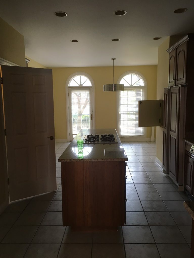
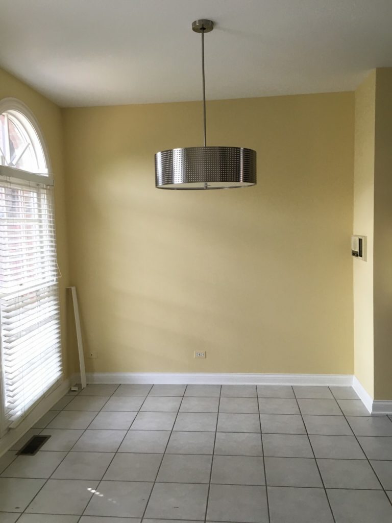
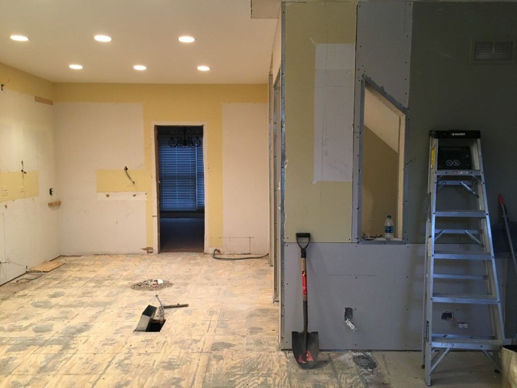
This is the kitchen shortly after they purchased it, looking towards a little eat-in area, seen below. Nothing sleek and modern about it! (Except maybe the chandelier?)
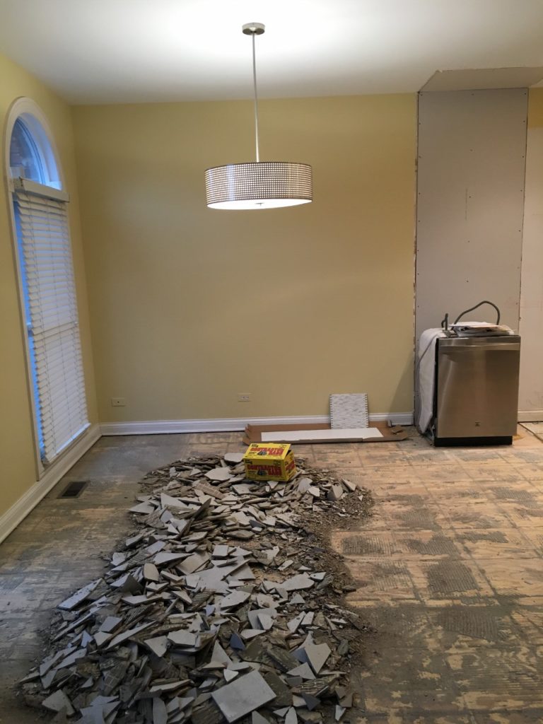
Everything had to go …
Ready for the After?
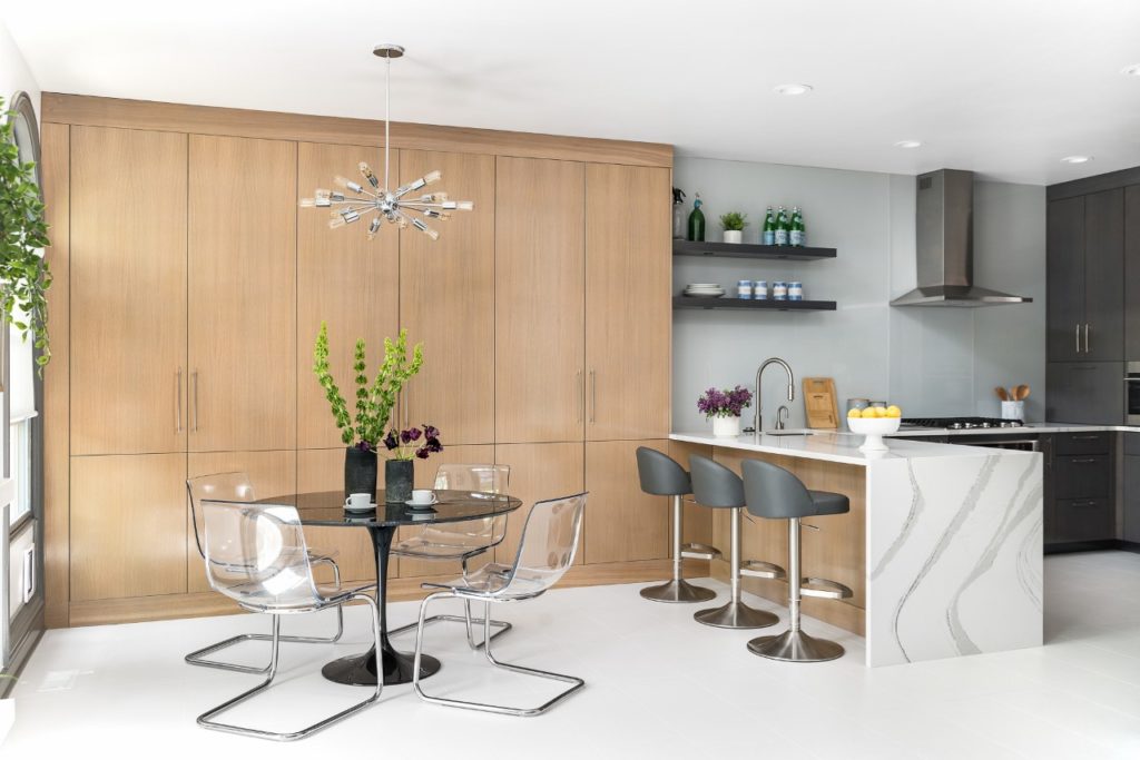
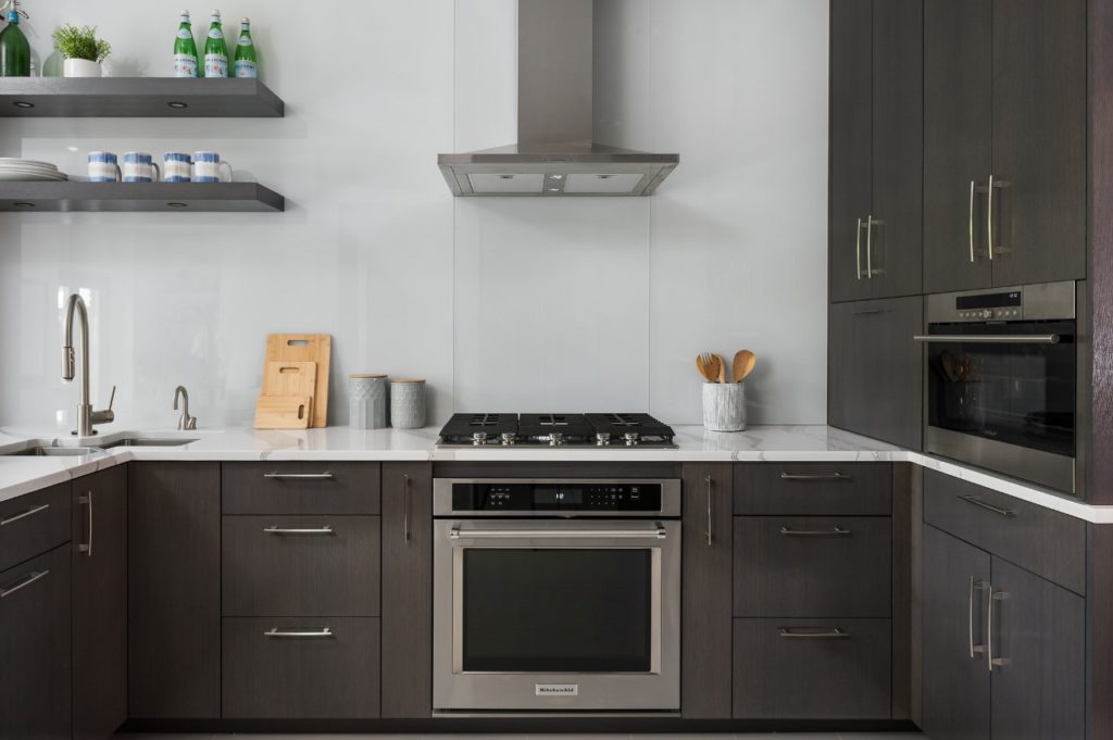
Quite a change, right? It now feels so fresh, bright, sleek and modern. My clients came to me knowing they wanted to do all white tile with radiant heat through out the kitchen and the living room. I had never done this before but loved how it opened up our options for wood finishes in the kitchen! So many people are doing white cabinetry with wood floors but we did the opposite. We picked a pretty textured tile and Cambria quartz for the countertops.
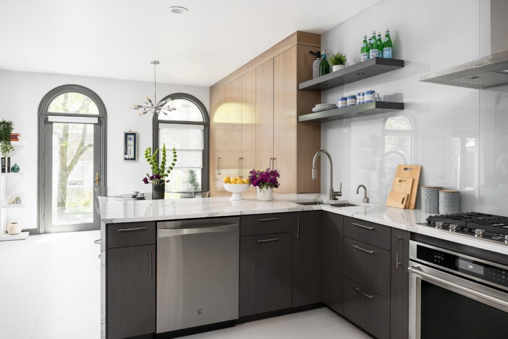
You can see we combined light and dark cabinetry in two custom stains. We went through many versions to find just the right complementary combo. Coming from a large kitchen in their previous house, our clients wanted to make sure they had enough storage here, even though this kitchen would be much smaller. Stephanie of Plain & Posh Distinctive Cabinetry Designs once again came up with a smart and functional plan that included extending the cabinetry into the breakfast area. We wanted it to look more like a wall than a wall of cabinetry so we kept things very minimal and carried the cabinetry from floor to ceiling with the crown and trim flush with the cabinets. The light wood stain that shows the natural grain of the wood adds warmth to the space as well as a kind of textural element.
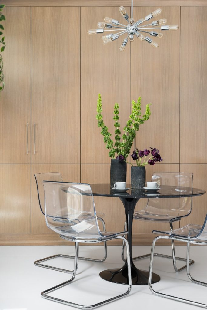
A Saarinen-inspired tulip table in unexpected black ties this area in with the darker colors of the kitchen and adds a touch of mid-century glamour. These acrylic chairs are from Ikea and so comfortable to sit in!
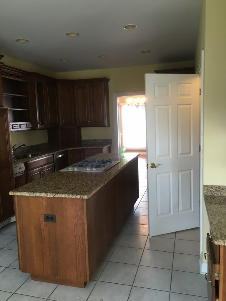
Here is another view of the kitchen’s old layout. The island in the middle and door on the right that lead to a stairway to the lower level and garage ate up a lot of space in this already tight kitchen. Plus, the island provided no additional seating.We removed the door and the island and reconfigured the space with a peninsula and 3 counter stools.
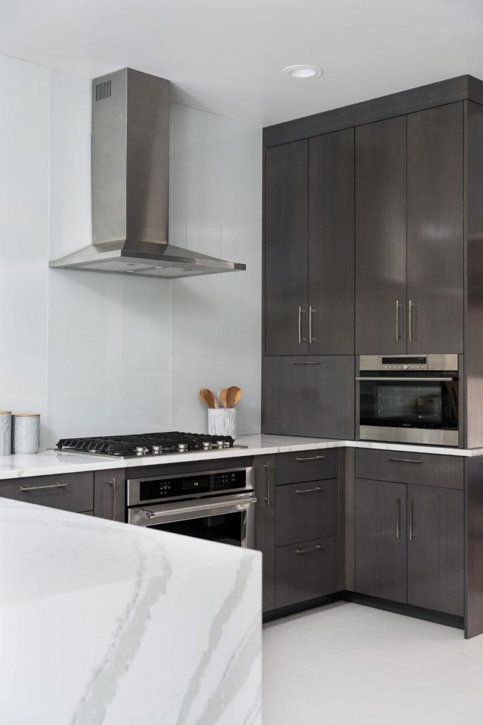

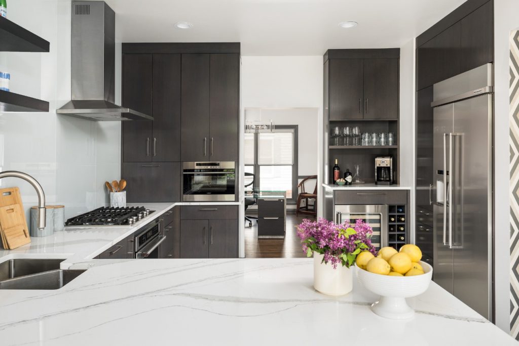
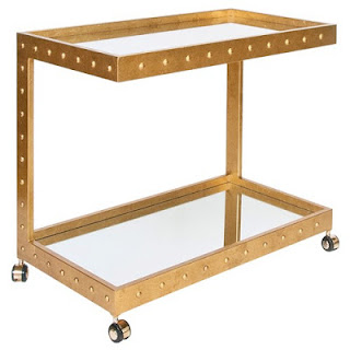
You’ll see we also added a wonderful wine and coffee bar in the corner.
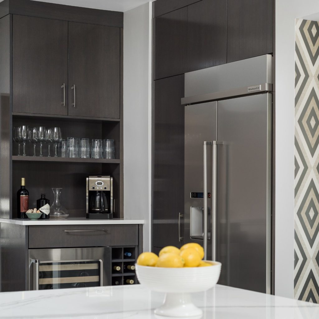
Let’s take a closer look at that backsplash … it is a back-painted glass. Perfect for the modern, minimalist look we were going for.
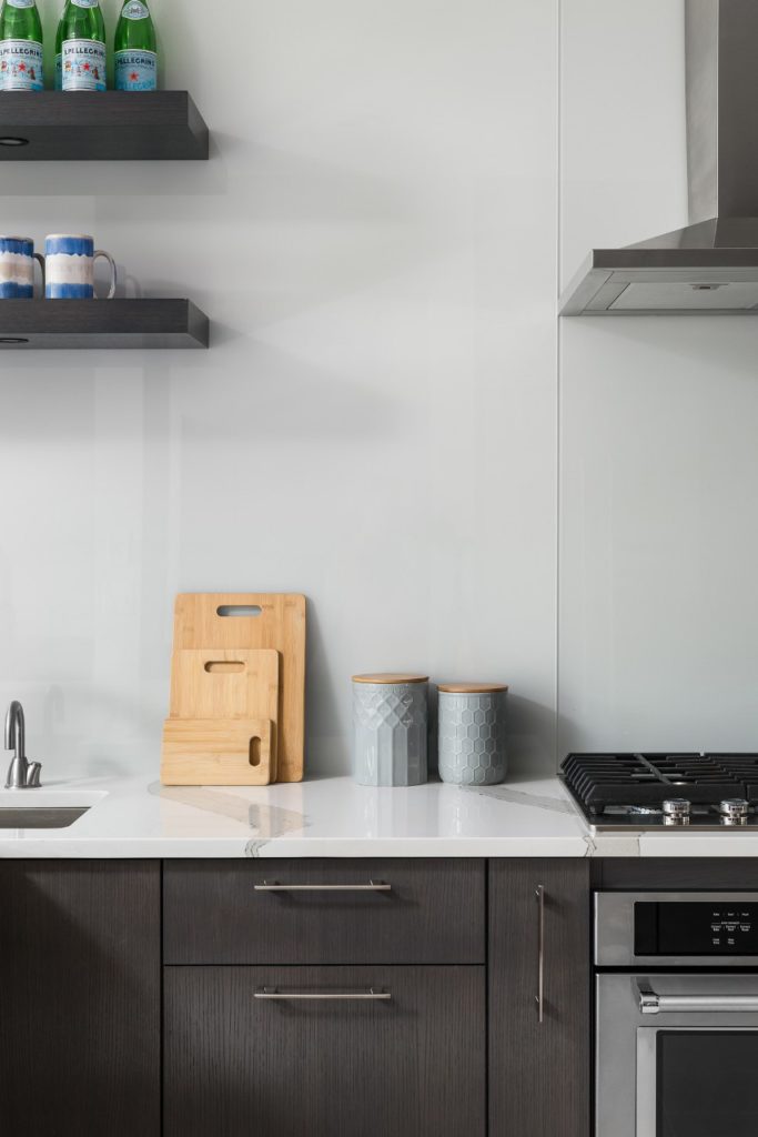
I absolutely love how this dark gray stain shows off the the striation in the wood.
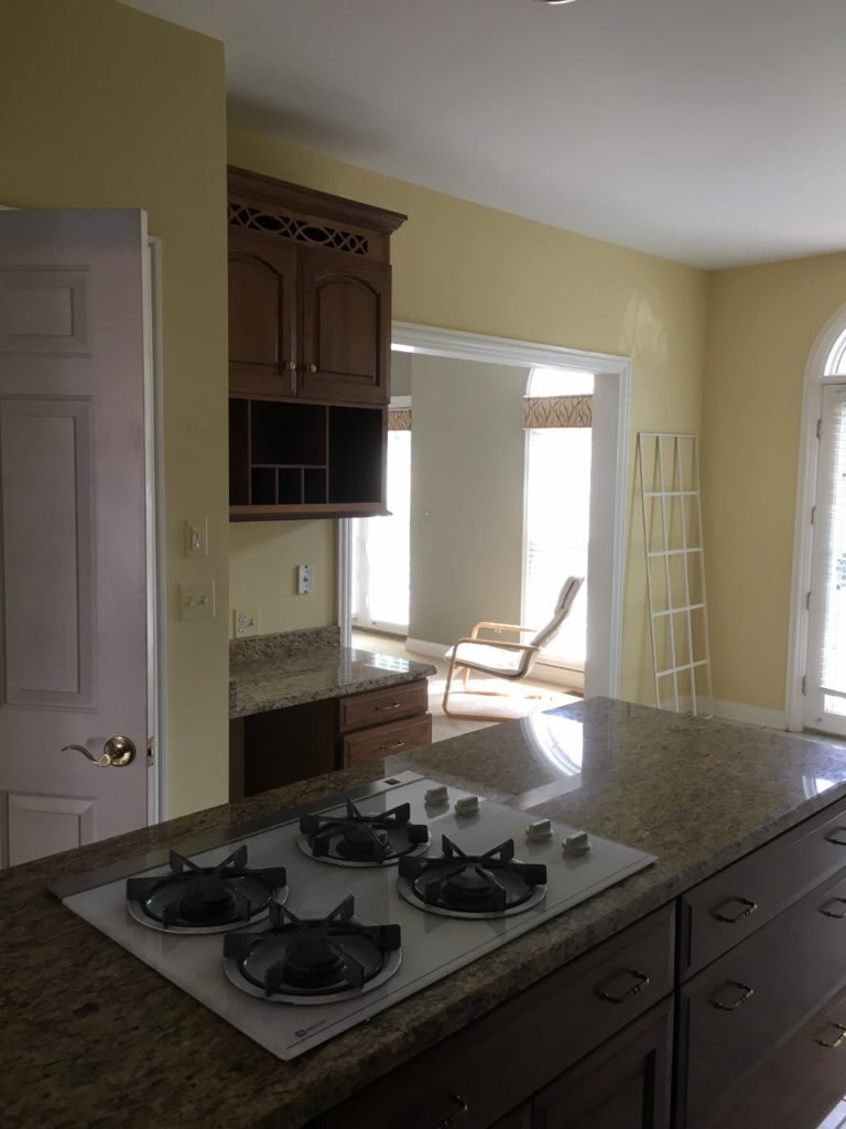
Okay so here is the old view standing in the kitchen looking towards the living room. My clients wanted this to be one open space for entertaining, so this wall came down.
Ready for the new view?
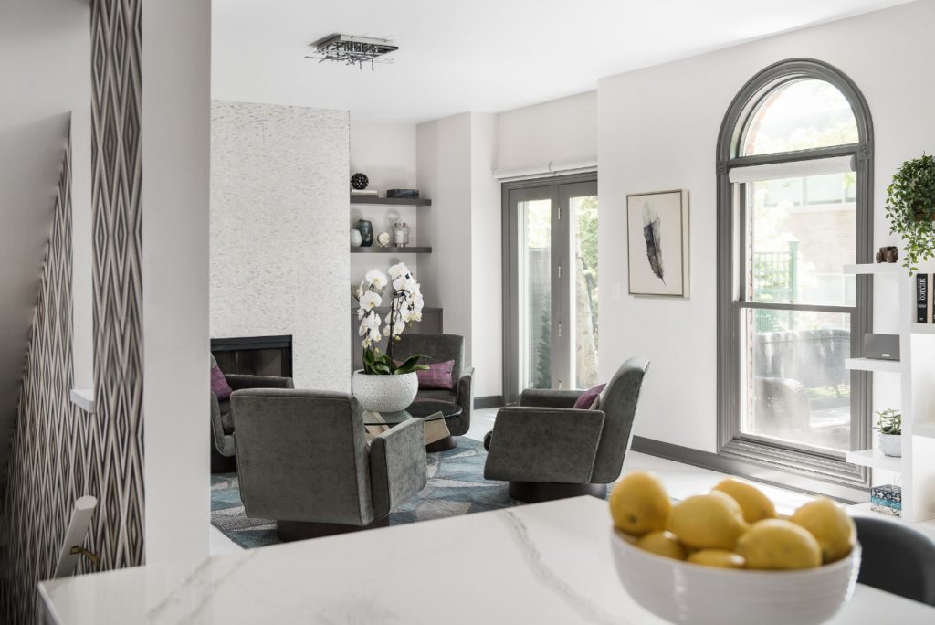
With the door gone and that stairway more open, we added a fun geometric wall paper to the stair well. And the living room? Let’s take a closer look at the before …
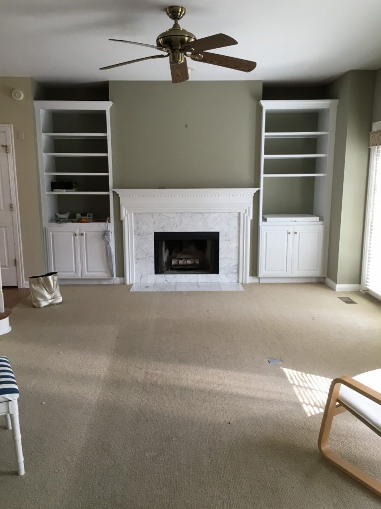
And the after …
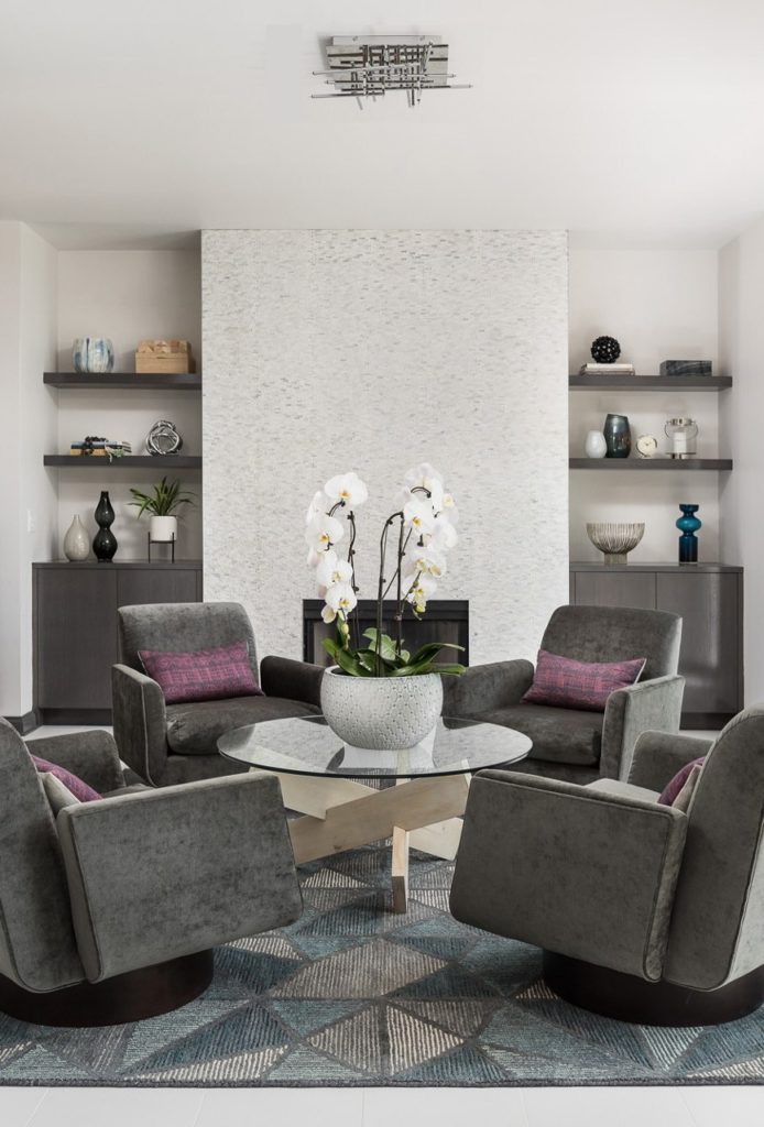
As you can see, we ripped out the fireplace mantel and surrounding tile and covered the entire thing in a gorgeous stack-stone mosaic tile. It provides gorgeous texture and a touch of shimmer. My clients did not want a TV in this room. I suggested doing four chairs surrounding a round coffee table to make this more of a conversation space with a loungey vibe. These mid-century inspired chairs from Mitchell Gold + Bob Williams swivel, so they can turn towards the kitchen area and unite the two seating areas. The wood and glass coffee table is from Wisteria and brings in a sculptural and organic element. The geometric rug from Loloi was the perfect way to ground the space and tie all the colors together.
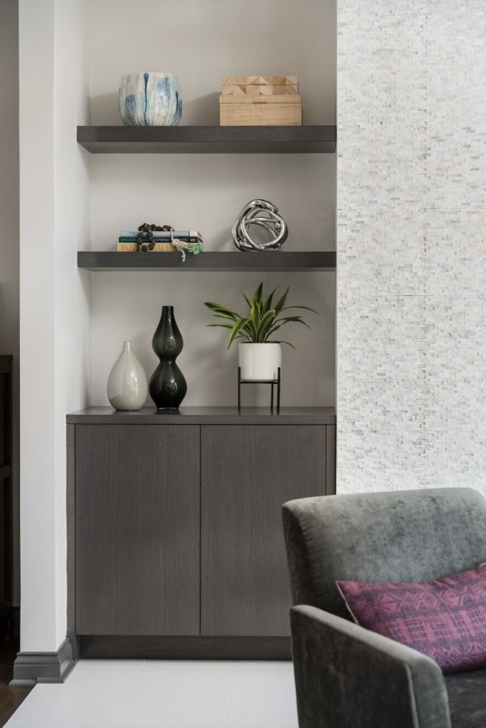
New built-ins were added in the same custom gray finish as the kitchen cabinetry. Floating shelves and no hardware are in keeping with our minimalist aesthetic.
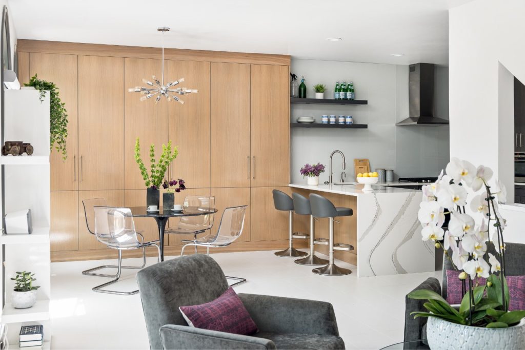
Now it is one big light and bright space, perfect for entertaining but also a cozy spot for my clients to relax, read the paper or chat after dinner with a cocktail.
At the front of the townhouse is the family room and my client’s home office. This was what it looked like when they moved in.
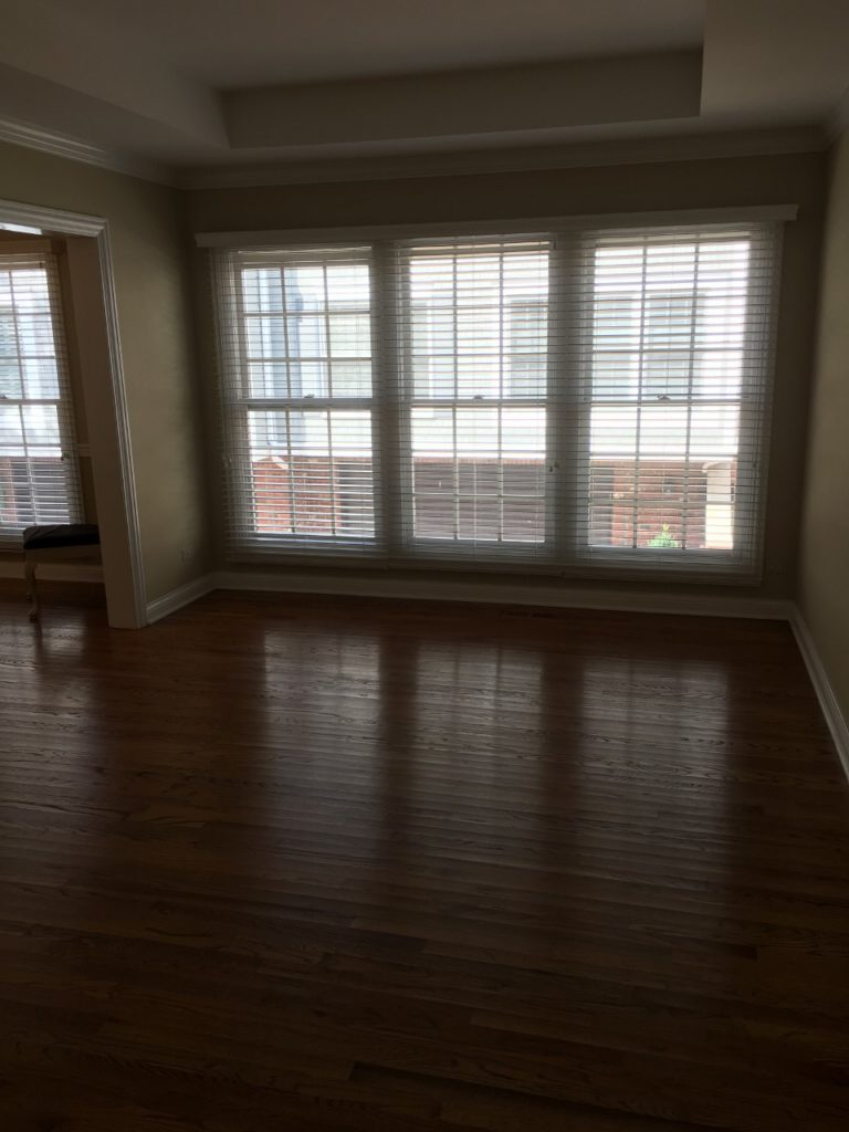
And now …
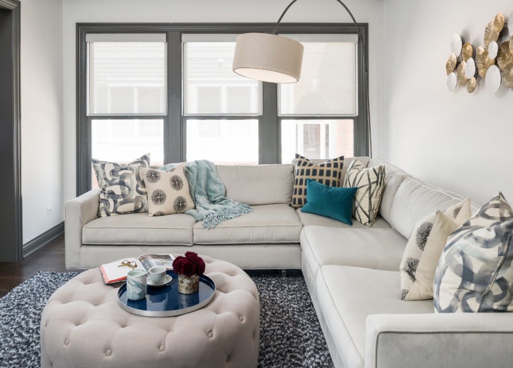
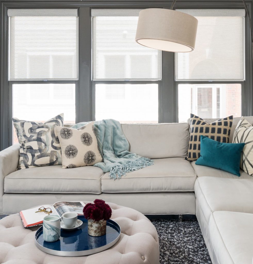
Cozy was the theme in this space. Since we did chairs in the living room – this is where we put a sectional – so the family could come in here to stretch out and watch TV. The shag rug from Loloi is so soft underfoot.
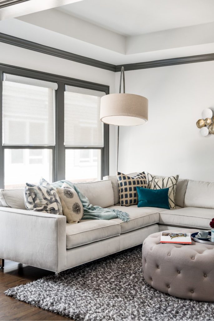
The sectional from MGBW is upholstered in a luxurious velvet fabric and the polished stainless steel legs add the modern touch we were looking for.
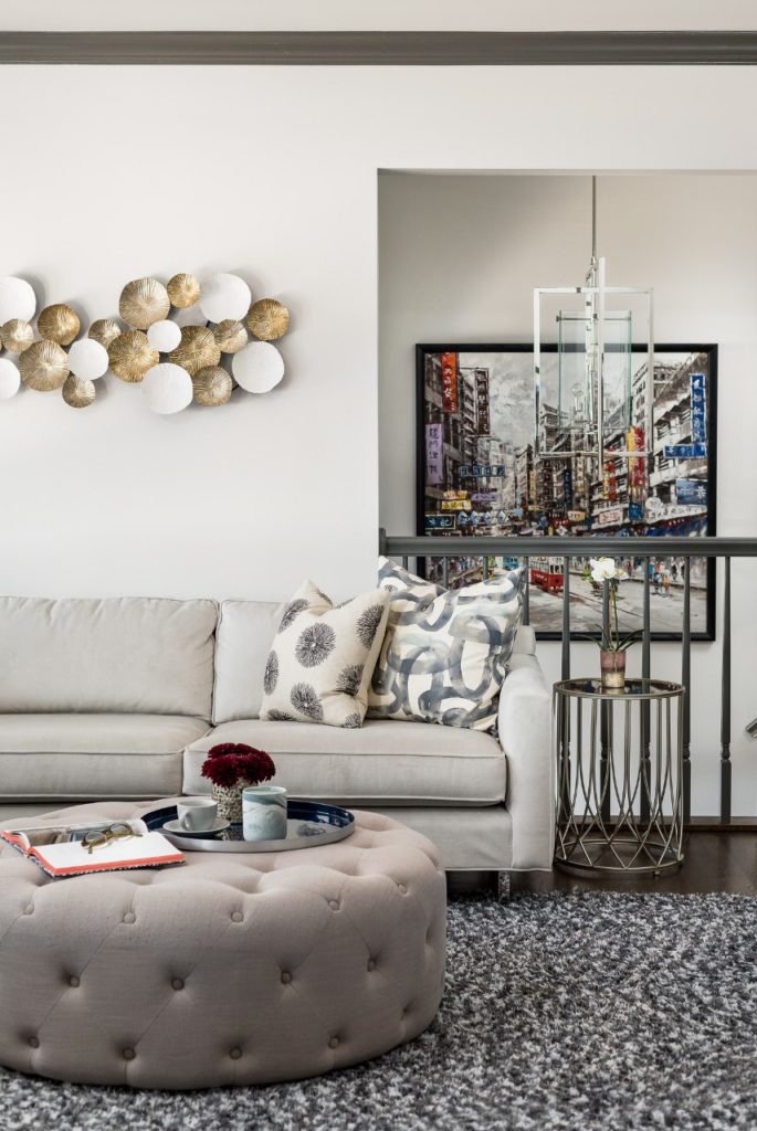
My clients have traveled the world – and they have collected quite a collection of eclectic art and accessories. I really wanted to keep the walls light and neutral throughout the space so that their pieces could really pop. Below you can see a favorite colorful piece from their travels that we incorporated into the front entry.
As a I mentioned before – this was such a fun project to be a part of as my clients were so open and eager to step out of their comfort zone. What a transformation!


