I’m so excited to share a two-part reveal with you this week! Especially during these gray, dreary “pre-spring” days, I think you’ll enjoy the bright and airy feel of these two rooms. First up, the Master Bedroom!
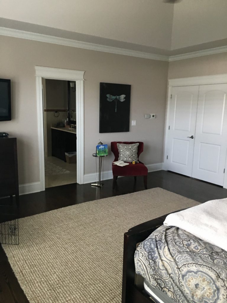
These clients are SO fun to work with. We really didn’t change much from my original design board and they were so ready for a completely different look and style than they had had in the past. Here is a picture of the master bedroom when I first saw it:
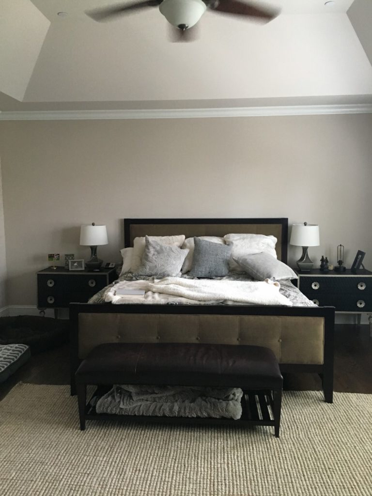
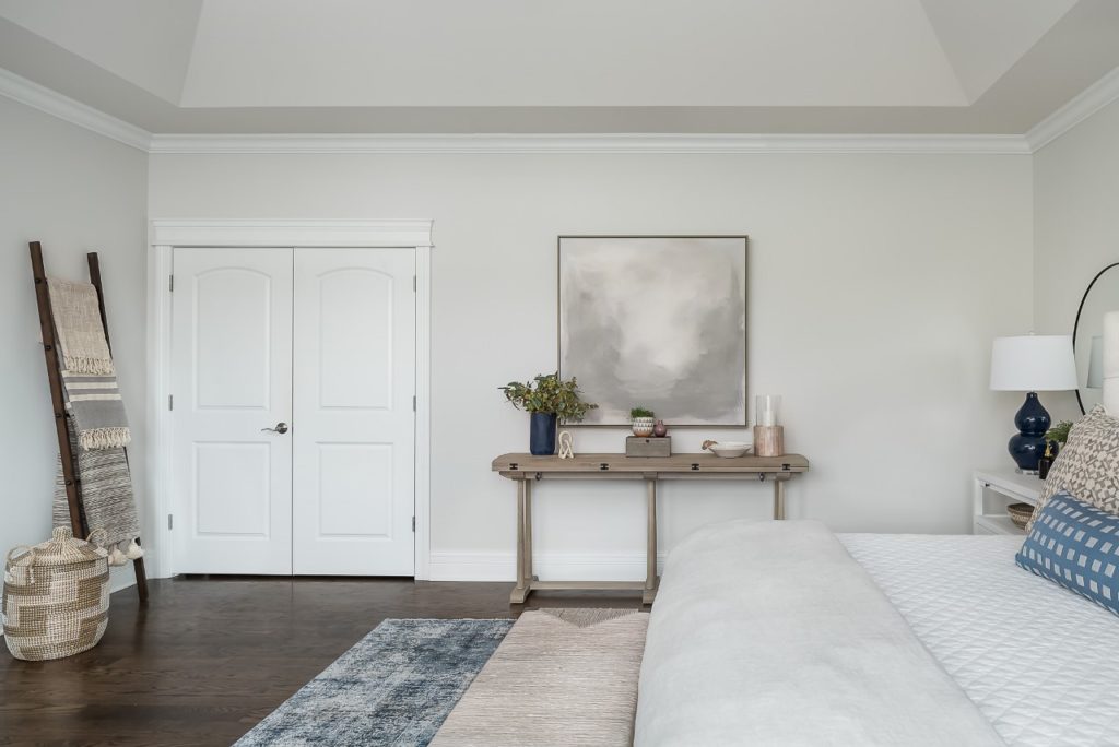
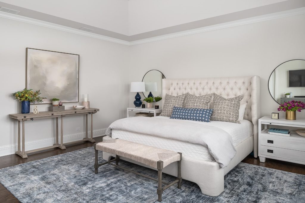
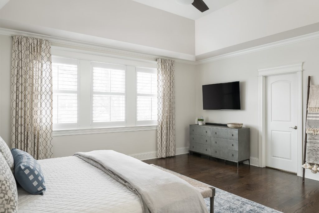
And here is the after …
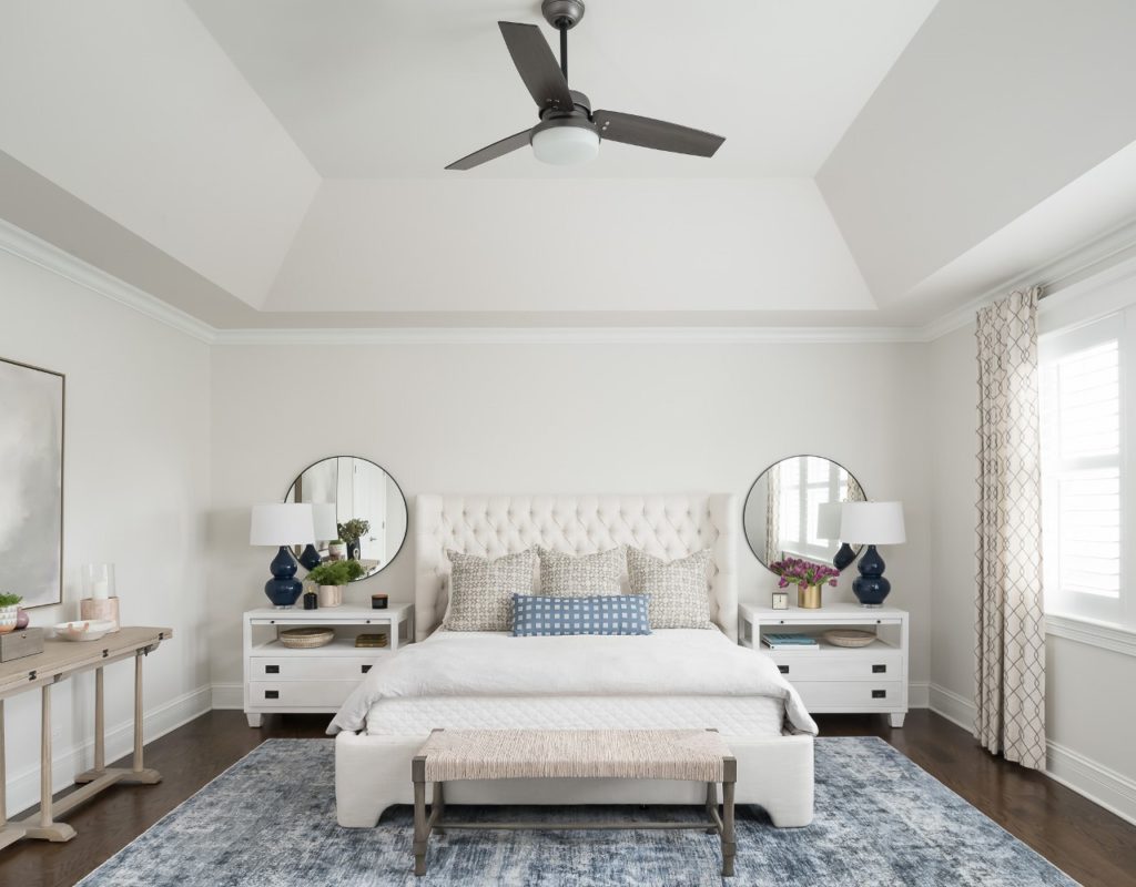
The only thing we kept were the drapery panels as they were fairly new, and I knew I could incorporate the classic pattern into my design.
Because this room does not get a ton of light despite the wall of windows, my goal was to keep everything as light as possible. We painted the walls my favorite Classic Gray by Benjamin Moore. It creates the illusion of a white room, without feeling too stark or cold. This room is a great example of how you can mix light neutrals: white, gray, ivory, taupe. Navy lamps and a soft blue rug injected a fun pop of color. And I specifically asked my photographer to capture the fan in this shot. There is often a debate about whether to go with a gorgeous chandelier in a bedroom or a fan. Oftentimes the husband wants a fan and the wife wants a chandelier. In this case, both husband and wife agreed that they love having a fan in their room but wanted to replace the ugly existing one. We found this sleek modern fan and I think it looks great. Form AND Function for the win!
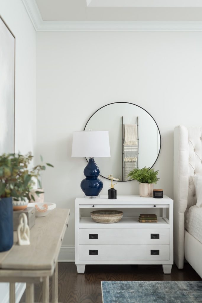
How pretty are these nightstands?
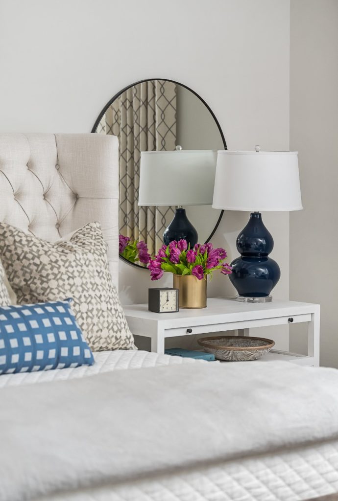
I love how much storage they provide while also giving ample space for pretty styling.

I love doing over-sized mirrors above a nightstand to reflect more light around the room and I find that it usually makes hanging anything over the bed unnecessary.
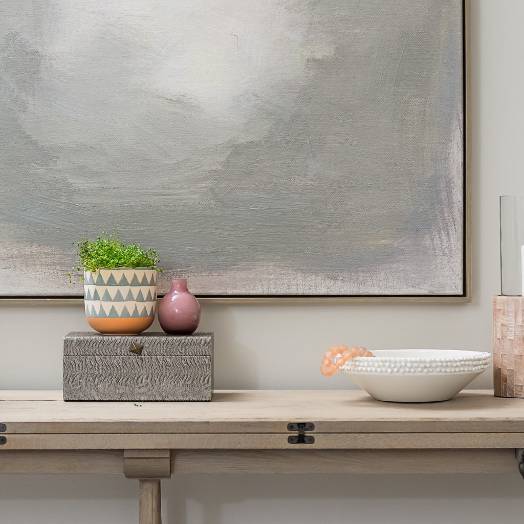
This room is huge and my clients weren’t sure what to do with this long wall …
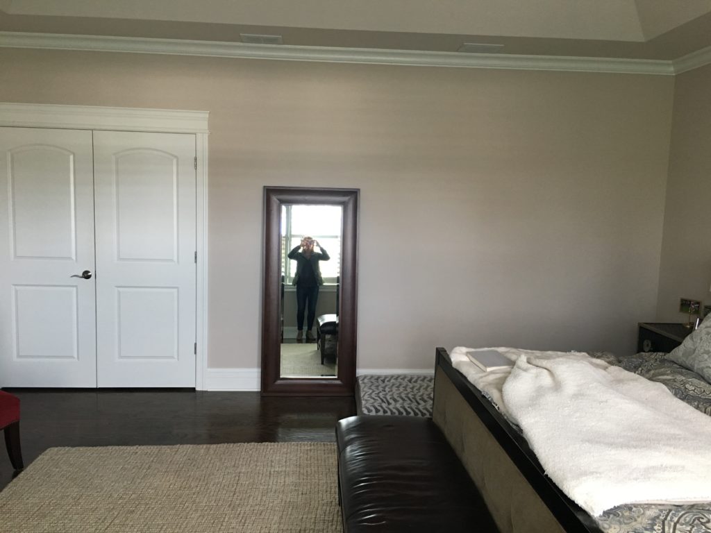
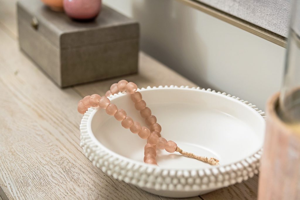
I knew it could be a pretty spot for art with a console beneath.
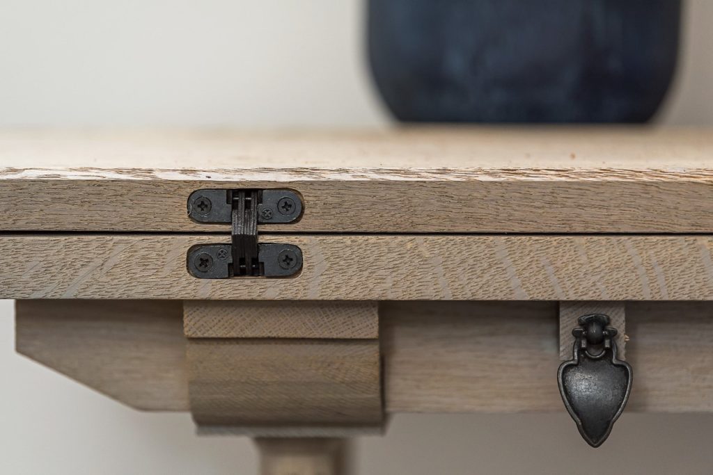
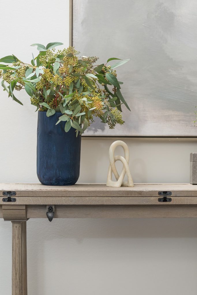
I love the details on this one.
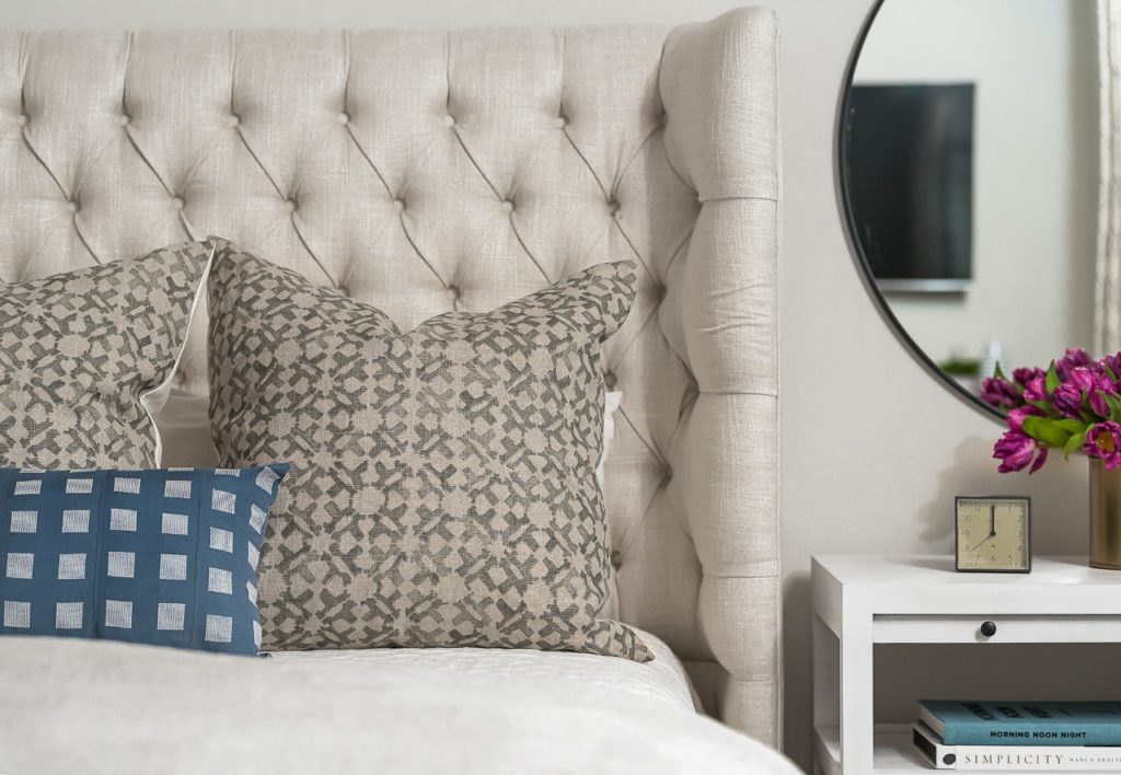
On a king-size bed, I like to use three large shams and one long lumbar pillow. I love the block print fabric on these shams mixed with the graphic pattern and color of the lumbar.
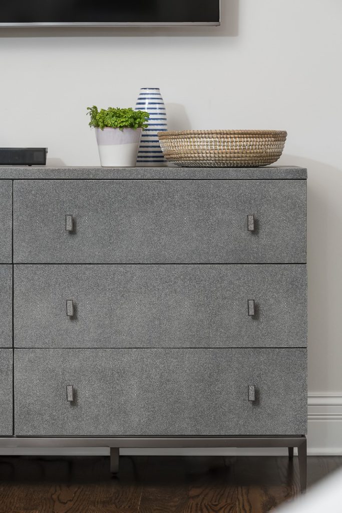
On the other side of the room is their TV, so we added a pretty dresser with a textured shagreen finish below.
And for the other “what-should-we-put-here?” space next to the bathroom door …
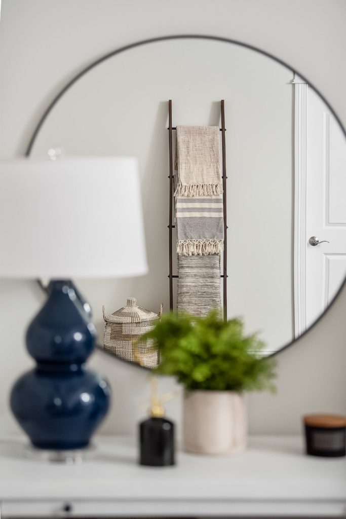
We simplified things with a pretty ladder to hold blankets and a fun little basket, as you can see in the mirror’s reflection.
While we talked about adding 2 chairs and a little table at the foot of the bed (they definitely had the space for it), we ultimately decided a new bench was all they really needed, and this was a great spot to bring in some more texture.
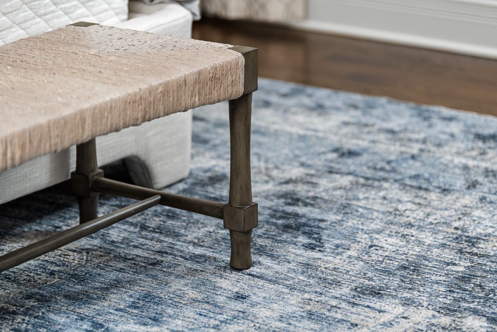
And how about this beautiful vintage inspired rug? The darker color makes it very …
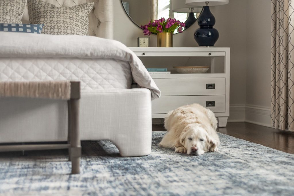
Pet-friendly!
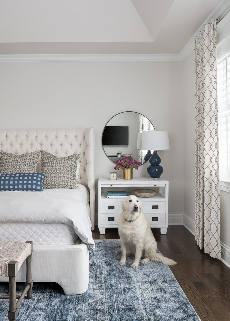
My clients are thrilled with their new room, which now feels more like a peaceful sanctuary. Check back tomorrow for the Before & After of their Living Room makeover.
Photography by Marina Storm: Picture Perfect Photography
