• Home
  • Portfolio
  • About
  • Blog
  • Services
  • Clients
  • Contact

Swoon Interiors

interiors that make your heart skip a beat.

Patience Makes Perfect: Part Three

November 9, 2022

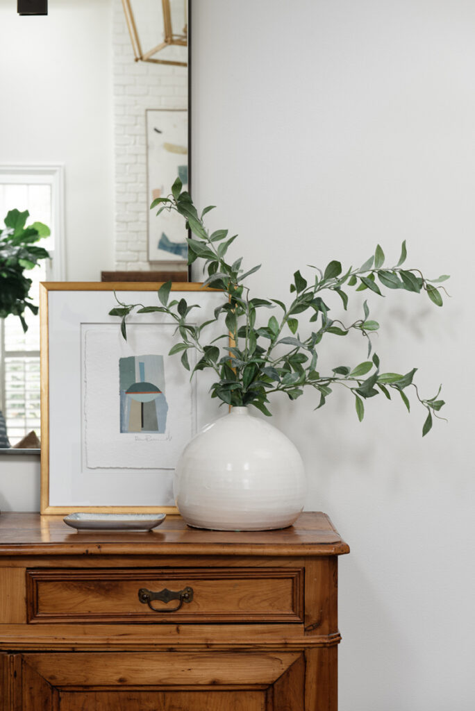
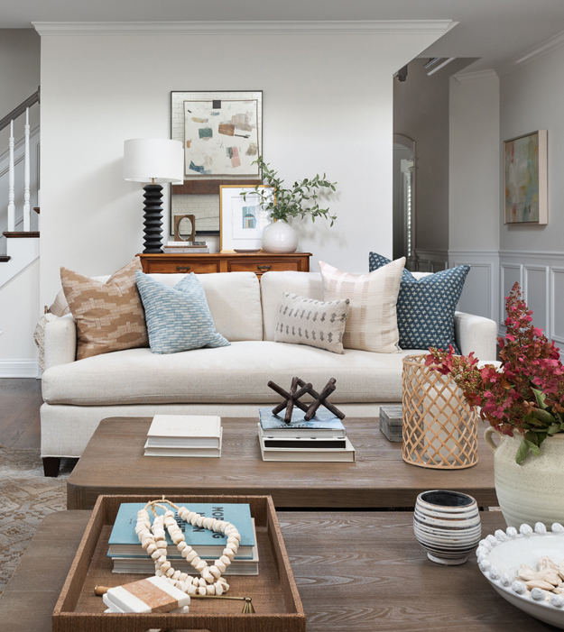
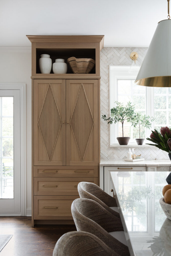
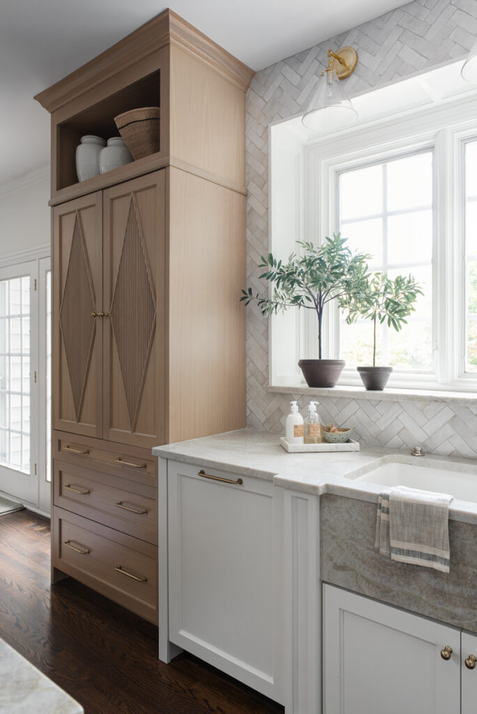
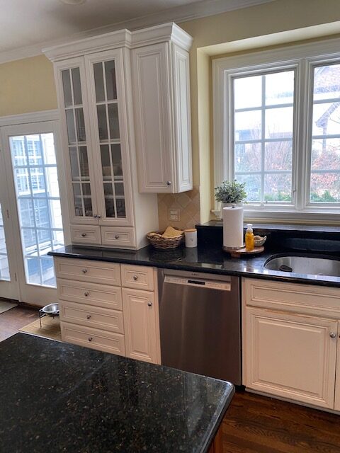
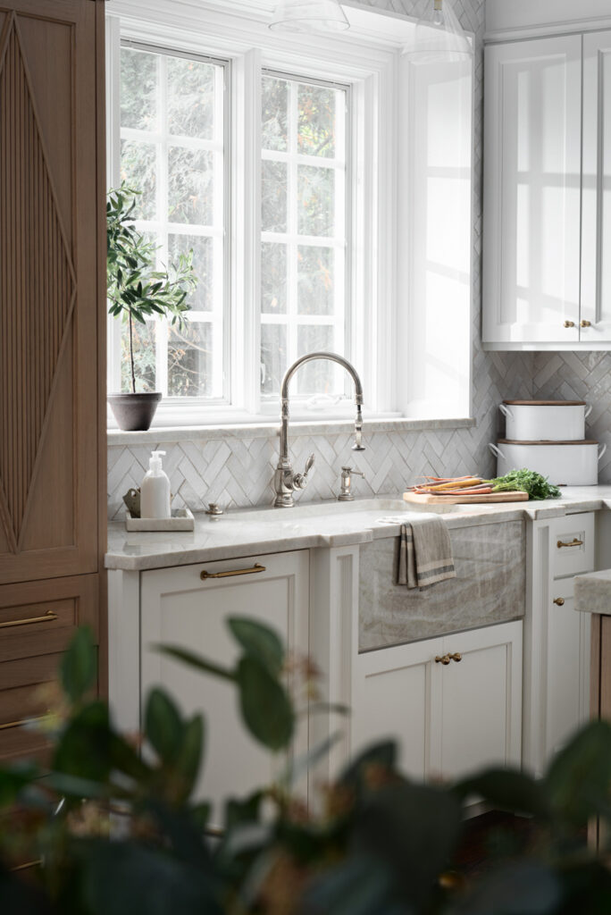
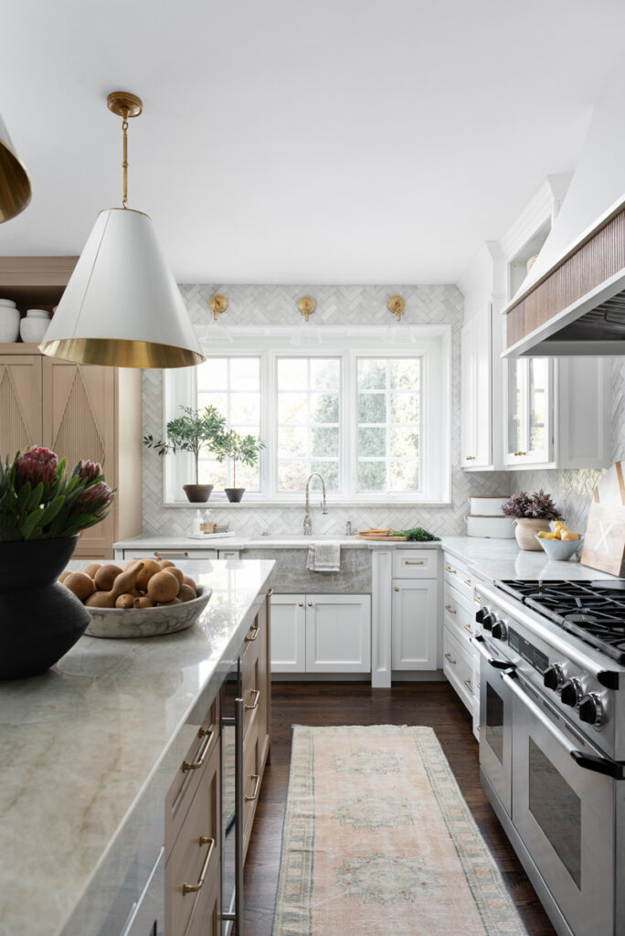
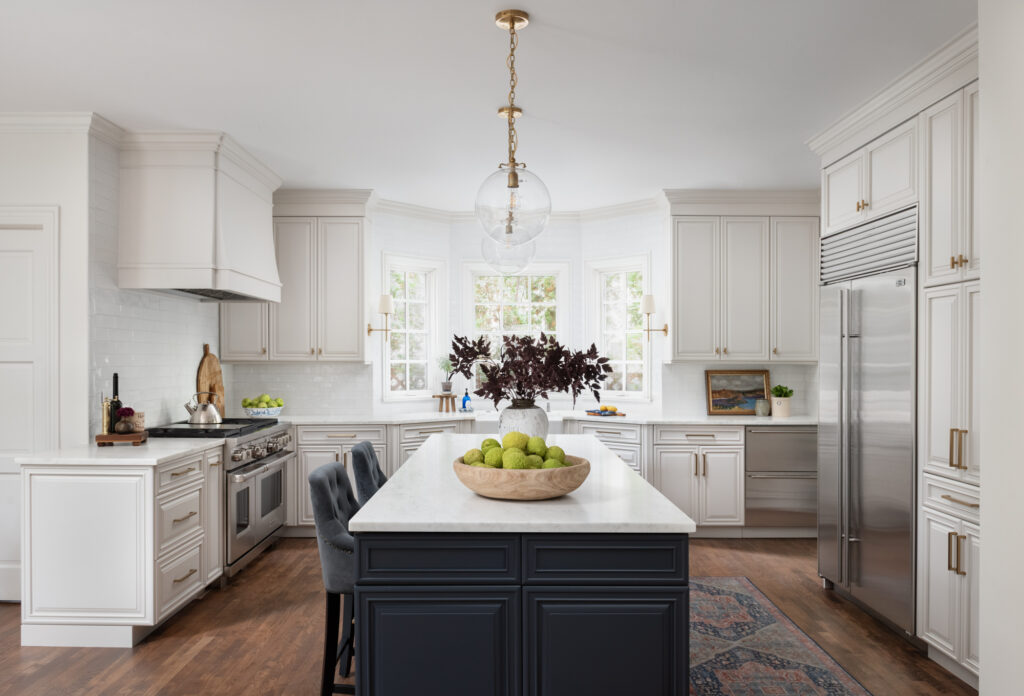
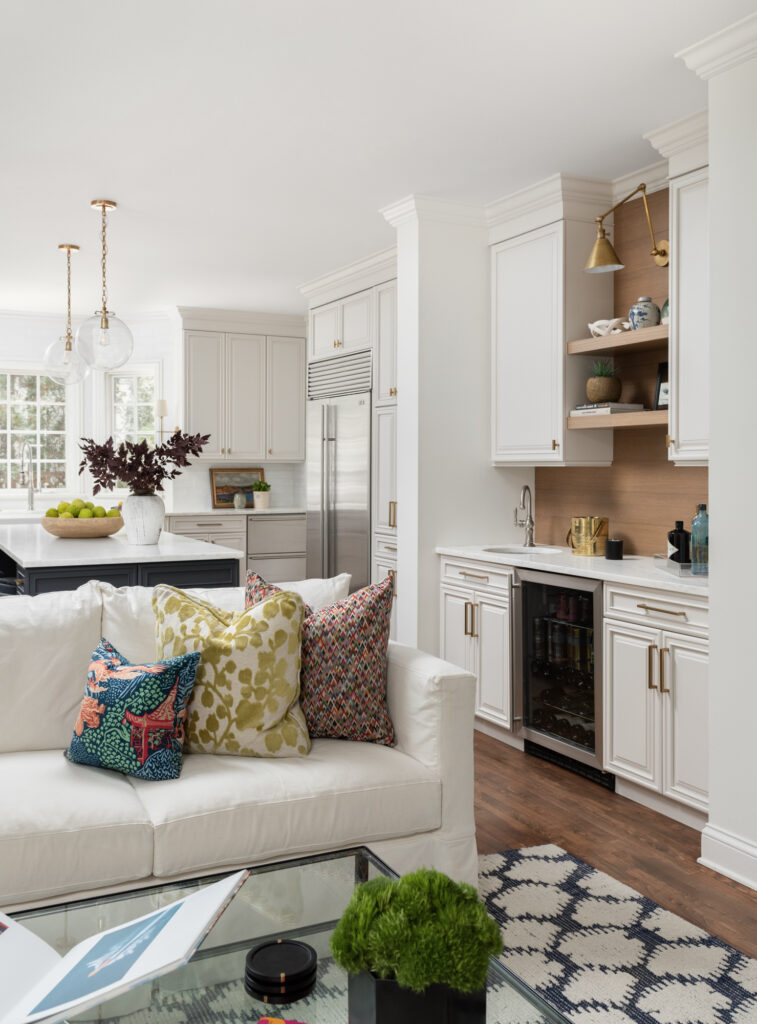
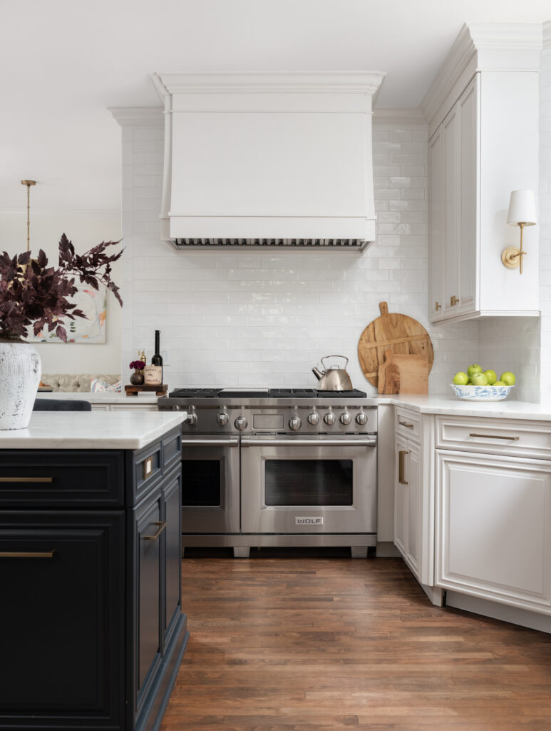
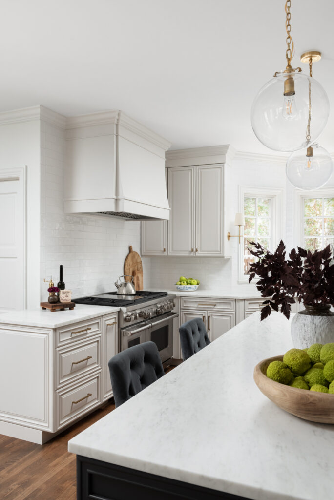
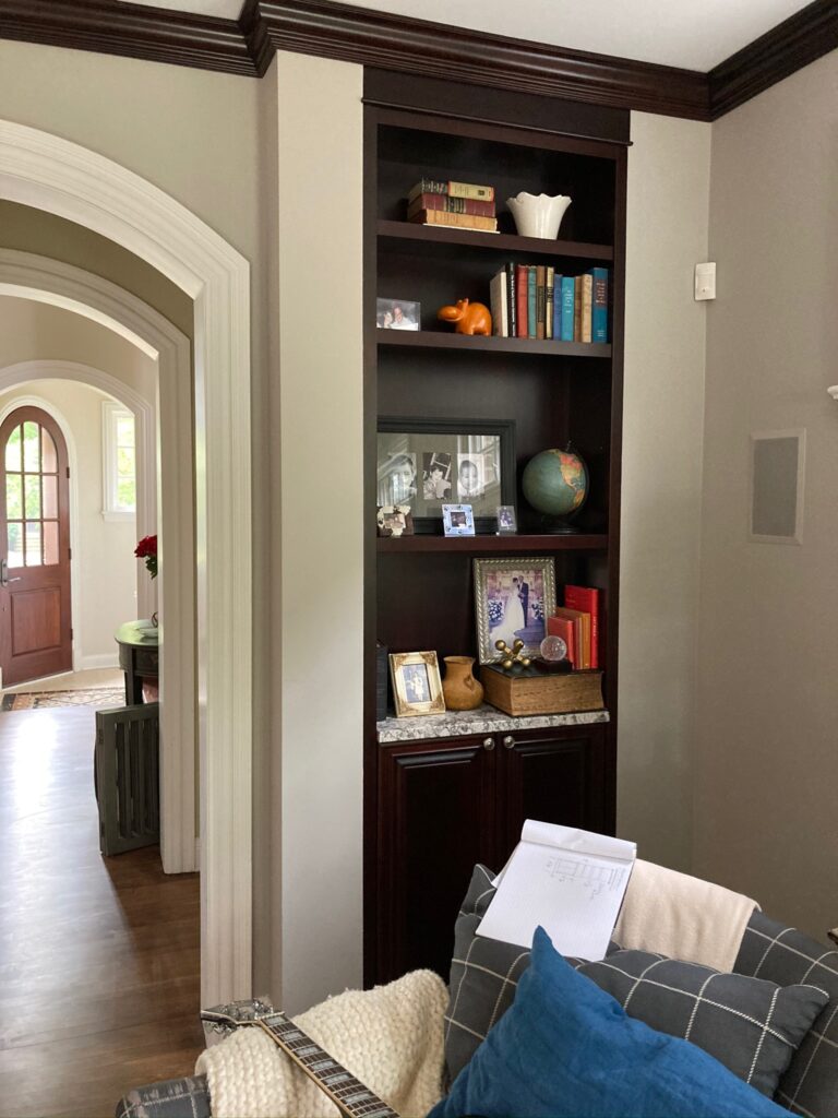
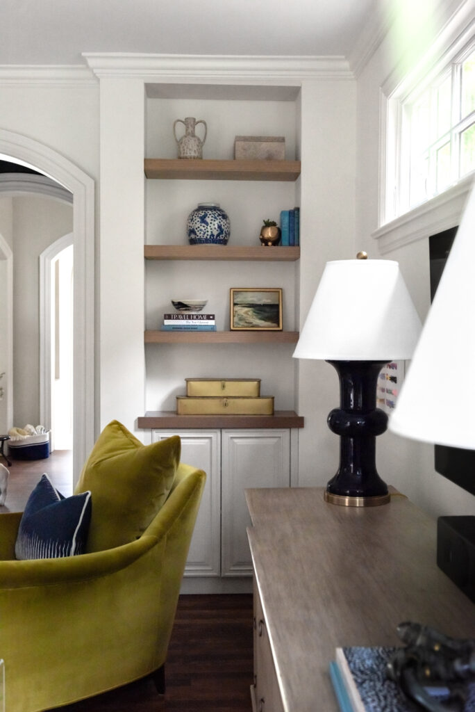
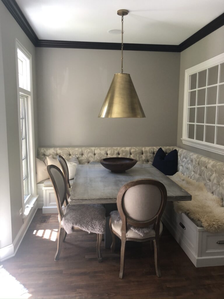
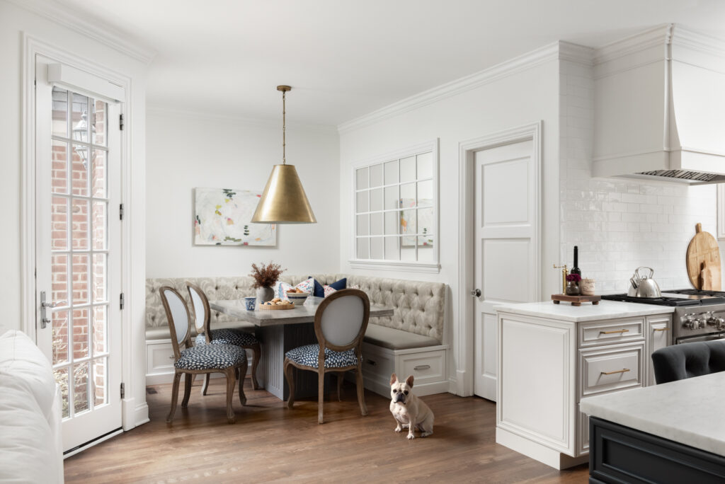
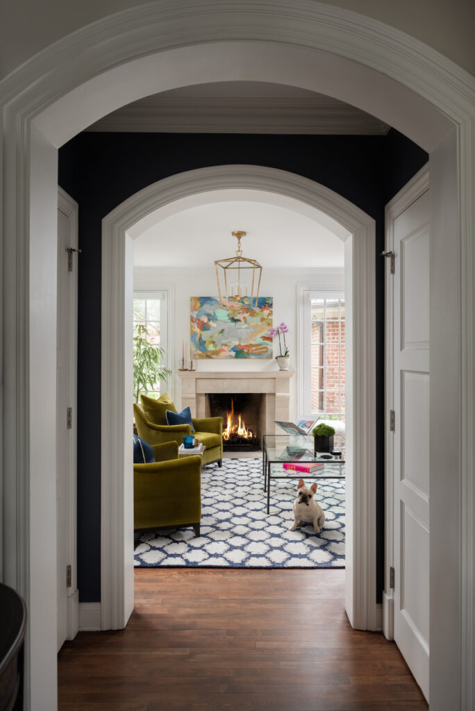
Back again today with Part Three of this lovely home’s transformation. In case you missed them, here are links to Part One and Part Two … the Kitchen and Family Room.

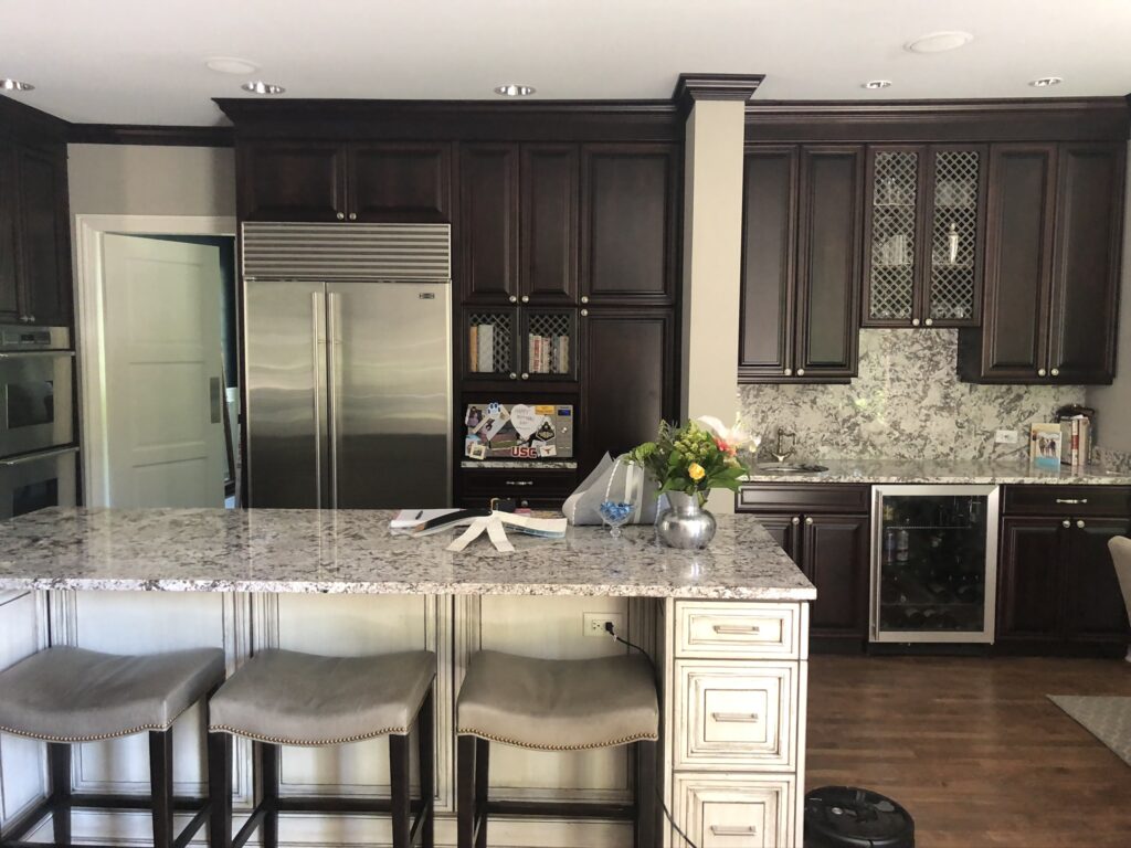
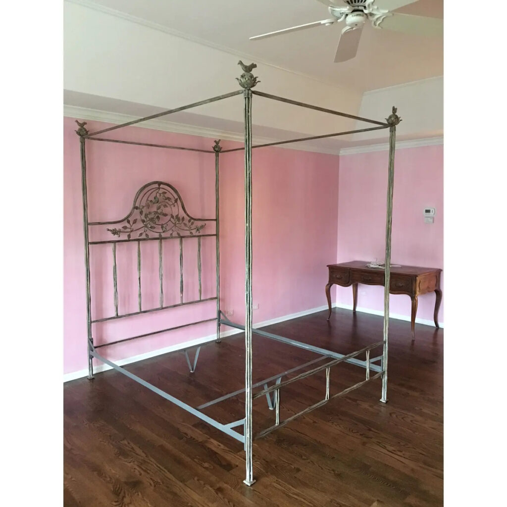
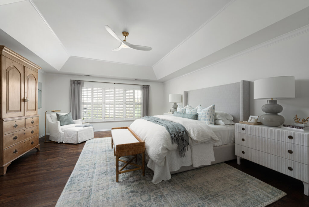
Today we are heading into the Master Bedroom! This room started out with pink walls. The bedding was a pale blue with shades of pink and sage green in a kind of Chinoiserie pattern that featured Chinese lanterns.   Drapes were sage green, and there were two bergère chairs in off white against the windows.  One side of the bed had an antique pine chest and the other side was a skirted table. On top were two large Cornflower blue lamps. While I don’t have a Before photo of the whole room, below is a picture my client had on Chairish to sell the existing bed, It gives you some idea of where we started.

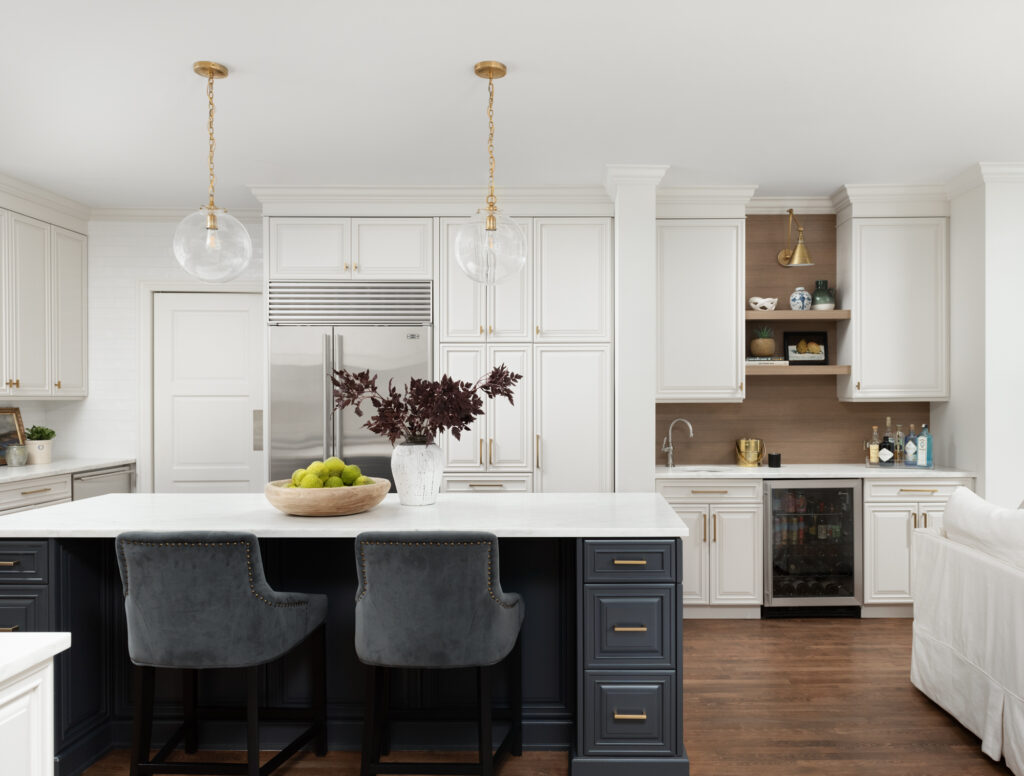
And here it is today!

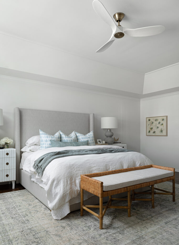
It feels so elegant and serene. With all of the bold colors and patterns of the original design, the goal here was to keep things soft and quiet and I think we achieved just that.

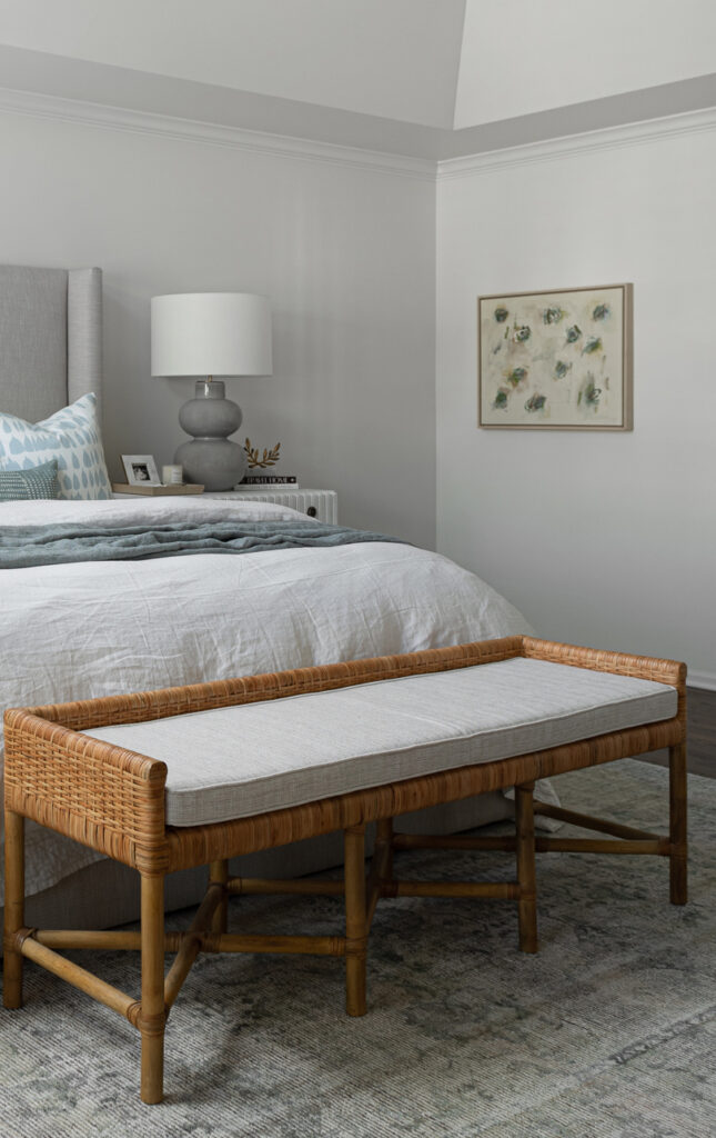
With tray ceilings like this, my preference is to take the paint color all the way up and to the ceiling to avoid a harsh line as in the first photo. We painted this room Sherwin Williams Alabaster.

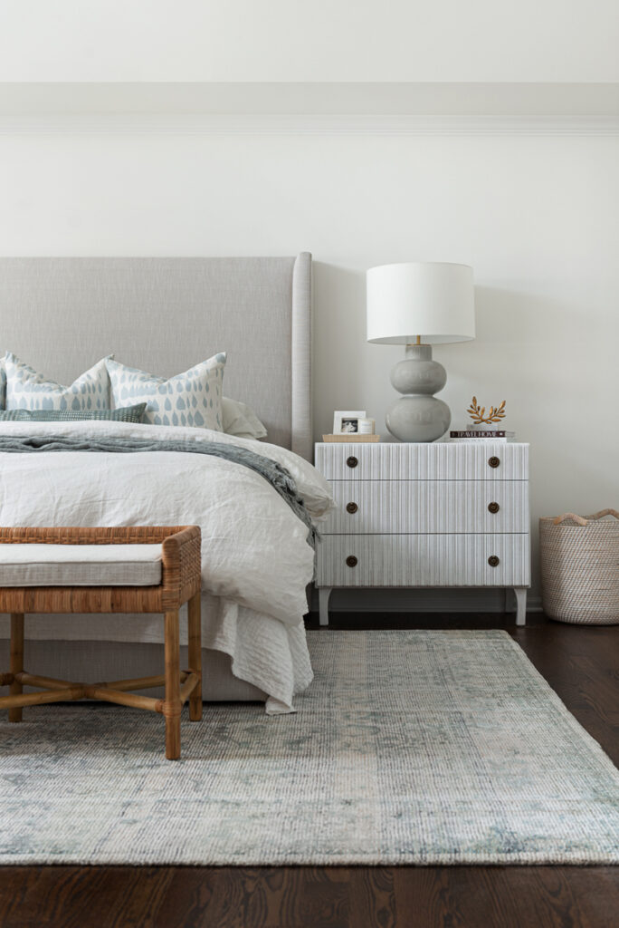
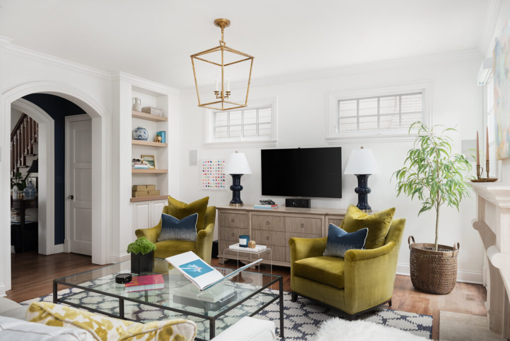
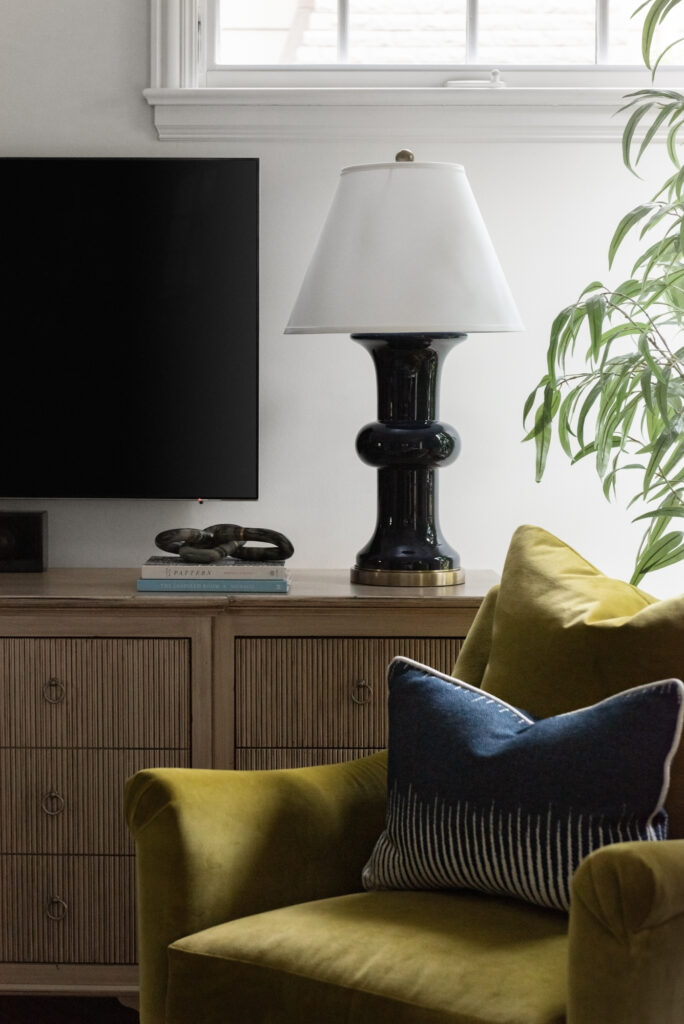
This shot shows a few of my favorite elements. First, the bedside lamps from Circa Lighting … that shape is so good! Next, the lovely rattan and wicker bench at the end of the bed adds some warmth and texture.

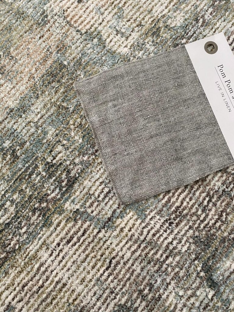
Also, the gorgeous rug from Loloi (one of the first things we got and the colors were really our jumping off point for the room. Sadly it is no longer available.)

And let’s talk about these dressers we used as nightstands …

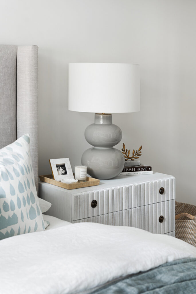
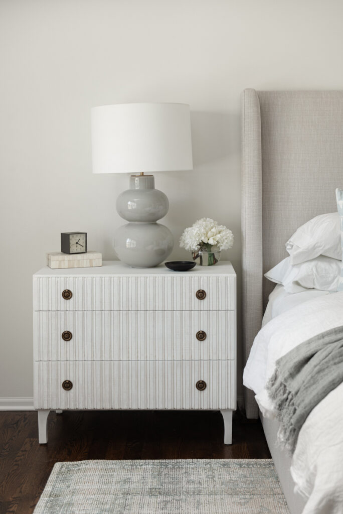
From Noir Furniture, the Daryl dresser is just gorgeous with the reeded fronts and vintage-inspired brass pulls. The white-washed finish was perfect for our soft breezy look while still leaning traditional which was important because we wanted to keep this beautiful traditional armoire that my client already owned …

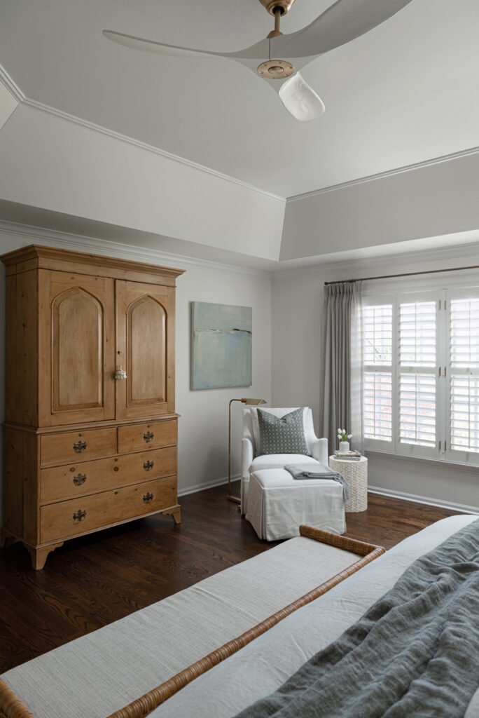
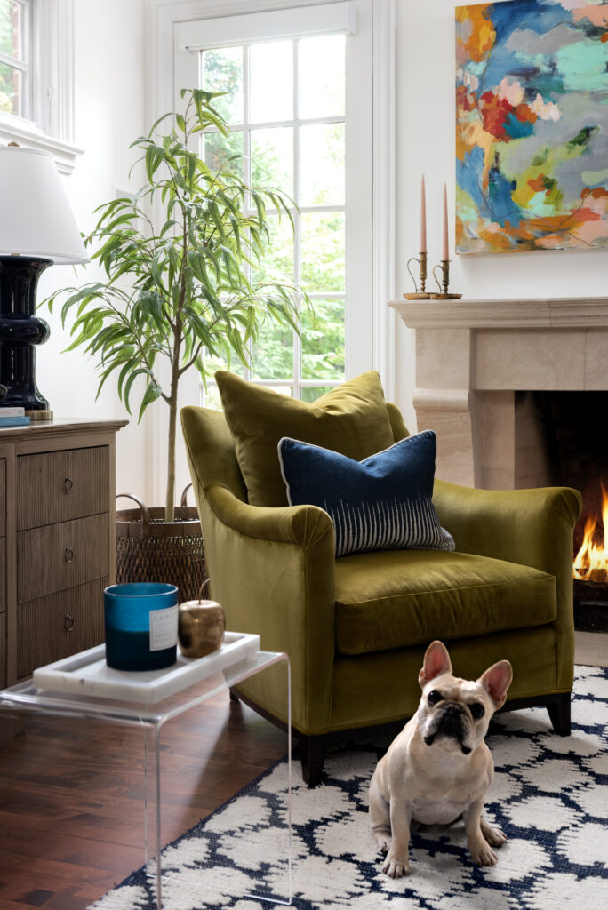
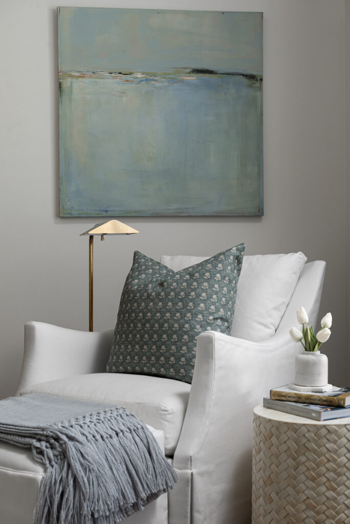
I just love this corner vignette. The chair and ottoman are from Highland House. The fan is the Maverick from Circa Lighting. We were so happy to find a BEAUTIFUL fan!

artwork by Jacquie Gouveia

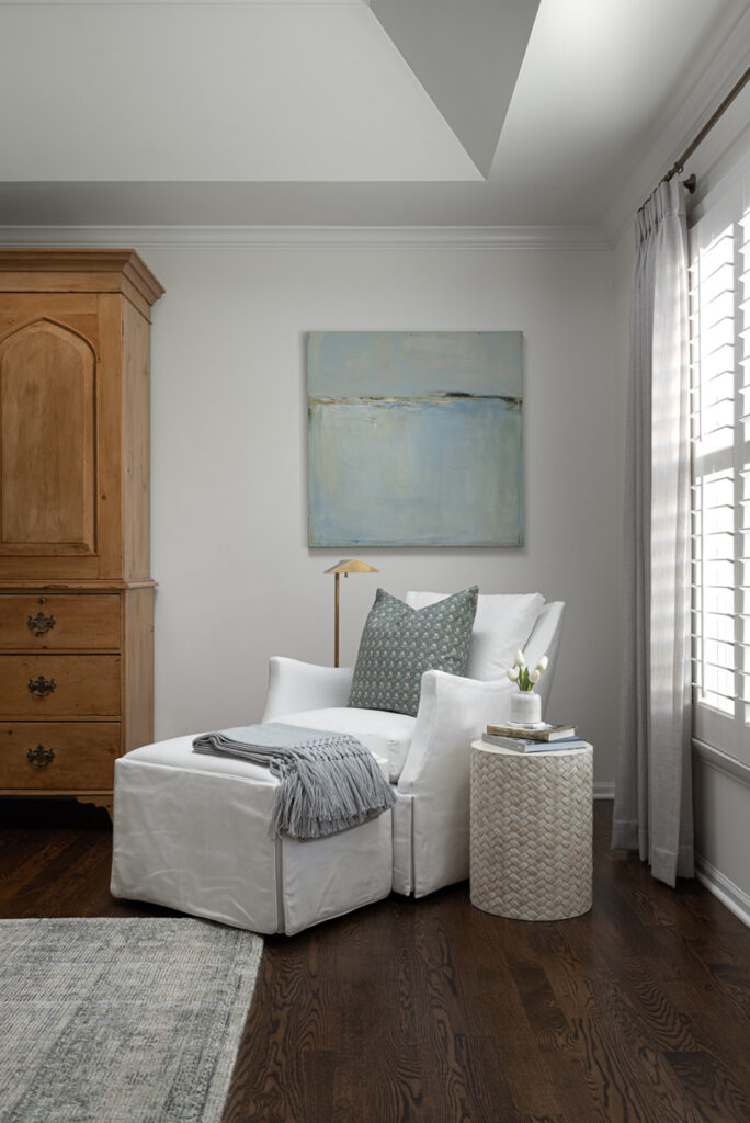
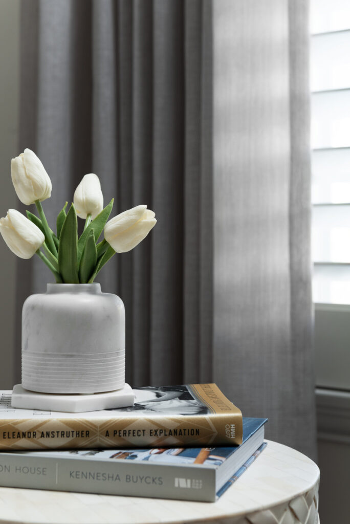
The gorgeous abstract landscape is by Jacquie Gouveia and brings our soft color palette to this corner perfectly. The pharmacy lamp is from Circa and the side table is from Wisteria (no longer available). We loved the basket weave texture.

artwork by Jacquie Gouveia Pillow from Jolie Marche

The lovely sheer drapery panels you see in the background were custom-made by Karen Flanagan of Sew Special Designs.

Here you can see how they flank the windows and soften that far side of the room.

The bedding we selected is from Pom Pom Home – a beautiful white linen with subtle frayed edges and one of their lovely throws to add some color at the end of the bed.

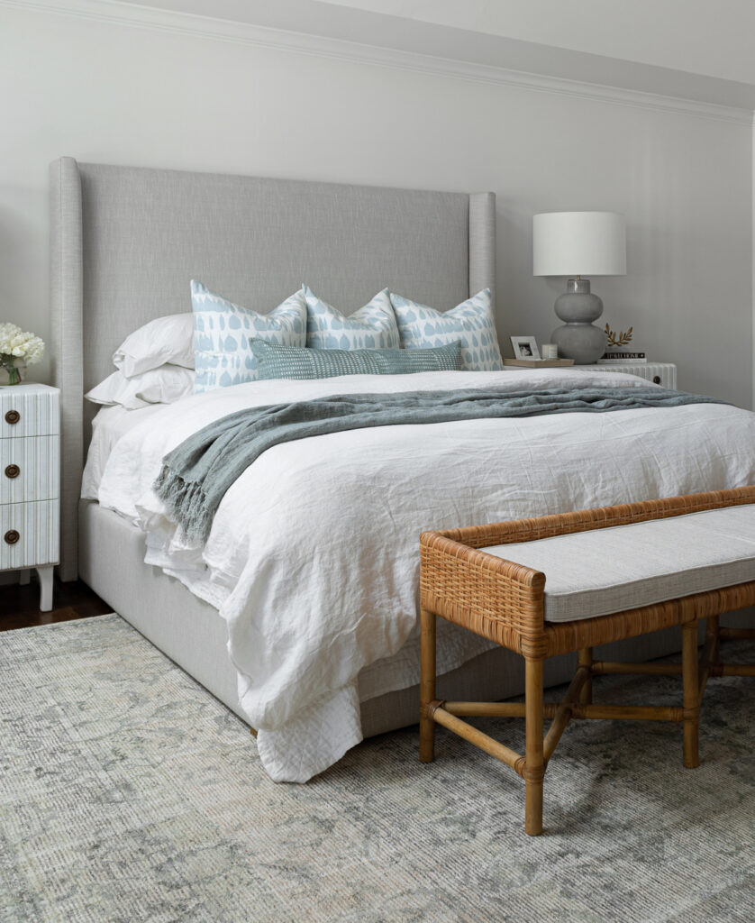
We decided on a fun combo of decorative pillows from Chloe and Olive on Etsy and Jolie Marche. I love this set up of three large pillows in front of the sleeping pillows with one long lumbar. It feels special but not excessive.

The bed is the Lawson Shelter bed from RH and was chosen for it’s extra tall height, eliminating the need to hang anything over the bed.

Instead we hung this fun abstract entitled “Swirls” by Kristin Blakeney on the large wall next to the bed. My client is hoping to secure another piece by her to hang with it – but her new releases go fast!

artwork by Kristin Blakeney

So that’s the Master Bedroom! Such a calm and soothing place to retire at the end of the day. That was the goal! Thank you for following along on this three day journey of this beautiful home. And thank you once again to Marina Storm of Picture Perfect House for her wonderful photography.

Leave a Comment · Filed Under: antiques, artwork, bedding, bedroom, Before & After, bench, blankets, chairs, client files, client projects, curtains, headboards, house tour, lamps, light fixtures, lighting, linen, master bedroom, nightstands, old and new, paint colors, pillows, Restoration Hardware, rugs, tables, textiles, wall art, window treatments

Patience Makes Perfect: Part Two

November 8, 2022

If you missed yesterday’s post, Part One, click here to read the background story and see the Kitchen Transformation.

I hope you enjoyed yesterday’s post. Moving into the Family Room … this is the only picture I have to give you a feel of the “Before” look …

(This is sweet Chloe, who greeted me at the door every time I came over. She passed away this summer and it felt so sad not to have her there for Photoshoot Day.)

You can see a little bit of some of the previous elements … traditional furniture, rug, window treatments in shade of red, green, gold.

Here is the room today …

Such a transformation! We definitely lightened things up but with those tall ceilings and white walls I wanted to bring in some warmer-toned elements. Two-story rooms can be tricky, the architecture is beautiful but as a Family Room, you still want it to feel cozy.

One of my favorite features of this transformation was adding this beautiful wood paneling to the ceiling. And of course, this stunner of a Chandelier naturally draws the eye up. The existing skylights bring in lots of light.

Here is the view from the Kitchen …

While most of the pieces in this room are new, we were able to incorporate some things from the previous design.

We reupholstered this chair from the first picture that is oh-so-comfy and solidly built.

We painted this brown-stained wood Built-in a crisp white to match the trim, added new doors and hardware.

This gorgeous cabinet was not touched but we added a modern lamp, accessories, art, and mirror.

artwork by Renee Bouchon

Layering art over a mirror is a favorite look of mine. This collage by Renee Bouchon is beautiful.

Speaking of art, let’s go back to this beautiful piece over the fireplace.

I shared a peek of this beauty on Instagram awhile ago. We commissioned it from Jennifer Daily and were able to really customize the colors we wanted.

artwork by Jennifer Daily

The red brick fireplace was painted white and we added a reclaimed wood mantel.

All of the other furniture in this room was thoughtfully selected. My client previously had a matching sofa and loveseat and the layout worked well for TV viewing. But this time I suggested doing two different sofas. With sleeker arms, we could get more seating. When doing two different sofas in the same room, I like for them to be as different as possible. So … fabric+ leather, light+dark, bench cushion + three seater.

I love an eclectic mix of pillows – these are from Susan Connor and McGee and Co.

The coffee tables required thinking out of the box. A single coffee table, even some of the larger ones, was not working to fill this large space and serve booth sofas. I was worried it would feel too dinky. I suggested using two rectangular coffee tables and my client loved the idea. Not only are they functional, but there is even more space for styling all the fun and pretty things!

A few other favorite elements we added. This gorgeous wool rug from Loloi Rugs …

This adjustable height side table from Noir Furniture …

And of course, a room with these high ceilings and windows called for a tall tree. This beautiful Fiddle Leaf came from English Garden Flower Shop.

Ok, that’s all for today. Thank you again to Marina Storm of Picture Perfect Photography for her photography. Come back tomorrow to see the transformed Master Bedroom!

Leave a Comment · Filed Under: accessories, antiques, artwork, Before & After, chandelier, client files, client projects, coffee table, fireplace, house tour, light fixtures, lighting, mantel, old and new, painted cabinets, pillows, reclaimed wood, styling, tables, Uncategorized

Patience Makes Perfect: Part One

November 7, 2022

A beautiful transformation years in the making …

I am so excited to share photographs of this project with you today. I first started working with this client exactly five years ago. When we first met, she walked me through the house they had built 20 years ago. It was a beautiful traditional home on a grand scale filled with lot of antiques and furniture they had invested in. As in so many homes built and decorated at that time, there was lots of red and gold, formal custom draperies, honey oak floors and overstuffed upholstered furniture.

She explained to me that they wanted to start updating things. But in a house of this scale, they knew it would not be an overnight process. They weren’t interested in “quick fixes” and changes. She wanted to take time to make the right selections, save for pieces she really wanted, invest in custom pieces, sell many of the investment pieces she had collected but no longer fit her style, and have fun in the process.

I am kicking myself that I did not take more “Before” pictures – but at the time, it didn’t feel like a typical Before & After project. We were on a journey and the destination seemed far off. Throw in a worldwide pandemic and the resulting product and shipping delays, and the years stretched on.

My client is also an avid art collector – and she had already purchased quite a few pieces she had fallen in love with. Many were abstracts, modern, light and airy with bold and fun colors. These certainly didn’t fit in with the traditional Red, Gold, French Country vibe of the rest of the house, but they became a jumping off point for our overall vision.

So floors were refinished, walls were painted shades of white, things started to be sold on Chairish, we decided what pieces could be incorporated into the new design (I still love a mix of vintage and modern) and started searching for the perfect … sofas, tables, lamps, rugs, nightstands, bedding … each and every item was very thoughtfully selected.

Of course, paint and furniture can only take you so far … what about an outdated kitchen? Well, of course, we brought my favorite kitchen designer, Stephanie Frees of Plain & Posh in for that!

And so that is where I will start with the photographs. I am going to break this up into three posts of my three favorite rooms. Part One today is the Kitchen. We did take photos right before demo started and this is what it looked like.

And here it is today …

Can you believe it? And this was not a full gut remodel. The perimeter cabinetry mostly stayed but got new doors and height added at the top. The island and tall wood stained cabinet to the left of the sink are new and custom built and Stephanie hand-drew the design of the new range hood. Isn’t it gorgeous?

The beautiful reeded detail came from our idea to add this special element to the new island and cabinetry. Bringing it over to the hood just tied everything together, don’t you agree?

Here is that same view before …

Lets talk about that sink, shall we?

We were so in love with this stunning Quartzite we chose for the countertops we wanted to feature it further in a custom apron-front sink.

We scoured Etsy for vintage runners and this one was our favorite for pulling in colors from some of the artwork we commissioned for these spaces … such as this whimsical piece by Marissa Voytenko.

After falling in love with her work, we realized Marissa is local to the Chicago area. She graciously hand-delivered this piece to my client, saying it isn’t often she gets to see in person where her art will hang in someone’s home.

This area used to be a small desk – common in so many kitchens for many years, but no longer needed or practical in a modern kitchen.

The new cabinetry by Plain & Posh is a beautiful replacement, don’t you agree?

artwork by @marissavoytenko

Some other special features of this kitchen – the lighting. That picture light above (a favorite), the pendants over the island and all sconces are from Circa. (I actually have those same Goodman pendants in my own kitchen – I love them so!)

artwork by Julia Rymer

Styling this new kitchen was such a treat!

artwork by John Tee

Of course, I must talk about this backsplash! There were so many times in the design of this house that my client and I could almost agree on things telepathically. We were both in love with the look of Zellige tile and it seemed that all of our favorite kitchens we had Pinned or saved pictures of used Zellige tiles … so it was just one of those … “Well obviously we are going to do Zellige!” moments.

Zellige Tile is a variety of glazed terracotta tile originally handmade in Morocco. It is kiln-fired over olive-branches, giving each tile a unique glaze, color and texture. No two tiles are exactly alike, so every application ends up being a unique tapestry of color and texture.

Once again, rather than make a quick decision, we got samples from a few different companies. And then, because there is inherently so much color variation, we ordered more samples over time to get an overall feel for the variation. Ultimately, we chose Clé Tile’s Zellige in Weathered White.

Installation of this tile, especially in the herringbone pattern we wanted, is not for the faint of heart! It took 5 days of labor and many hours of going through boxes to mix the colors. But definitely worth it!

Another way we added texture … these beautiful stools from Restoration Hardware.

Marisol Seagrass Slope Counter Stool

As we get ready to head into the family room in tomorrow’s post, these shots below give a good example of how we were able to incorporate the old with the new …

The dining table and chairs were custom well-loved pieces my client had invested a lot into years ago and wanted to see if they could still work.

The chairs were so unique I definitely wanted to be able to keep them. We had new cushions made of faux ostrich leather by Sew Special Designs and a custom rug made by Carpet Showcase to break up the wood-on-wood. I think the setup ads a lot of unique character to the space.

A huge thank you to Marina Storm of Picture Perfect House for capturing this space so beautifully. Be sure to come back tomorrow to see the Family Room. It’s a beauty!

Leave a Comment · Filed Under: artwork, Before & After, cabinets, client files, client projects, hardware, house tour, kitchen, kitchens, light fixtures, lighting, mixing metals, rugs, styling, tile, Uncategorized, wall art · Tagged: Before and After, kitchen

The power of color: Before & After

November 15, 2021

Oh it feels so good to have completed projects and photo shoots again! This Before and After is an especially warm and uplifting one as we head into these shorter, darker days and colder temps.

I’ll admit, when I first walked into this client’s house my initial thought was, I wonder what she needs me for! Ha! They had a very sophisticated space with lots of unique details, lighting, art and furniture. She admitted to me that she had done the whole “neutral” thing … lots of gray, white, ivory, beige … but she was over it! She wanted to bring in some bright and fun colors. The neutral palate had actually made the space feel darker. And the kitchen, with it’s dark brown cabinets and granite countertops wasn’t helping the situation since it was an open layout with the family room.

Teaming up with Stephanie Frees of Plain & Posh Distinctive Cabinetry Design again for her amazing kitchen designs, we set out to transform the space with color and brightness.

Before:

After:

Looking towards the kitchen before …

And now …

Bright and cheery is now the best way to describe this space. Can you believe the transformation?

First, I’ll delve into what we did in the family room. My client loves navy (me too!) … but what brighter colors could we add to the space? After selecting this fun rug from Serena & Lily …

Hi Stella!

… and a new crisp white slipcovered sofa from Crate & Barrel for a comfy casual feel, my client said she’d love to bring in bright chartreuse and pops of pink.

We decided her existing chairs with their great shape were the perfect opportunity to go bold with a luxurious chartreuse Velvet. Karen Flanagan of Sew Special handled the reupholstering and made our custom pillows.

Next – can we talk about his amazing art by Heidi Becker?

The bright happy colors draw you into the room from the front door and tie all of our selections together.

We said goodbye to gray walls and dark trim and painted everything Benjamin Moore White Dove, always a great backdrop for pops of color and bold artwork.

On to the kitchen …

Besides just painting the perimeter cabinets (Benjamin Moore Classic Gray), there were other things we could do to make it not feel so heavy. Removing the cabinets above the windows was one thing that just opened up that whole area by the sink.

We also added a white farmhouse sink and more lighting with these classic sconces.

The cabinetry surrounding the range also felt heavy. Stephanie designed a beautiful and sleek new custom hood that allowed us to bring our backsplash tile all the way up to the ceiling.

The island was originally painted with that distressed finish that was so popular for awhile. I suggested we bring our favorite navy color into the kitchen and onto the island. It was a hard-sell at first, but we landed on a pretty dark blue-gray custom color that just really ties into the family room and makes the new honed marble countertops pop.

Let’s talk about this busy wall. We decided to simplify things by adding solid doors next to the fridge and giving the bar area a whole new look.

Rather than doing the same backsplash in this area, we wanted it to feel a little different … and the natural wood shiplap and shelves bring some nice warmth to this white kitchen.

As you can see in the before picture, this large kitchen never had any pendant lighting over the island. We chose the Katie Globe pendant to tie in with the other brass Circa Lighting fixtures she had in the space. And you can see the Boston Double-Arm library light there above the shelves in the bar area.

The dark cabinetry of the kitchen also carried into the family room in the form of this corner bookshelf.

We lightened it up as well and used the same wood shelves from the bar area in a custom stain.

Finally, the breakfast nook got a little love too …

We needed to bring some fun pops of color to this area as well and these chairs presented the perfect opportunity.

A mix of navy cheetah print and pinstripes and instantly the space feels much more fun!

Stella agrees!

As we all have been spending more time in our homes during this crazy pandemic, creating spaces that feel happy, bright and uplifting seems even more important. Bring in colors, patterns, and artwork that bring you joy. Simplify spaces that feel chaotic or heavy so that you can feel the comforts of a home that makes you happy.

Photography by the talented Maria Storm of Picture Perfect House. Thank you, Marina!

Leave a Comment · Filed Under: Before & After, kitchen, Uncategorized · Tagged: Before and After, family room, kitchen

Next Page »

I'm a mom, wife and interior designer who loves creating lovable and livable spaces for both my family and my clients. This is my little space to share inspiration, ideas and projects. I hope you'll come along for the ride!

Let’s Connect!

  • Facebook
  • Instagram
  • Pinterest

Subscribe Via Email

Instagram

swooninteriors

Swoon Interiors Inc.
One month into 2025 and it’s been a busy one! So One month into 2025 and it’s been a busy one! So many creative projects in the works and I’m not mad about it! I’m not one for resolutions - but I’m going to TRY to be better about sharing more of these fun projects this year … stay tuned!
Pinch me - I was with Jean Stoffer last night! (Ju Pinch me - I was with Jean Stoffer last night! (Just before she flies out to LA for the Emmys!) what a wonderful event at the Monogram Design Studio learning Jean’s tips and tricks for setting a beautiful holiday table. (It doesn’t have to be perfect or match … lean into nostalgia with vintage pieces and found treasures from travels and take advantage of faux greens … just to name a few!) Plus the talented chefs at Monogram served up the most delicious snacks using their amazing Five-in-One Wall Oven. I’m excited to set my table for Christmas Eve this year and I may just be using Jean’s idea of tying velvet ribbons to vintage coupe glasses. Oh and the dried orange garland!  What are your favorite things to add to your Holiday table?
was was
The uplifting power of a fun stair runner …. Swi The uplifting power of a fun stair runner …. Swipe ➡️ to see the before. So lucky to have a great local source for my clients in @carpetshowcasedesign. The best in personalized service and a curated collection of rugs to choose from.
Quick site visit yesterday to check out the finish Quick site visit yesterday to check out the finished product of my clients beautiful new pantry. The soft palette, vintage rug,
pretty wallpaper, custom peg rail, drawer pull cut outs, gorgeous quartzite and dreamy lighting … it’s all …👩‍🍳💋 Chef’s kiss!
Travel always provides such inspiration for artist Travel always provides such inspiration for artists, writers, designers … and the Lake Como region of Italy is no exception. I couldn’t get enough of all the saturated colors, beautiful stone, arches, and colorful shutters. Each and every building is so unique and charming. #ladolcevita #designinspiration #travelphotography #lakecomoitaly
Love getting photos sent from Virtual E-Design pro Love getting photos sent from Virtual E-Design projects when I can’t see the results in person! Swipe to see the original photo this client sent me asking what they could do to their home office that is right off their entry to make all the cords and big black monitor disappear. My solution … paint the back wall dark and invest in a true Executive Desk with hidden cord openings. Then add some warmth with a rug and art. I sent them several Design Boards and paint swatches with this is where we landed! #edesign #homeoffice @luluandgeorgia @potterybarn @benjaminmoore
If you've been following along this week, this is If you've been following along this week, this is Part Three of this beautiful home's reveal ... the Master Bedroom. Click the link in my bio for sources and to read all about it. @pictureperfecthouse @jacquie_gouveia @kristinblakeneyart @loloirugs @noirfurniture @circalighting @pompomathome @joliemarche @chloeandolive
Into the Family Room today! Click the link in my b Into the Family Room today! Click the link in my bio to read all all about the transformation of this pretty, light-filled space. @pictureperfecthouse @jenniferdailyart @reneebouchon @circalighting @loloirugs @susanconnor_ny @studiomcgee
Very excited to share this favorite project with y Very excited to share this favorite project with you! Click the link in my profile to read about and see the full reveal. Check back over the next few days to see more of this beautiful space revealed. @plainandposh @pictureperfecthouse @circalighting @cletile @marissavoytenko
Photo shoot day! Literally cannot wait to share th Photo shoot day! Literally cannot wait to share the amazing transformation of this house with you. Have been working with this client for almost 5 years and am so proud of all these spaces we have collaborated on and to now call her a friend. Also another great opportunity to work with Stephanie of @plainandposh on the stunning kitchen and to have Marina of @pictureperfecthouse come in white her photography magic. Stay tuned!
When you get live video updates and progress shots When you get live video updates and progress shots for your clients commission - you know you’re working with the best! @heidibeckerart - you’ve done it again!
#localartistsupport #colorfulabstract
Swipe to see how just adding a rug, wallpaper and Swipe to see how just adding a rug, wallpaper and smaller scale coffee table transformed this room … oh and a beautiful Audrey ficus from @shopvagabond soaking up the sunshine in the front window.
“Champagne is one of the elegant extras in life. “Champagne is one of the elegant extras in life.” -Charles Dickens 🥂🥂🥂Don’t you agree? I can’t wait to see this beautiful Quartzite in my clients’ kitchen. @calia_stone_boutique #mykindofbubbly
Christmas in September! Things are FINALLY coming Christmas in September! Things are FINALLY coming in! These are pics my clients have sent me in the last week of chairs, sofas, artwork and more we having been waiting for! (53 weeks takes the prize 😳 for longest lead time). They are finally all swooning as they walk into their rooms! Sometimes it really is worth waiting to get exactly what you want. #worththewait
🎶 “These are a few of my favorite things” 🎶 from Design Edge Chicago. So much inspiration in these textures, fabrics, lighting and furniture. Thank you for bringing this “mini High Point” to Chicago! Can’t wait to share my finds with my great clients! @designedgeco
Do you know the story of how Crate & Barrel began? Do you know the story of how Crate & Barrel began? Newlyweds Gordon and Carol Segal discovered simple white European dinnerware on their honeymoon and decided their hometown friends needed it too. They opened the first Crate & Barrel in Chicago in 1962. So honored to be invited to their 60th Anniversary celebration last night. And let me just say, Crate & Barrel sure knows how to set a table … for 60! Every detail of this evening was beautifully styled in that special C&B way that has made them a favorite place to shop for so many for so long. It was wonderful to hear Gordon speak and the last picture is the lovely cozy view I had for dinner. Quintessential Crate & Barrel. @crateandbarrel #60thanniversarycelebration
Site visits are always a pleasure … especially w Site visits are always a pleasure … especially when electrician is there hanging some of your favorite Circa lighting fixtures!
So much design inspiration on this trip to Cabo an So much design inspiration on this trip to Cabo and San Jose, Mexico. From the gorgeous tile and ceramics, to the colorful domes and buildings and the rustic and coastal elements … it was the perfect place to usher in warm spring vibes and color inspiration. @haciendadelmarloscabos @florafarms @haciendacocinacantina @surcabo #designertravels
Gray Malin has a new series! @plainandposh … rem Gray Malin has a new series!
@plainandposh … remember when we met him in Chicago? 😍😍
Load More... Follow on Instagram

Search